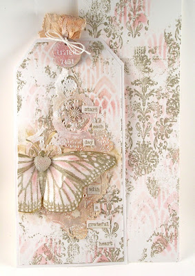
Here's the first version of the card which I shared with you on Wednesday as part of the current '
So Delicate' challenge;
(click on each photo for a closer look)
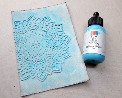
Let's show you how to recreate this one, starting with the background. I cut a background big enough to fit the white card blank and a couple of Mandala shapes from kraft card. Depending on how deep you want your 'embossed' look to be you can either go with one Mandala shape glued onto the background or two. Place the first one off-centre and then glue the second one over the top, ensuring they are correctly aligned (the design is not fully symmetrical so this is important). I would suggest using scissors to trim off the excess along one edge.
Paint the kraft background with a coat of white gesso followed by 'Buff' Acrylic Paint. These two steps are the basis for the other versions too.
For the verdigris look spritz the background with water before adding a watery layer of 'Sky' Acrylic Paint. Dry this with a heat tool after allowing it to pool around the Mandala shape and dab off any excess with a dry cloth.
Dry brush over the whole background with 'Ancient' Acrylic Paint before sanding the surfaces back gently with a sanding block. This will help to reveal some of the lower layers including a little of the kraft base. Continue to dry brush and sand until you are happy with the look.
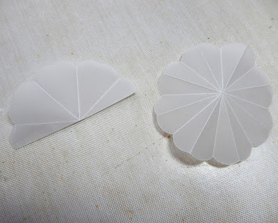
Moving on to the flowers begin by cutting the largest floral shape from the 'Folio Page, Pocket & Flowers' set out of vellum (or similar). Fold into eighths by matching two petals at the top from each angle as shown below.
Turn the flower shape over and fold in eights again matching the singular petal shapes at the top as shown below.
Using the smaller pf the flower shapes in the set die cut two from vellum. This die cuts the outside shape plus a second set of petals on the inside. Pinch the outer petals together and shape the inner ones upwards using a ball tool or even the bottom of a pencil.
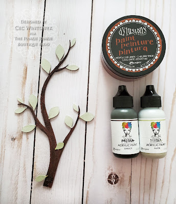
Use the remaining dies from the set to cut smaller flowers and leaves from a mix of kraft card and vellum. Paint the kraft shapes in colours to coordinate with your background. For the verdigris version I used 'Blackberry' Acrylic Paint on the flowers and a mix of 'Evergreen' and Olive' Acrylic Paint for the leaves.
Layer the flowers together as shown below and finish them with a dot of Liquid Pearls (I used Wendy Vecchi's 'Prickly Pear' version for these cards). Finally die cut or stamp your choice of greeting and add to the card. I used the Tim Holtz 'Alphanumeric Type' dies for this and painted them with the 'Blackberry' colour. I would suggest using Wendy Vecchi's STAY-TION with its magnetized ruler to get your letters and words lined up properly. Mount your finished design onto the card blank and it's ready to send.
Now for the first of three further colour alternatives that has the look of a worn black book cover.
After mounting the Mandala on the kraft background and painting it all with white gesso and 'Buff' Acrylic Paint go over it all with a coat of 'Black' Acrylic Paint.
Gently sand over the surfaces with a sanding block, then dry brush with more 'Buff' and after some 'Gilt' Acrylic Paint. Sand it back again and repeat until you get the look you want.
I used the same mix of green paints for the leaves and 'Ruby' Acrylic Paint for the flowers and words on this version, though most colours would go with such a neutral background.
The third version is a softer neutral, this time replicating the look of aged plaster.
After adding the white gesso and 'Buff' Acrylic Paint layers to the background spritz it with water and add a dilute layer of 'Elephant' Acrylic Paint, allowing it to pool and dry. Dab off any excess with a dry cloth.
Repeat the process with diluted 'Umber' Acrylic Paint over a wet surface - you'll need less than you needed with the 'Elephant' layer. Sand back gently when dry.
To team with this paler neutral background I added more of the green mix to the leaves and teamed the flowers and words with 'Heather' Acrylic Paint.
The final version is more colourful than the last two with more of an aged velvet look.
This last one is a little different from the first three, beginning not with white and Buff but with a coat of 'Heather' Acrylic Paint.
Mist the dry surface with water and add a dilute mix of 'Blackberry' Acrylic Paint, allowing it to pool as before and after drying with a heat tool dabbing off any excess with a dry cloth.
Repeat the process with a smaller amount of dilute 'Umber' Acrylic Paint again allowing it to settle around the Mandala.
When dry gently sand back the surfaces before dry brushing them with 'Gilt' Acrylic Paint. Repeat this process until you achieve the look you want.
I teamed this final finish with the green leaves and this time added flowers and words coloured with 'Cheddar' Acrylic Paint.
Thanks for visiting to catch today's Saturday Showcase tutorial featuring Eileen Hull's new '
Mandala' and '
Folio Page, Pocket & Flowers' Thinlits die sets. I hope you've enjoyed seeing how it is possible to achieve several different looks using the same design and a range of colours.
There's still plenty of time to enter the current Funkie Junkie Boutique Blog challenge '
So Delicate' which runs through Tuesday, February 2nd at 11.55pm. We look forward to seeing your amazing creations.
Jenny
Products used to create this junk journal are available from
The Funkie Junkie Boutique and are listed/linked below.
Sizzix Thinlits Dies by Tim Holtz - Alphanumeric Tiny Type Upper
Ranger Wendy Vecchi Liquid Pearls - Prickly Pear


