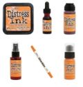
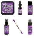
I have to admit that I bought every new ink pad and various combinations of the different products sprays, markers, and stains. I am a bit of a color fanatic. I love the different color combinations and I have many ink pads to reflect that!
I like to make color swatches and put them on strips of white cardstock. You then have a series of color swatches that you can pull out when you want inspiration. I cut a series of inchies (1" x 1") squares from white cardstock. I then smeared the ink pad over the squares until they are saturated with the ink. Then the fun begins as you can take those different colors and mix and match them to create different color combinations. Once you have a color combination you like you attach it to a strip of white cardstock to create your own chip sample. You can also punch a hole in the corner and put them on a ring to create your own color sample book to use as inspiration.
Here are a few different ways I used some of the color combos I created:
My first play with the colors involved smearing three colors in a repeating pattern on an acrylic block. I spritzed it with water and placed the cardstock on it to pick up the stripes of color. Then I stamped an drew the images over the surface and came back and added more colors with a waterbrush.
After that project I moved onto some bold colors with a stencil. I wanted to show how easy it is to pull together a group of bold colors. I sponged the various colors over the stencil and hen came back and blended them together. I love how the vibrant colors make the stencil image pop.
A few tips on how to blend the colors:
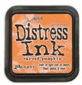
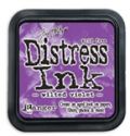
- Start with the lightest colors first and work your way up to the darkest color. These are all strong colors but I went in the following order: Carved Pumpkin, Lucky Clover, Wilted Violet and Blueprint Sketch.
- Randomly apply patches of color with very little overlap between the colors.
- After all colors are applied and most areas are covered in color use the lightest color to blend all the colors together.
You can take this to shabby or distressed easily. I took this sample and softened it with a coat of white wash (Mix of a little white acrylic paint spritzed with water) on the right side and distressed it with the Ground espresso along the edge and added water spot around all the edges.
I also created a plaid combo using a color combo strip:
I thought these colors would be fun for a Holiday card.
For my last color combo I played with a few different colors and created a variety of backgrounds.
Suzz
P.S. Here is one photo of all my different color swatches using the 2015 colors!









Fantastic ideas for using these colours Suzanne! xx
ReplyDeleteWhat great ideas you have shared to inspire us! A whole new way of looking at the color palette as far as I am concerned.
ReplyDeleteAwesome ideas :) TFS!
ReplyDeleteSherrie K
Wow Suzz, this is amazing! I love all the ways you used these colour combos. I think my fav is Twisted Citron with Abandoned Coral and Hickory Smoke, so light and summery! Great post! hugs :)
ReplyDeleteLove this Suzz ! I am always looking for different colour combinations, this is fabulous ! Sue C x
ReplyDeleteWhat an awesome idea!!
ReplyDelete