Showing posts with label Tim Holtz Idea-Ology. Show all posts

Saturday, April 9, 2022

Saturday Showcase - Sizzix Tim Holtz Texture Fades Embossing Folders

Happy Saturday! Suzz here to share a Saturday Showcase featuring the lovely Sizzix Texture Fades Embossing Folders designed by Tim Holtz.


I started by pulling out all my Texture Fade Embossing Folders to play with.


I then pulled out many different leftover scraps of inky backgrounds, white cardstock, and patterned papers and started embossing!


The Texture Fade Embossing Folders take a patterned paper and add a whole new level of visual and physical texture.


This Idea-ology Backdrop looked like leather and the embossing folder added the quilting and hint of texture with some ink sponged over the texture after the paper was embossed.


I used the soft yellow Backdrop paper with the Typewriter embossing folder in the card above. I took the Distress Ink pad and dragged it lightly over the embossing to create a contrast.

Then I started playing with the embossing on white cardstock to create a different effect.

I sponged this background with Versamark Embossing Ink by dragging the ink pad face down over the raised texture. I sprinkled it with a gold embossing powder, shook off all the excess, and heated it with the heat gun.


Next I sponged with Antique Linen Distress Ink to age it. A little sprinkling of water and brown Distress Spray added a little bit more aging. The finished product became the background to my first card.


I loved how that turned out, and decided to play with some Mini 3D Texture Fades.
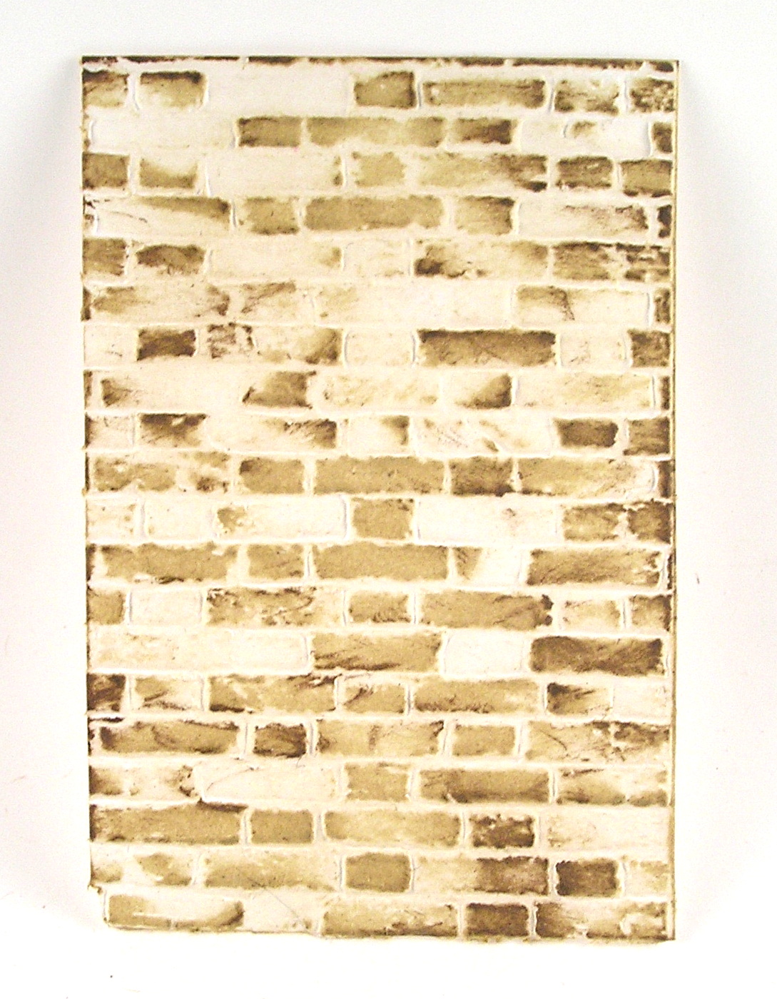

On the background embossed with Mini Brickwork, I dragged the Antique Linen pad across the surface multiple times. I then used a brown Distress Ink to add a hint of shading. I dragged the brown ink partially across the surface to only pick up some of the edges. I loved the effect, and repeated it with the Mini Cobblestone Embossing Folder.


For the cobblestone, I started with the Antique Linen Distress Ink, dragging it across the embossed paper. I then came back with the Hickory Smoke Distress Ink and added another layer of ink by dragging it across the embossed surface. It is quite addicting!

Then I decided to try spraying on the Doily Embossing Folder with Distress Ink Sprays, and then embossing white cardstock.


I thought that was too much ink, so I decided to ink up the embossing folder. I wiped it down from the previous experiment, and after it dried I took the ink pad and dragged the ink directly across the raised portion of the embossing folder.


I also spritzed the inked up embossing folder with water to loosen up the ink and give a stronger impression on the paper. I took the inked up embossing folder and opened it up completely on my craft mat. I laid the paper onto the open folder. I used a brayer to roll over the surface and pick up the ink. For my next example, I used blue dye ink.


This print was created using the same process, but with more water spritzed. The more water, the softer the effect. After all the spritzing, I wondered how it would look without adding any water and only dragging the ink across the surface.


I used a brown ink and you can see because the ink beads up on the plastic surface you get a stipple effect

For the last one, I spritzed the paper as well as the folder.


I decided to pull out some other inky backgrounds previously made as well as using spray to add color to white cardstock. I started with white cardstock and embossed it using the Damask Texture Fade.


After the embossing was complete, I pulled out a beautiful silvery Distress Stain Spray and spritzed the surface, allowing pooling of the ink and then heat setting the ink.

I found this gorgeous painted gold background in my leftover pile and embossed it using the Typewriter folder.


After I pulled it out of the embossing folder, I decided to splatter it with some white paint and hit it with some shimmery inky spray.

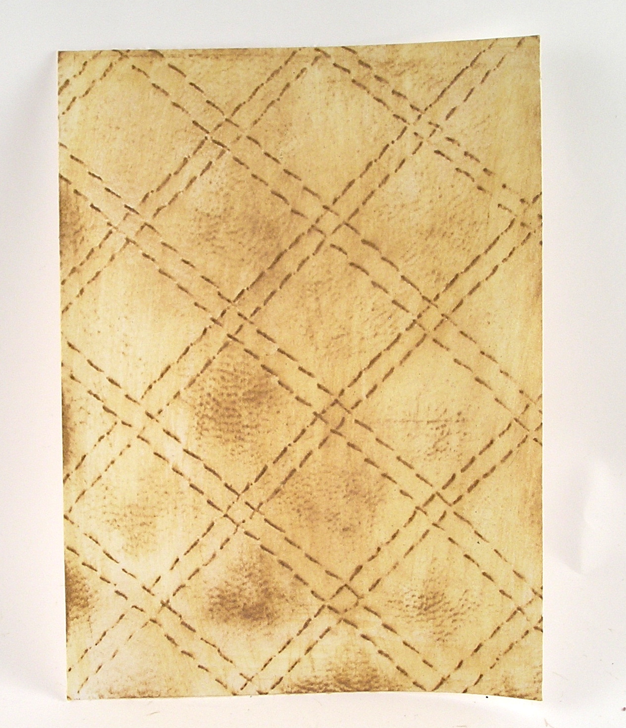
Next up, I tried to create a leather-inspired piece with the Quilted folder. I embossed the quilting on white cardstock. After I embossed the paper, I used an ivory dye ink and a brown dye ink to create this soft effect.

Finally, I decided to try cutting some die cut flowers from embossed backgrounds.
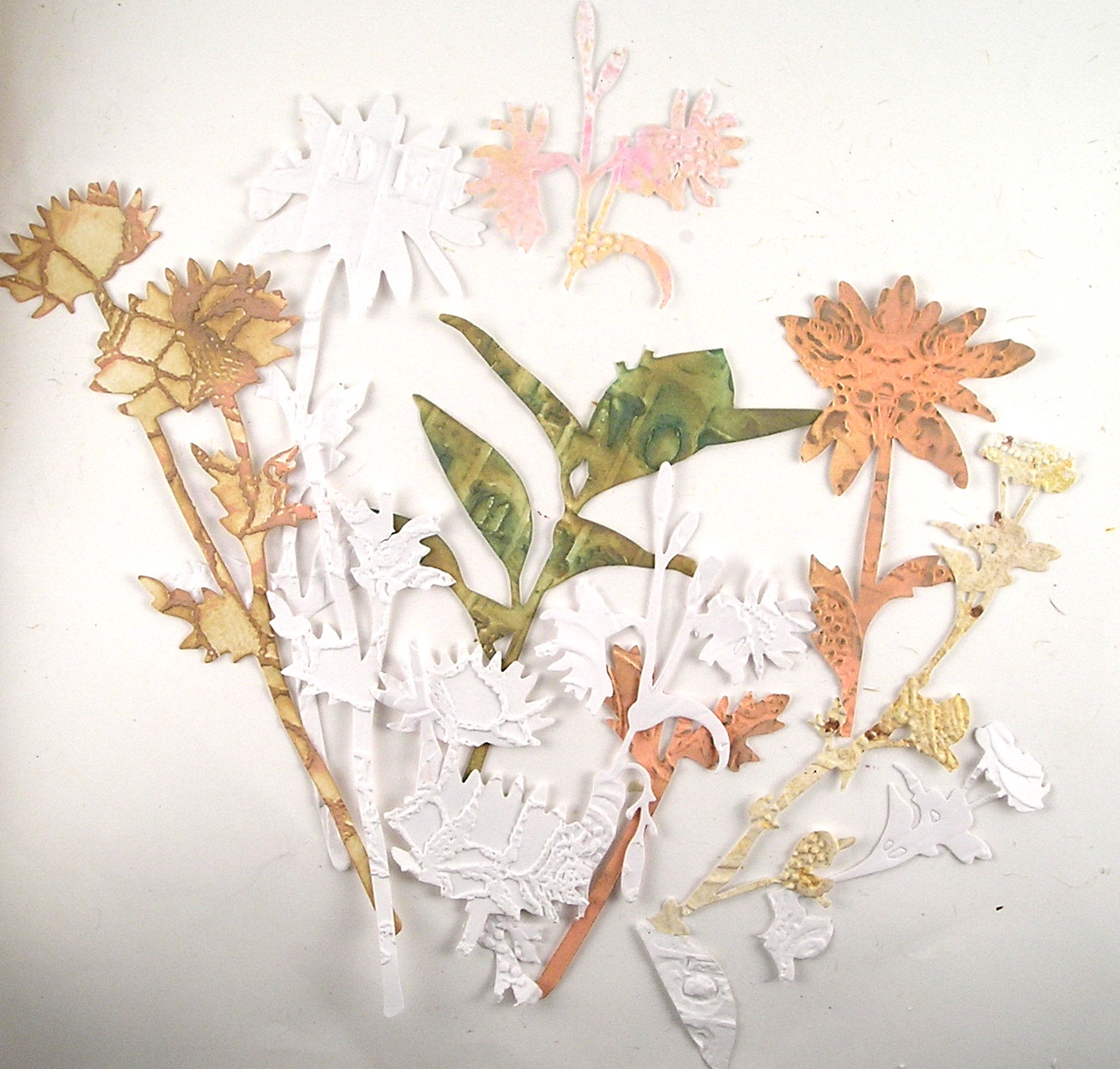

After I die cut them, I sponged a few of the different flowers. Hint: The 3D Embossing Folders will impress deeply, and you can see that some of my flower stems broke off. (Easily fixed as you can put them on the card back together.)

A few more pictures on how effective the embossed background shows up on different art.


In this clean and simple card, the Doily embossing folder speaks volumes with no color, just its beautiful texture.

In these pages from a mini book I created, I pulled pieces embossed with the Damask folder as a layer of texture and interest.


I love the Damask, as it is elegant and can look well in a rustic project.


I hope this Saturday Showcase has inspired you to check out the Texture Fades Embossing Folders.
Suzz

Products Used

Ranger Distress Oxide Inks - Vintage Photo, Hickory Smoke, Saltwater Taffy
Ranger Distress Ink - Antique Linen, Ground Espresso, Hickory Smoke
Tim Holtz Idea-ology - Transparent Wings TH93785
Ranger Distress Sprays - Saltwater Taffy, Silver, Gold

Saturday, December 7, 2019

Saturday Showcase -- Prima Christmas in the Country and Tim Holtz Idea-ology Christmas Tokens and Quote Chips

Hello friends and Funkie Junkie Boutique fans. Ginny here to share this week's Saturday Showcase. I'll be sharing how to create dimensional frames with mixed media supplies then using them on 2 cards with different styles.


Here's a schneaky peek of the completed cards. I love that they have similar elements but by changing the background papers I was able to get two distinctly different looks.


I pulled out all my beautiful Funkie Junkie Boutique Christmas Crafting Supplies and came up with my plan to create dimensional frames.  Having all the options gathered in one spot helps me to decide on a design and color scheme. 


I decided that the buffalo plaid patterned paper from the Prima Christmas in the Country 8 x 8 paper pad would be my common element for both cards. I was able to get 2 frames from one sheet.  I cut the rectangles pieces being careful to have the darker blocks around the outside. Next I used a  rectangle die to remove a portion out of the middle to create the frame shape. 


After swiping an anti static pouch over the surface of the paper I stamped the scripty font from the Prima Art Alchemy Stamp #6 by Finnabair in a random pattern around the frame using clear medium. I sprinkled on Liquid Platinum embossing powder from Ranger onto the stamped impressions then heat set it to create a shiny finish.


I added adhesive foam spacers to the back to create the dimension. Faux snow added randomly around the outside edge gives the frames a frosty look.  The frame on the left has the stamping right on the surface without the anti-static powder and it adds to the mottled look of the embossing. I like them both equally. You can decide how much is right for your project.


For the first card I chose the more altered frame. I think it adds a subtle frosty look that helps the frame look more wintry.


This card has a very traditional color scheme. The paper layers come from the 8 x 8 Prima Christmas in the Country Paper Pad. I used red cardstock between the layers to help keep the patterns from looking busy.


The focal image in the frame also comes from that same paper pad. What's more wintry than a big red barn covered in snow? I live out in the country so trust me on this I see them all the time!


Stacked trims are added between the layers to create a textural element. That red trim is simply gorgeous and I wish I had a whole roll just to keep in my stash as decor!


Holiday details come from the Christmas in the Country Ephemera Pack. The wreath is in the frame and the 25 is on the frame adding depth and dimension. I trimmed down the Tim Holtz Idea-ology Christmas Quote chip for a perfect fit then topped it off with pretty flowers and a loopy twine bow.


These flowers are a combination of made by me and ready made flowers from Prima. I've arranged them with die cut foliage for a nice full look. Last but not least is the Idea-olgy Christmas Token and silvery pine cone charm. I've added the Ice Resin Glass Glitter in Antique in Antique Gold for added sparkle.


To change up the look of this card I added a layer of pretty checkered pink paper from the 6 x 6 Prima Dulce Paper Pad and pink polka dot ribbon. Now I have a shabby chic inspired card with the same layout as the first card.


That darker colored frame looks great with the lighter color scheme of this card as the Santa image has a darker outfit and balances perfectly.


Like on the first card I chose a stacked rectangle layout with cardstock to separate the layers. This time I went for a soft dove gray. There is also spacers between the layers for added depth.


This time around I picked images and a sentiment from the Christmas in the Country Chipboard Stickers. That gold foiling is extra festive!


I've also swapped out a dimensional flower for a floral chipboard sticker. A few tiny stars from the ephemera pack are added to the layers.


Since I went outside the actual Christmas collection for the patterned paper I also added some not holiday flowers. These are just sweet and simple pink and white Prima flowers to coordinate with the paper. The same charm arrangement as on the first card are tucked under the flowers for the perfect finishing touch.

I hope this inspires you to create custom dimensional elements to add to your paper crafting.  What better way to get perfectly coordinating add ons that fit just right? Also consider getting all your supplies out to help you come up with unique combinations for a project that's uniquely your style.

Wishing you all a happy and productive day!
Ginny

Links for all products used on these cards from The Funkie Junkie Boutique.....


Saturday, November 9, 2019

Saturday Showcase - Eileen Hull Designs 'Fabulous Fall' Pocket Notebook

Hi everyone and welcome to another Saturday Showcase, the Design Team's chance to share tutorials and products available from The Funkie Junkie Boutique with you. Our latest challenge is called Fabulous Fall - my Design Team project for this one is an Eileen Hull Designs Pocket Notebook featuring a Prima Marketing Finnabair moulded piece and an Autumnal floral bundle altered with Ranger Alcohol Ink.


With a number of techniques and products being used to create this Fall Pocket Notebook I've put together a tutorial to show you how to recreate it, so here goes!

************

Start with the cover - I've shown in previous posts on my blog how to use the Pocket Notebook die cut pieces to create a cover with a flexible spine (see HERE if you've missed it). Cut away the spine pieces from the covers, place one of the spines in the centre separated from the covers by about 1/4 inch each side, and stick together with adhesive backed tape. I then covered the outside of the cover with cotton calico fabric, painting over it with White Gesso and Apricot Acrylic Paint from Dina Wakley Media. To darken the edges try blending them with Watering Can Archival Ink from Wendy Vecchi.


You'll see by clicking on the photo below to enlarge it that I've punched two extra holes in the centre of the spine so that there are three holes at the top, middle and bottom. To add age to the cover spritz over with water and brush on diluted Umber Acrylic Paint. By letting it dry a little and dabbing off the excess you get this watermarked look.


To finish the cover stick patterned paper of your choice onto the inside and re-punch the holes through the fabric and paper layers.


Now for the embellishments; I love using Ranger Alcohol Inks to alter embellishments as they will work on pretty much any surface, dry fast and add a lot of colour with just a drop of ink. First up these adorable silver acorn charms were given a warm brown glow by adding a little Latte Alcohol Ink.


Next a small sprig of Tim Holtz Bouquet Findings needed just a little Lemonade Alcohol Ink to make it pop with a beautiful yellow-orange hue.


Tim Holtz Beaded Berries were transformed for Fall by applying Cranberry and Shell Pink Alcohol Inks to the tips. With a little Espresso Alcohol Ink on the stems they were ready to bend into shape.


These Antique Bronze Leaf Charms are incredibly detailed - after being given a coat of White Gesso a little Lettuce Alcohol Ink was added to make them more lifelike.


A much larger Bronze Leaf Embellishment needed to contrast with the vibrant Fall colours used for the rest of the floral bundle. Again, White Gesso was applied, followed by Gunmetal Mixative Alcohol Ink.


Now for the moulding; I pushed air drying clay into one side of the Prima Marketing Finnabair Kingsbury Medallion, ensuring the surface was smoothed over to make it flat and remove any excess clay. Linda now stocks the new tubs of Prima Marketing Redesign Air Dry Modeling Material which will be ideal for this. You don't always need to use the whole of a design to get a dramatic impact.


Whilst wet turn out the moulded piece onto a stamping block (or similar) and add a little wet glue to the upturned surface.


Flip the stamping block over onto the front cover to apply the moulded piece to it - as everything is still wet at this stage there's time to wiggle it all into the desired position. I left the clay to air dry as required and waited for the colour to change to a crisper white.


Once dry it's time to start adding the altered embellishments. I glued a piece of muslin next to the moulded piece to disguise the unfinished edges and added the large leaf to the top; you'll see from the photo below that you can shape the leaf easily by bending it with your fingers. Carry on adding the other bits and pieces that you've coloured into an arrangement you're happy with.


Creating the signatures inside is easy as Eileen Hull's Pocket Notebook die cuts the pages as well as the covers. Fold your choice of papers in half, lay the folded edge along the blank side of the die and cut! I chose to use tea stained old scrapbook papers and copier paper to coordinate with the cover.


Use a sharp tool to stab a hole into the centre of each set of signatures. I chose a coordinating colour of jute string to secure them in place. Start by threading the string from one of the centre holes on the outside of the spine through to the inside and through the corresponding hole in the signature. Then take the string to the top of the signature and push the string through one of the top holes in the spine.


Now thread the string back through the centre hole in the spine to the middle of the signature before pushing it through one of the holes in the bottom of the spine.


The photo below shows where the string has gone through the spine, into the signature, back out to the top, back through the middle, down to the bottom and out. Finish each one by tying the string off in the centre.


When finished you'll end up with three sets of knotted jute string on the outside of the spine. These can be embellished further with beads and charms, but I chose to tie them together and untwist the jute to create a tassle.


When finished you'll have a Fall themed Pocket Notebook with three signatures inside. Here are some close ups;


Thanks for visiting to catch today's Saturday Showcase tutorial - I hope you've found it helpful. There's still plenty of time to enter the current Funkie Junkie Boutique Blog challenge 'Fabulous Fall' to be in with the chance of being a Guest Designer here. We look forward to seeing your amazing creations.

Jenny
Products used to create this Faux Finish Pocket Notebook are available from The Funkie Junkie Boutique and are listed/linked below.