Saturday, July 30, 2022

Saturday Showcase - Underwater Love


It's another Saturday Showcase! Lyla here, taking you into another cool project with a very cool product: Underwater Love, a Ciao Bella Paper with a sweet summery theme! Like many others, I pass over paper after simply glancing at the photos since I know what usually will work as far as color shades with a planned project. But even as I passed over this particular paper, something kept drawing me back to it; there was just something about that particular shade of blue... aside from the 'flowery' images that I usually don't care much for. Wow, wow, WOW; was I set up to be surprised! No sooner had Tim Holtz come out with the newest shade of Distress Ink, Unchartered Mariner, than it began to click together; that beautiful shade of blue was the same in Underwater Love! And more surprise was in store for me once I got the latest 'happy mail' from The Funkie Junkie Boutique. This paper is not only beautiful, double-sided, and very sturdy (I'm even going to go as far to say it's as sturdy as Tim Holtz's newer Kraft Stock), it's a pleasing perfect match for the Unchartered Marine Distress Oxide! Follow along with me and see if you agree!


This project is using the Eileen Hull Folio Journal Die and Eileen Hull compatible thin die sets as shown in photos below. The 'star' of this Showcase is the Ciao Bella Underwater Love 12x12 Paper.


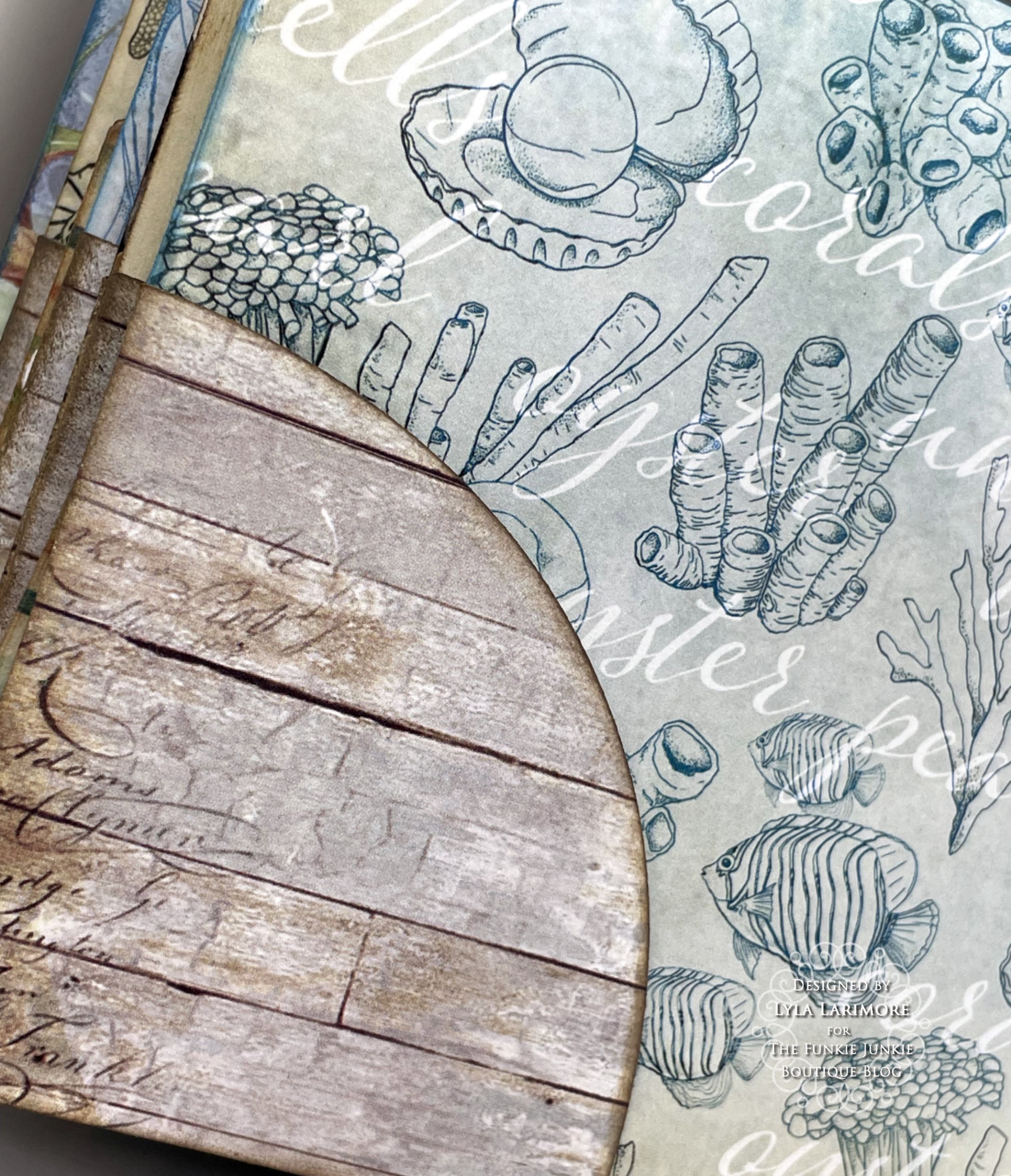
The camera simply does not do the colors in the photos enough justice. We're talking a beautiful shade of blue, and I've put my Unchartered Mariner Oxide Ink into the middle of the double-sided papers so you can compare with your own. I fell in love with the 'wood' as well as the 'map' papers and there are 2 of each! The other side of the stack is just as pleasing, but to get better views than this, you really need to see it HERE (BONUS: It's on SALE for $10.00 !!)


I chose one of the 'wood' sheets for my outside with one of the 'map' sheets for the inside. Normally, I am one of those who insists on putting another cardstock in between these layers, just for stability. Not this time; this Underwater Love stock is all that's needed!


I did my normal opposite layering (left blue to right blue then left wood to right wood) since it always gives a good spine. I did use my usual Glossy Accents for adhering. I also had a plan for the leftover strip up there at the top of this photo...you'll see.


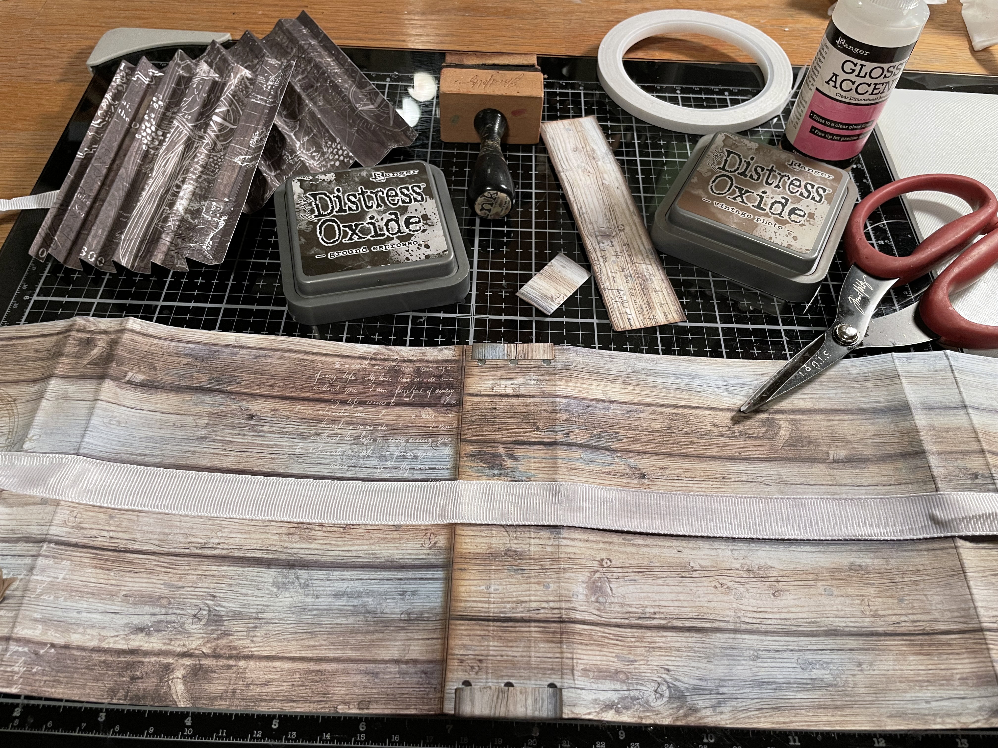
After getting the outside and inside covers together, I chose a plain ribbed white ribbon for closure. A 'slice' of that wood leftover became a sweet board to overlay onto the spine- inside and out. It hid the holes as well as secured the closing ribbon.


I got out the compatible Eileen Hull Thin Die Set Page Pocket and Flowers to cut pages and corner pockets. The leftover pieces of stock were cut into one-inch strips - just short of the length for the pages - for use in making the pages into tuck pockets themselves.


Next, I used the other two compatible Eileen Hull Thin Die Sets (Card Waterfall/Tags and Bookbinding/Label) for waterfall pages, the tags I planned to fill several pockets with, and the binding for the pages to layer onto.


Then it was time for the assembly of all the inside. I gave all the edges and corners (including the cover) a bit of the Tim Holtz Unchartered Mariner Oxide Ink, and heat dried everything.


I'm showing how I put together my pages to form a pocket in the middle of them. This page above, was to have nothing else on the outside. Others will have tuck pockets on the outside lower corners. You can see in the next pic, how I added the corner tuck spots before putting the pages together.


Making the top-to-bottom waterfall pages was easy. I inked them up all around the edges and that Unchartered Mariner just PERFECTLY matched!


I used ALL the pages except for one: the mermaid/secrets page. I did have plenty of leftovers even after cutting more tags than I initially had. That 12x12 stack went pretty far! Now, my only problem was to figure out what I wanted on the front of the entire book. Flowers? Nah. Tim's Paper Dolls? Much as I love them...nah. More wood cuts stacked up? Nah. Everything I suggested got flat-out rejected by my ArtMuse. A memory came out of nowhere, along with a voice in my head saying, "Less is more. Less is more!" The memory is so peaceful: my favorite Happy Place...


I spied the bag of Tim Holtz goodies I have for a future project on my desk. The package of Idea-ology Window Frames caught my eye. Why not? So I went to my computer, looked up the date to find that set of photos, and found IT - the perfect shot.


After printing it out on regular white cardstock, I laminated it with clear shelf paper. I used only one thing on the Window Frame: Distress Crayon in Speckled Egg all around the edges.

And it looked simple and simply amazing to me!


This is where that one strip of wood went to... cute, eh?


Some of the other 'wood' and fish paper...


... and more of the other side of these papers.


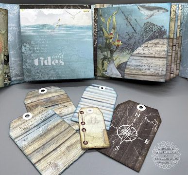
These are probably my favorite designs of the Underwater Love 12x12 Ciao Bella Paper. I hope you enjoyed this Saturday Showcase as much as I enjoyed making this folio!


Products Used:
Eileen Hull Page Pockets & Flowers Die 664883
Eileen Hull Bookbinding & Label Die 665153
Eileen Hull Waterfall Pages & Tags Die 665154

Wednesday, July 27, 2022

Scotch It Is!

This Funkie Junkie Boutique challenge is from Suzz: "I googled what July 27th is and it came up as National Scotch Day. Why not be inspired by Scotch? I am going to take great liberties with this and say you can be inspired by Scotch in any way you want to interpret it, including and not limited to: tape, plaid, liquor, or any way you are inspired by the word Scotch. Make sure to share with us how you were inspired!"

The guidelines for entering are simple: create a new vintage or shabby chic project following the challenge theme, link it to your post (not just your blog) and also include a link to this challenge in your post. You can combine our challenge with up to 10 challenges (including this one) to be in with a chance for winning. If you are entering through a public forum (such as Instagram) you'll need to include the words 'Funkie Junkie Boutique Challenge'. Also, please turn off your Word Verification so our Design Team can leave comments on your blogs. Make sure you follow these rules as unfortunately, we have had to eliminate entrants from the prize drawing in the past.

Here's how our Design Team interpreted Suzz's theme:

Suzanne Czosek - Suzz's Stamping Spot

Lisa Hoel - Creative Juice


Teri Wilson - TerisMailbox

The overall winner will be offered the chance to be a Guest Designer at a future date here at The Funkie Junkie Boutique Blog, and everyone who enters and follows the rules will go into the drawing for the chance to win a $25.00 spending spree at The Funkie Junkie Boutique. There are also Top 3 Badges for three additional outstanding entries, chosen by the Design Team.

Whatever you create, enjoy the making! We look forward to seeing your projects! This challenge is open through 11:55pm Eastern Time on Tuesday, August 9th, 2022.

Wednesday, July 20, 2022

Guest Designer - Lia van Bruggen-Vreman

The Funkie Junkie Boutique is delighted to welcome Lia van Bruggen-Vreman (Lia's Designs) as our Guest Designer this week. Lia was the overall winner of our Stuck in the Middle challenge recently.


My name is Lia and it's great fun being a Guest Designer this time. During my whole life I am a creative person and I like all kinds of papercraft, like cardmaking, scrapbooking and making crafts for and with kids. As for cardmaking: I don't have a favorite technique, but I prefer making all kinds of sceneries with stamps and diecuts. I am a card designer for one of the most well known Dutch designers for cardsupplies (Leane Creatief) and that's big fun! But I also like cross stitching, reading good books and traveling with our motorhome. I am a textwriter for several Dutch craft magazines and sometimes I make craft projects to be published in these magazines.


Today you see my interactive card for the challenge theme "Moving Parts" which I made with diecuts from Leane Creatief and unbranded stamps. I made the background with diluted Distress inks and colored the stamped images with markers.


I attached the car with big foampads onto the 'pull out' paperstrip and attached the front of this card with foamtape onto a green card. Done that, this has been glued on the front of a double cream card.

Make sure you check out Lia's blog (Lia's Design) to see more of her beautiful creations. Don't forget to share your 'Moving Parts' project with us. The challenge can be found HERE and runs through 11:55 pm EST on Tuesday, May 31st.

Monday, July 18, 2022

Challenge Winners - Stencil Mania

Teri's "Stencil Mania" challenge asked us to use at least three stencils to create our entries, and the project that Maryanne of The Creative Muse was the entry that stole our Design Team's hearts.


We look forward to seeing Maryanne return as a Guest Designer at a future date here on The Funkie Junkie Boutique Blog. You'll be contacted shortly with all of the details. And now our picks of additional outstanding entries for The Funkie Junkie Boutique Blog Top 3 Badges. In numerical order they are #3 Barb Turpin, and #4 Katy Drogos. You'll be contacted shortly with the Top 3 badges so that you can display them proudly on your blog.

And finally for the lucky randomly drawn winner for the $25 gift certificate to The Funkie Junkie Boutique: our congratulations go to #4 Katy Drogos. Please email Linda at thefunkiejunkie@gmail.com for the gift certificate details.

Thank you again to everyone who took part in this challenge and congratulations to all our winners. The current challenge - 'Moving Parts' - can be found HERE and runs through Tuesday, July 26th at 11:55 pm EDT, so there's still plenty of time to link your projects. Please be sure to read the rules carefully before you submit your entry.

Saturday, July 16, 2022

Saturday Showcase - Tim Holtz Foundry Waxes

Happy Saturday! Suzz here with a Saturday Showcase highlighting the Distress Foundry Waxes. I had so much fun putting together this book, which was inspired by the Prima Marketing Sweet Farm Paper collection and the Foundry Waxes.


The book started with a variety of different pages made from acetate, cardboard, and envelopes. I spent time thinking of how to incorporate the farm life into the pages.

Front Cover:

The covers received a whitewash using watered down acrylic white paint - just enough to give it a soft effect against the cardboard cover. After the whitewash dried, a layer of Ranger Distress Opaque Crackle Paste was applied with the Tim Holtz Layering Rosette Stencil. The paste was purposely applied unevenly to give it a worn effect. After the paste was dried, a touch of the Foundry Wax was was painted onto the stenciled surfaces and around the edges to add a hint of gold.

Back Cover:

The Foundry Wax looked beautiful on the edges of the flowers, on the chicken wire which had a moss coating and even around the edges of the paper dolls. The pretty trim received a sponging of Distress Ink to add a shabby, worn appearance.


When you flip the page you are greeted with some vintage lace that has been distressed with a little brown dye ink. The clock was sponged with red and brown dye ink and accented with a hint of the Foundry Wax. Even the buttons had a brush of gold added to them, which was the perfect accent.

The next page was two separate envelopes and my humor got the better of me. I decided to make it look like barn doors with the horse peeking out. The doors were created with strips cut from the patterned paper to fit the envelopes. They were decorated with a layered floral bouquet. Again I sponged around the edges of the flowers with a gold highlight from the wax.


For the backside of the envelopes they were papered with a dark wallpaper.


The flap was covered with a coordinating paper and highlighted with a few strips of tissue tape. The bucket and flowers were highlighted with a touch of the waxes to make them gleam.


Again the poor horse was made to sit in the basket with a bow and flower accent. The other page was a long envelope that was stamped with a ledger stamp using a Distress Ink. The wooden buttons were gilded with a touch of the gold around the edges.


The next page had a lovely piece of pattern paper with a white wash coat applied and a fun page filled with Farm inspired photos, embellishments and the cow. Up next was some burlap and fabric tape and a windmill.


The windmill is on an acetate tabbed page that has been stenciled with the Crackle Opaque Embossing Paste. After it was dry, a coat of mixed Foundry Wax was applied. The last page was the rooster on a clock highlighting the number 5. I think it was the inspiration of the 5 AM rooster wake up call. The number, circle, and accessory all received a gold highlight using the Foundry Wax.


The windmill was created using a few bits and pieces and I wanted to highlight a few of the pieces before they were glossed up with the Foundry Wax.


I started with a metal ring, some wooden stakes for the garden,  white cardstock and some foam from some packaging for something we bought.  I also had a pin with a ball on the top.

First I cut out a template for the windmill blades. I googled some images to get a feel for the blade design. I then just created one template. After I had one that I liked (we won't go into how many failed ones I created. :) I replicated it 12 times.

Next up I painted each of the blades with the Foundry Wax and heated them up to make them shine. I had uneven blotchiness purposely on all my pieces because I wanted them to look worn.

I cut a few extra strips of white cardstock and painted them, and heated the wax up as well.


I was lucky enough to have these two wooden garden stakes that actually fit together nicely on an angle. I painted them with the Foundry Wax and then heated them up to make them shine. I glued them together with hot glue.

I then cut the angled pieces and taped them onto the wood sticks. I took the blades and attached them to my metal rings.

To make the blades spin, I put the star in the middle and hot glued the ball of the pin into the center of the star. I then added a piece of foam to the sticks and cut the pin very short with wire clippers and stuck it into the foam.


Then stuck the blades with pin into the foam.


The end result spins like a real windmill and the Foundry Wax made it look like old aluminum metal.


Thanks for stopping by!


Products Used:
Prima Marketing Sweet Farm
Idea-ology Tim Holtz Paper Dolls