Saturday, July 31, 2021

Saturday Showcase - Tim Holtz Sizzix Flower Field Die

Hello friends. It's Teri from TerisMailbox here spotlighting the 'Flower Fields' Die from Tim Holtz and Sizzix for The Funkie Junkie Boutique. I admit to be addicted to all things Tim Holtz. This die has become a new favorite!

Check out the variety of techniques on all five cards!

I started by watercoloring two different cards using watercolor techniques. The first card uses the border as a watercolored die-cut piece.

Check out the dimension achieved by layering an additional die cut below the water-colored piece! I used distressed ink reinkers to color the die cut and smooshed the background with Tumbled Glass and Speckled Egg Distress inks.

Colors used include Wilted Violet, Mustard Seed, Spun Sugar, Bundled Sage, Peeled Paint and Abandoned Coral inks for the flowers.


After gluing the die cut watercolor piece to the smooshed background, I mounted the watercolor piece on an A2 hotdog  cardstock base. The sentiment is from Stampers Anonymous 'Nature's Wonder' stamp set that I thought completed this card well.

The second card is also water-colored, this time using an embossed image. Check out this soft willowy image!


This card started with the die embossed onto a piece of watercolor paper. I added the same colors of ink listed above to the embossed areas on the paper. I filled in the sky with Tumbled Glass Distress Inks and spritzed the paper and let the colors move.


Check out how soft the colors are after they spread!  If you look closely, you can see a faint outline on the flowers and grass, This was achieved by using a brayer to apply Hickory Smoke Distress ink directly to the die and re-embossing the piece. I love how it just spotlights the flowers!


The sentiment is from Stampers Anonymous 'Tiny Text' Stamp. I love these sets for the variety of sentiments for all occasions! I stamped it on a strip of watercolor paper and applied to the front of the piece. The embossed piece is mounted on an A2 cardbase.

I have a video on my YouTube Channel documenting the process for these two cards. I hope you enjoy the video I'd love to have you subscribe to my channel.


In addition to these cards, I created three other cards using backgrounds from my stash. Do you make backgrounds and save for "just the right card"? Once I get going with a background technique, I tend to make several and find just the right opportunity to use them at a later date.

I used two alcohol ink backgrounds for the first two cards.


Check out the shine on this card! The background is Ranger orange and yellow alcohol inks with gold spotlights from gold Thermoweb Deco Foil applied while still wet. The floral border was cut from gold cardstock and applied over the alcohol ink piece.


The sentiment is from the Stampers Anonymous 'Tiny Text' Stamp by Tim Holtz, embossed in gold on black cardstock. Black cardstock frames this piece beautifully.

I love the elegant look of this card!


This card is also on a Ranger alcohol ink base, this time with rainbow hues. The alcohol inks spread so well on Ranger Yupo Paper


Check out the brillance created from the combination of the bright alcohol inks mounted on black cardstock and topped with the 'Flower Field' Die cut from black cardstock. The sentiment is from the Stampers Anonymous Tiny Text Stamp by Tim Holtz, white heat embossed on a strip of black cardstock.

The final card today used ink smooshing. I love to ink smoosh. This background uses Dusty Concord and Bundled Sage Distress inks on watercolor paper. 


This color combo is one of my favorites!  The 'Flower Field' Die was cut from Dusty Concord ink smooshed watercolor paper and mounted on the base.


There is that same sentiment from 'Tiny Text', this time stamped on watercolor paper and popped up with additional strips of cardstock. The watercolor base is mounted on an A2 cardstock base.


Stop by The Funkie Junkie Boutique and check out all the wonderful products available!

I hope you have enjoyed my spotlight. I hope I have inspired you to try different techniques. I'd love to have you follow/subscribe on my social media sites Instagram, Facebook, Blogger and You Tube.  Be well. Be creative!

Wednesday, July 28, 2021

Shimmering Summer Fun Challenge

Greetings Friends! Janna here to host my first challenge  post for The Funkie Junkie Challenge blog! Welcome to our newest challenge: ‘Shimmering Summer Fun!’

Use bright summer colors in your project and add some shimmer, shine, or sparkle to it. Does summer make you think of sparkling blue oceans, family vacations, or flowers in full bloom? We want to know, so add some shimmer to your cards, tags, scrapbook pages, and journal spreads. Happy crafting! 

The overall winner will be offered the chance to be a guest designer at a future date here at The Funkie Junkie Boutique Blog, and everyone who enters and follows the rules will be entered into the drawing for the chance to win a $25 spending spree at The Funkie Junkie Boutique. There are also Top 3 Badges for three additional outstanding entries, chosen by the Design Team.

The guidelines for entering are simple; create a new vintage or shabby chic piece following the challenge theme, link it to your post (not just your blog) and also include a link back to this challenge in your post. You can combine our challenge with up to 10 challenges (including this one) to be in with a chance of winning. If you are entering through a public forum (such as Instagram) you'll need to include the words 'Funkie Junkie Boutique Challenge'. Also please be sure to turn off your Word Verification so our Design Team can leave comments on your blogs. Make sure you follow these rules as unfortunately, we have had to eliminate entrants from the prize drawings in the past.

Now on to some shimmering inspiration from the Design Team:

Suzanne Czosek - Suzz's Stamping Spot


 Teri Wilson - TerisMailbox


Janna Ketchum - treasuresofthesea_jannak

  
Laura Gilhuly - AngelScraps


Tera Callihan - The Crafty Sugar Addict


We hope you will join in the challenge! Have a great week!

Wednesday, July 21, 2021

Guest Designer - Christine Bedford

It is time to welcome our Guest Designer for the 'Funkie and Frilly' challenge. Say hello to Christine Bedford (pearshapedcrafting) who was the Design Team's top pick from the 'I'm Feeling Like Royalty' challenge.


Hi everyone, I am so pleased and honoured to be Guest Designer here today. My blog, Pearshapedcrafting has led to me being known as Pearshaped Chris, which would be about right! I live in South Manchester with my hubby, who has recently joined me in taking part in online art journaling classes. We love to go out to visit country gardens , many of which get shown on my blog. I have always done some sort of crafting since I was a child, encouraged by my Mum. Since retiring from teaching Special Needs children I have enjoyed paper crafting, especially art journalling.

Here is my Funkie and Frilly card.


First I assembled an assortment of bibs and bobs I thought I might like to use.


I gave the edges a wash using Faded Jeans Distress Ink before adding some favourite papers.


I tried some ideas out - not happy with that lace on the right! As you can see it was easily changed.


Thanks for inviting me for this challenge - I had forgotten how much I love layering paper and lace! I hope you will join in with this Topic 'Frilly and Funky’.

Chris xx
* * *
Isn't Chris's card fabulous and so perfect for the current challenge. Thank you Chris for your wonderful inspiration and for being our latest Guest Designer. Once you have checked out her blog, come on back and share your 'Funkie and Frilly' makes with us.

The challenge can be found HERE and runs through 11:55 pm EST on Tuesday, July 27th.

Monday, July 19, 2021

Challenge Winners - Time has a wonderful way of showing us what really matters

Thanks for joining us today as we announce the winners for our 'Time has a wonderful way of showing us what really matters' challenge and thank you to everyone who played along with your thoughtful projects.


The Design Team really enjoyed seeing all the entries and in the end picked #1 Alison Bomber (Words and Pictures) as our overall winner. We loved how she depicted precious time spent in nature from the point of view of a naturalist in this beautiful journal page. You can see much more of the detail and find out how it came together on her blog post.

Congratulations to Alison on winning an opportunity to be a Guest Designer at a future date here at The Funkie Junkie Boutique Blog. You will be contacted shortly with all the details.

And now our picks of three additional outstanding entries for the The Funkie Junkie Boutique Blog Top 3 Badges. In numerical order they are #4 Lyla Larimore (A Chief's Wife's Heart's 'aFire), #6 Alice K (Yellow House Studio) and #9 Catherine (Catherine's Crafty Corner). Please email Linda at thefunkiejunkie@gmail.com for the codes for the Top 3 badges so that you can display them proudly on your blog.

And finally for the lucky randomly drawn winner for the $25 gift certificate to The Funkie Junkie Boutique; our congratulations go to #10 Barb Turpin (Barb's Boys). Please email Linda at thefunkiejunkie@gmail.com for the gift certificate details.

Thank you again to everyone who took part in this challenge and congratulations to all our winners. The current challenge 'Funkie and Frilly' can be found HERE and runs through Tuesday, July 27th at 11:55 pm EST so there's still plenty of time to link your projects.

Saturday, July 17, 2021

Saturday Show Case Alcohol Lift Ink and Bold Sayings

Hi I'm Janna and welcome to the Saturday Showcase! Today I wanted to showcase a favorite  technique and some of the new Stampers Anonymous Tim Holtz stamps. The technique we will cover today is alcohol lift ink and the stamp sets I will be using are CMS433 Bold Sayings and CMS430 Floral Outlines.  I also wanted to slip in an educational comparison as well. The comparison will be on isopropyl alcohol percentages. Below are the cards I will show you how to make today. Lets get started!


As we know isopropyl is a must have for creating with alcohol inks. The only thing is there are many percentages available. The question which one to use. Today we will be looking at three different percentages and comparing then. (99%, 91%, and 70%)


To follow a detailed comparison check out the video below. Click here

Here is my swatch card showing the results from the different percentages of isopropyl rubbing alcohol. On the 70% I noticed very little blend and the ink appears to be mostly monochromatic. Conclusion: not enough alcohol to get good flow. 91% is good and it gives a ghostly flowing look when the alcohol is move around. I also noted that it has great color gradation. 99% is my favourite  of the three because I feel it gives the most flow when I am moving the alcohol ink around. It also gives me great ripples which is an effect I really like. For the most part I highly recommend that you try this out yourself. Everyone is going to have different preferences and desire different effects. So enjoy and have fun exploring!


Now onto the cardmaking portion of this blog post. Today we are going to be playing with alcohol lift ink and making two cards.


For the cards we will need the following: stamp sets CMS433 Bold Sayings and CMS430 Floral Outlines, specialty stamping paper, alcohol inks glacier, cobalt boysen berry, and wild plum, TH alcohol ink blower tool, lift ink, yupo paper, isopropyl rubbing alcohol, Ranger silver embossing powder, distress embossing ink, Sizzix die leafy twigs, acrylic stamping block or stamping platform, and paper towels. As always video instructions are available too. Click for here video instruction.


To start I will be working on a piece of yupo to make my first background.


First I dripped isopropyl onto the yupo paper and then drizzled on alcohol inks.


Once I had all of my inks down I the moved the alcohol ink around with the TH ink blower tool. I like the ink blower for backgrounds because I can easily control were the air goes.


Here is the finished background. I love how the wild plum still shines through the deeper colors.


Then I trimmed down the yopo paper to 4.25in x 5.5in with my tonic TH paper trimmer.


Now it is time to lift. For this technique I prefure to use a stamping platform. I find it easier to line up the stamps. With stamps in place I tapped on the lift ink all over the stamps.


With good firm pressure stamp on the yupo paper. While stamping I hold the pressure for an extra 20 seconds to make sure the lift ink has time to transfer and work its magic.


Lifting up the lid of the stamping platform you can see where the ink has lifted onto the stamp. I always like to check to make sure the ink has successfully transferred.


Here is the yupo paper with lifted ink. Right now the image is kind of ghost like and blurry, but that will soon change.


Setting aside the yupo for the moment I switched out the paper for some specialty stamping paper to stamp the lifted ink. The ink transfer worked beautifully. Looking at the stamped image you can see all the gradients and colors of the alcohol ink.


Now lets bring our stamped image on the yupo paper into focus. Fist I covered the entire sheet with a piece of paper towel and pressed. This lifted the first layer of lifted ink.


Next I will go in with a small piece of paper towel and start dabbing off small areas of the stamped image. The more dabbing, the clearer the image will become. After dabbing I will get a clean scrap of paper towel and then gently rub off the last of the residue. I do not rub first because it could smudge the image with left over lift ink.


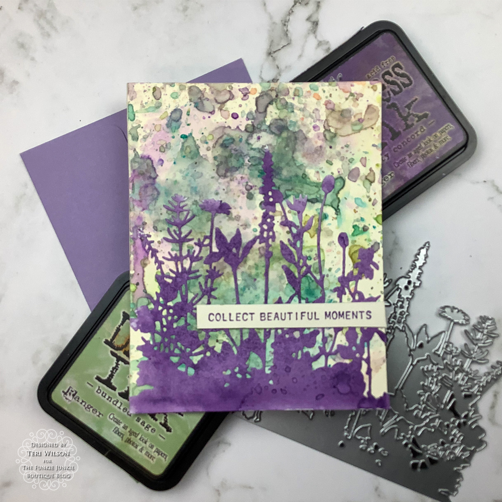
Now check out the end result! The image is nice and clear and easy to see. I love lift ink. It is like magic watching the image come into focus.


For our sentiment we are going to be using the new stamp set CMS433 Bold Sayings.


We are going to be stamping on some plain black cardstock and a piece of vellum measuring at about 2.75in x 3.75in. I will be stamping with some distress embossing ink. Just before stamping I like to check the stamp to make sure I have good ink coverage. By turning the stamp sideways it is possible to see a shine where the embossing ink has stuck to the stamp.


Next I sprinkled some silver Ranger embossing powder onto the cardstock. When I have embossing powder where I don't want any I take a small paint brush and brush off the excess powder.


I stamped a sentiment for each card, one on black card stock and one on vellum. Then I embossed the powder with an embossing gun.


Here I decided to add an extra layer to the card with the alcohol ink stamping. I die cut some shiny TH metallic purple cardstock with the die leafy twigs.


Here is the finished die cut below. I love all the fantastic details of this die. Before die cutting I added some double sided adhesive sticky tape to the back of the metallic cardstock. This makes placing the die on the card much easier and avoids glue ooze.


For this card I decided to only use part of the die cut and cut it apart with some Tonic TH scissors.


Then I stuck the die cut onto the card and glued the embossed sentiment over the top.


For the velum paper sentiment I used a different tape. I used a vellum tape that would be almost invisible through the vellum.


As you can see the vellum tape is almost completely invisible.


And here are the two completed cards using the alcohol lift ink stamping technique. 


Thank you so much for joining me here today at the Funkie Junkie Boutique Challenge Blog. Until next time happy crafting!
~Janna

Below are some links for some inspired shopping at The Funkie Junkie Boutique;

Tim Holtz Stamp Set CMS433 Bold Sayings
Tim Holtz Stamp Set CMS430 Floral Outlines
Yupo Paper Paper
Alcohol Ink Glacier
Alcohol Ink Cobalt
Alcohol Ink Boysenberry
Alcohol Ink Wild Plum
Ranger Lift Ink
Distress Embossing Ink
Sizzix Die Leafy Twigs