Wednesday, May 25, 2022

Guest Designer - Michelle McDonald

The Funkie Junkie Boutique is delighted to have Michelle McDonald (Michelle's Scrap Designs) as our Guest Designer this week. Michelle was the overall winner of our A Study In Contrasts challenge recently.


Hello. My name is Michelle and I call the beautiful Smoky Mountains in Tennessee home. I began my journey into all things paper crafts, focusing heavily on scrapbooking when my daughter was little. In 2016 we moved and I left my craft supplies boxed up. Between remodeling our new home and working overtime constantly to pay for my daughter's tuition/dorm, I didn't have much free time to dedicate to crafts. She just graduated from university this month. I couldn't be more proud of her accomplishments. Now it's time to finish unboxing my craft supplies. I have a lot of catching up to do. I'm very honored to guest design for The Funkie Junkie Boutique Blog this week.


One of the first things I always look for when I go thrift shopping is tea cups. I love to collect them and I'm always thrilled when I find them. I also love to check out the old books section. The book page on my layout is from one of the books I've picked up recently from a thrift store near me.


The brown envelope that my photo is on I also picked up there. It was in a gallon sized baggy chocked full of these brown envelopes in various sizes. I had originally got them because I thought they would work well in a junk journal and I've been wanting to make one for a while now. I just haven't started yet...one of these days. I also recycled a Tim Holtz package backing into my layers under the photo.


The tags remind me of the price tags you see at some of the shops. The pearls, watch, and tea cup charm remind me of the costume jewelry typically found in most thrift shops. I distressed everything to give it a worn feeling, keeping in tune with the thrift shop vibes.

Make sure you check out Michelle's blog (Michelle's Scrap Designs) to see more about how she created this wonderful layout. Don't forget to share your 'Reuse and Upcycle' project with us. The challenge can be found HERE and runs through 11:55 pm EST on Tuesday, May 31st.

Monday, May 23, 2022

Challenge Winners - Sunday In The Park

Lyla Larimore asked us to create projects that remind us of what we might see on a lovely day in the park for the "Sunday In The Park" challenge on The Funkie Junkie Boutique Blog, our Design Team choose the mixed media tag with a vintage vibe that Sara Emily Barker created as their favorite.


We look forward to seeing Sara Emily return as a Guest Designer at a future date here on The Funkie Junkie Boutique Blog. You'll be contacted shortly with all of the details. And now our picks of three additional outstanding entries for the The Funkie Junkie Boutique Blog Top 3 Badges. In numerical order they are #1 Esther Asbury, #3 Jo - Let's Art Journal, and #8 Zowie Dixon. You'll be contacted shortly with the Top 3 badges so that you can display them proudly on your blog.

And finally for the lucky randomly drawn winner for the $25 gift certificate to The Funkie Junkie Boutique; our congratulations go to #4 Pamela Dixon. Please email Linda at thefunkiejunkie@gmail.com for the gift certificate details.

Thank you again to everyone who took part in this challenge and congratulations to all our winners. The current challenge - 'Reuse & Upcyle' - can be found HERE and runs through Tuesday, May 31st at 11:55 pm EDT, so there's still plenty of time to link your projects. Please be sure to read the rules carefully before you submit your entry.

Saturday, May 21, 2022

Saturday Showcase - Sizzix Bold Text #2 Die Set

Hello friends! It's Teri with TerisMailbox. Today I am sharing seven unique cards created using the Sizzix Bold Text #2 Dies with a variety of backgrounds from my stash for The Funkie Junkie Boutique's Saturday Showcase. I tend to sit down and get creative using one technique at a time such as alcohol inks, embossing and ink smooshing. The result is a fun box full of colorful backgrounds.


Check out this great variety!

Before we jump in, I will share I have a video over on my YouTube Channel:

In case the video is not displaying, here is the link: https://youtu.be/YrCYqB0u-1I


Let's start with the ink blended background. This is the only one I created just for this video. I started with the two layer Moon Mask. I sprayed it with Pixie Spray and attached to the upper right section of an A2 size piece of white Cougar Cardstock. Using bright Distress Inks (Twisted Citron, Salvaged Patina, Squeezed Lemonade, Prize Ribbon and Chipped Sapphire), I ink blended the bright colors first in small areas on the base, followed by the blues around these areas. A spritz of water allowed the colors to soften and move. After drying the piece, I removed the moon base and blended Pumice Stone Distress Ink on the clear spot and then used the second stencil to add the craters with Hickory Smoke Distress Ink.


After drying, I splattered White Gesso on top, followed by placing a few larger spots with a paint brush tip. The base was attached to an A2 white card base. I then decided it needed additional texture. Black Soot Distress Ink stamped on the front in small sections using the Ledger Script Stamp provided that interest.

Products Used for Card One:
Stampers Anonymous Ledger Script Stamp CMS241


The second card is a bright and sparkly shaker card using an alcohol ink and glitter cardstock background.


This was an easy shaker to make. Start by cutting the sentiment from the alcohol inked cardstock, and trim it down to a smaller rectangle. Attach a piece of clear acrylic paper to the pack. (I used the plastic envelope that stamps come in.) Add thin foam tape around the edges, add sequins and attach to a piece of white cardstock. I did run a small line of white glue on the foam after removing the paper to help it seal well.


Create the base by ink blending Wilted Violet Distress Ink over THS155. Trim the shaker piece and attach to the front of the stenciled base. Create a focal point using the Brushstroke Butterfly Die and cutting the base with heavy vellum and the details from leftover alcohol inked cardstock. Cut the body with black cardstock, assemble and glue the body section to the perimeter of the shaker.

Products Used for Card Two:
Purple Alcohol Ink from my stash


Next up is a fun Two-fer set. Don't you love it when you have pieces left over to do that? Because these sentiment dies create both a positive and negative piece, it is so easy to make 2 cards!


This is the first card I did. Select a colorful alcohol inked piece. Cut the frame using two rectangle dies from one set. Tape them together to form a frame. After die cutting the frame, cut the sentiment from the inner gold piece as well.

Center the sentiment die and cut from the alcohol inked base. Use double sided tape on the back, covering the letter openings. This will make it easy to pop the gold letters inside.

Trim the alcohol piece and attach to a white A2 base. Center the gold frame around the letters, attach and pop the gold letters in the openings.

Products Used for Card Three:


Here is the second card of our Two-fer set! It started with an ink smooshed background with Distress Resist Spray on it. It is textured with great shine. I wish you could see it! Trim and mount the background on an A2 White card base. Center the negative sentiment piece.


Chose a coordinating piece of metallic cardstock from the Metallic Confections set and die cut using one of the Artsy Stems Dies. Thread the stem into the sentiment piece prior to attaching.

Products Used for Card Four:


Next up is another fairly simple card using an ink smooshed background. After selecting the background, ink blend another piece of cardstock to cut the embellishment from and to use as the backdrop for the sentiment. I used Twisted Citron and Cracked Pistachio Distress Ink.


Use the Lucky Love 3-D Impresslit Embossing Folder to cut one shamrock from the green paper plus three more from white cardstock to strengthen the shamrock. Use the "Lucky is a State of Mind" Die to cut it from the smooshed background. Attach the ink blended piece behind, trim to 5" by 3.75" and attach to the A2 cardbase. 


Using a Vintage Photo Distress Crayon colored on your mat, add some water and use a stiff brush to grunge the shamrock. Attach the shamrock to the card in the upper right corner. I am always a huge fan of shamrocks. Our oldest son is able to find them easily. Now I have spent many hours in my childhood searching without success!

Products Used for Card Five:
Sizzix Tim Holtz 3-D Impresslit Embossing Folder - Lucky Love 665227


Next up is a feminine card using Saltwater Taffy (my new favorite color) and the doily embossing folder.


Check out the dimension and texture created with embossing folders! The background is from my stash, but I do demo how to create it in the YouTube video.

In addition to the background, I also used the Floral Frame from my stash that was already colored and ready to go. Attach the Doily background to an A2 cream cardstock base. Cut the "Choose to Shine" from another piece of cream cardstock. Use the Damask 3-D Embossing Folder to add texture and swipe with the Shabby Shutters Distress Ink pad to add a hint of color. Mount this on green cardstock, trim and add to the cardfront.


Select a Photo Shop image and attach to the back of the frame and then onto the card front. This card has so much dimension and texture, nothing else is needed! See how easy it is to make a wonderfully textured card?

Products used for Card Six:
Ideology Photobooth TH93799


Last card has a Snarky Cat in front of a brick wall. I Girl Zoe has an excellent blog post describing how to create your own brick wall using the Brickwork Embossing Folder. The link to her tutorial is HERE. I used Rusty Hinge, Vintage Photo, and Gathered Twigs Distress Inks for mine. Cut the sentiment in the top section of the brick wall. Run the piece back through your die cut machine after cutting using the folder to deepen the lines.


I love the dimension on this background! A Snarky Cat is the perfect addition to this card! Stamp the cat plus a bowtie and hat on Cougar Cardstock. After coloring with Copic Markers, fussy cut the images and add to the front! Isn't he cute?


Products used for Card Seven:
Sizzix 3-D Texture Fades Embossing Folder - Brickwork 664259
Stampers Anonymous Tim Holtz Snarky Cats CMS392 (Note: this one is out of stock, but you could use one from the Snarky Cat Halloween CMS407)


I hope you have enjoyed my collection of cards using the Sizzix Bold Text #2 Dies! The Funkie Junkie Boutique has challenges every two weeks. We'd love to have you join in the fun and you may win a prize.

Thanks so much for stopping by today! I'd love to have you follow/subscribe to my social media sites Instagram Facebook, Blogger and YouTube all called TerisMailbox. I am somewhat of a cameleon crafter! I love bright colors, vintage, florals and all things Tim Holtz!

Wednesday, May 18, 2022

Reuse & Upcycle Challenge

Ready for some spring cleaning? Try using something that would end up in the trash as part of your creative project! Up-cycle thrift store finds, use your junk mail or product packaging in creative and 'arty' ways. Let's see what you can do with "trash". Here's a look at what our Design Team did with this challenge theme:

Lisa Hoel - Creative Juice

Suzanne Czosek - Suzz's Stamping Spot


Laura Gilhuly - Angel Scraps


Teri Wilson - TerisMailbox

The overall winner will be offered the chance to be a Guest Designer at a future date here at The Funkie Junkie Boutique Blog, and everyone who enters and follows the rules will go into the drawing for the chance to win a $25.00 spending spree at The Funkie Junkie Boutique. There are also Top 3 Badges for three additional outstanding entries, chosen by the Design Team.

The guidelines for entering are simple: create a new vintage or shabby chic project following the challenge theme, link it to your post (not just your blog) and also include a link to this challenge in your post. You can combine our challenge with up to 10 challenges (including this one) to be in with a chance for winning. If you are entering through a public forum (such as Instagram) you'll need to include the words 'Funkie Junkie Boutique Challenge'. Also, please turn off your Word Verification so our Design Team can leave comments on your blogs. Make sure you follow these rules as unfortunately, we have had to eliminate entrants from the prize drawing in the past.

Whatever you create, enjoy the making! We look forward to seeing your projects! This challenge is open through 11:55pm Eastern Time on Tuesday, May 31st, 2022.

Wednesday, May 11, 2022

Guest Designer - Susan Babcock

The Funkie Junkie Boutique is delighted to have Susan Babcock (Susanbcards) as our Guest Designer this week. Susan was our Design Team's choice as overall winner of our April Showers Bring May Flowers challenge in April.


Hello, I'm Susan aka Susanbcards. I'm so happy and honored to have been asked back as a Guest Designer for the Funkie Junkie Boutique blog! As long as I can remember, I've always enjoyed arts and crafts. My fondest memories of my mother were the times when we sat and colored or worked on an art project.

When I was told the challenge was "Sunday In The Park", the image that came to mind was of wrought iron gates around a flower filled park. I used the Tim Holtz/Sizzix Gate Keepers die, assorted small floral dies and the Cobblestone 1 embossing folder to make the path.

The Idea-ology Paper Doll of a boy and dog were a perfect, he looks a bit sad as dogs aren't allowed in the park! I placed the panel into a Tim Holtz Idea-ology Vignette Tray to give it a 3D effect. I hope you like it, more details can be found on my blog.

Make sure you check out Susan's blog (Susanbcards) to see more about how she created this wonderful mixed media piece. Don't forget to share your 'Sunday In The Park' project with us. The challenge can be found HERE and runs through 11:55 pm EST on Tuesday, May 17th.

Monday, May 9, 2022

Challenge Winners - A Study In Contrasts

Lisa Hoel asked us to highlight the contrasts of the changing seasons, whether with themes, colors, textures, or forms for the "A Study In Contrasts" challenge on The Funkie Junkie Boutique Blog, and we were all delighted with the entries you submitted. Our Design Team to choose the layout that Michelle McDonald entered as the overall winner. Her lovely use of bright spring flowers against the grey weathered wood background, and the contrasting straight and torn edges were just right.


We look forward to seeing Michelle return as a Guest Designer at a future date here on The Funkie Junkie Boutique Blog. You'll be contacted shortly with all of the details. And now our picks of three additional outstanding entries for the The Funkie Junkie Boutique Blog Top 3 Badges. In numerical order they are #4 Zoë Sanderson, #7 Meghan Kennihan, and #11 Jo - Let's Art Journal. You'll be contacted shortly with the Top 3 badges so that you can display them proudly on your blog.

And finally for the lucky randomly drawn winner for the $25 gift certificate to The Funkie Junkie Boutique; our congratulations go to #2 Alice K. Please email Linda at thefunkiejunkie@gmail.com for the gift certificate details.

Thank you again to everyone who took part in this challenge and congratulations to all our winners. The current challenge - 'Sunday In The Park' - can be found HERE and runs through Tuesday, May 17th at 11:55 pm EDT, so there's still plenty of time to link your projects. Please be sure to read the rules carefully before you submit your entry.

Saturday, May 7, 2022

Saturday Showcase - Distress Medium Techniques

Hello, I’m Janna and welcome to this week’s Saturday Showcase at the Funkie Junkie Boutique Challenge Blog. Today I want to highlight some Idea-ology and Sizzix products by making a index card file with the new Vignette Card File. In the box I will be placing some swatch cards and technique cards. I will be breaking this showcase up into three parts, each with a corresponding video.


Part 1 - Altering the Vignette Card File (For video click Here.)

Part 2 - Making Swatches and Technique Cards (For video click Here.)
  1. Swatch Glazes
  2. Swatch Card Mediums
  3. Swatch Archival Ink
  4. Swatch Card Glitters & Sticky Embossing Powder
  5. Distress Glazes over Texture Paste Opaque
  6. Distress Glazes over Crackle Paste Translucent
  7. Distress Glazes over Crackle Paste Opaque
Part 3. Making Technique cards using Distress Ink and Paper Dolls (For video click Here.)
  1. Distress Ink blending and drip
  2. Distress Ink dip
  3. Distress Ink + contrasting Distress Oxide dip
  4. Distress Ink watercolor stamping
  5. Reinker watercoloring
  6. Altering Idea-ology Paper Dolls with Distress Markers
  7. Altering Idea-ology Paper Dolls with Distress Glaze
  8. Altering Idea-ology Paper Dolls with Distress Crayons
  9. Altering Idea-ology Paper Dolls with Distress Embossing Medium Frosted Crystal

Part 1: Altering the Vignette Card File.
(For video click Here.)

The first step for altering the Vignette Card File is to remove the drawer pull. To do this, I used a star screwdriver to remove the handle.


Next to get a more grungy look going, I spritzed the box with Black Soot Distress Spray Stain. Then I wiped down the box and sprinkled a little bit of water onto the box to create droplets.


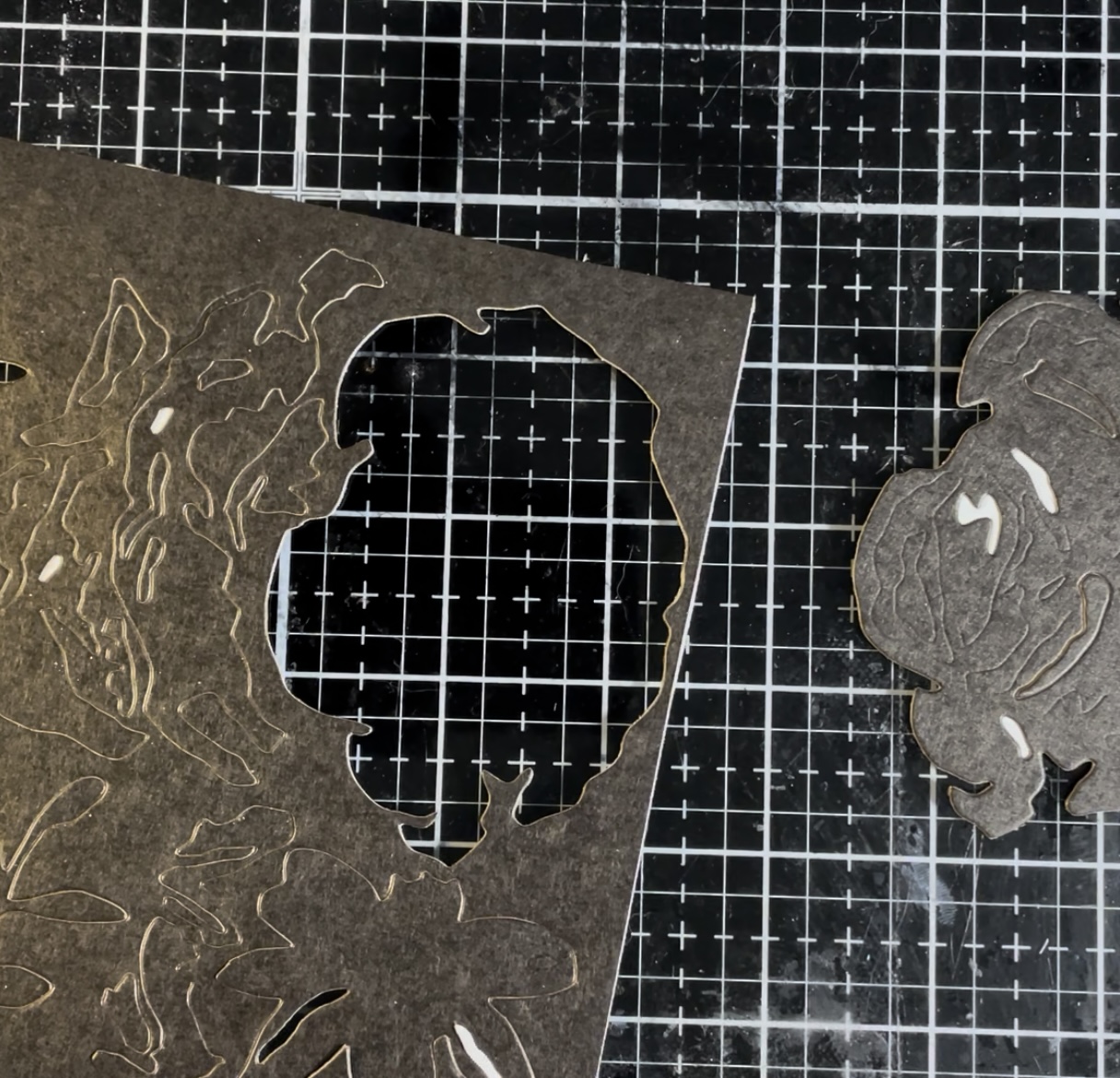
With the base substrate altered I then decided to add some textural interest to the box with die cuts from Brushstroke Flowers #4.


For die cutting, I decided to use a substrate of the Black Idea-ology Kraft Stock paper. Before die cutting, I added double sided tape to the paper to make assembly easier.


Below is one of the assembled flowers done in layers of Black Kraft Stock.


To get all the flowers to fit on the Vignette Index File, I cut down the flowers with the Tonic Tim Holtz Mini Trimmer.


Here I have started the assembly process of adding die cuts to the Vignette Index File. With the double sided tape on the flowers and leaves, it was easy to stick the die cuts onto the box like stickers. Even better: it was easy to move them and reposition if the die cuts didn't quite line up.


With all the die cuts on the box, I then took some Statue Distress Foundry Wax and added it to the raised portions of the die cuts. I placed some of the Foundry Wax onto the kraft mat portion of the Glass Media Mat. I let it sit until the Foundry Wax started to stiffen slightly to the texture of peanut butter. Then with a finger, I gently brushed it onto the raised die cuts.


Now the magic happens. Here I used an embossing gun to heat the Foundry Wax. To the far right the wax has melted and I am working my way over to the left. The vibrancy of the Foundry Wax is gorgeous, and so bright that my camera had a hard time picking up the color.


Here are the finished results of the melted Foundry Wax.


Below is the completed Vignette Index File. After making all of the alterations, I reattached the draw pull with a star screwdriver.


Products Used:


Part 2 - Making Swatches and Technique Cards
(For video click Here.)


For this portion of the file box project I will be making some swatch cards and some Distress Embossing Glaze technique cards. To start, I am going to use the small folded Idea-ology File Cards.


To alter the first two cards, I covered the outsides with washi tape. I used the blue Idea-ology Design Tape, Marbled and some thinner tape from an older Idea-ology tape set.


Once the outsides were covered, I then added some sticker labels I printed out.


Below is the second file card I altered. This time I used some of the red and green marbled Design Tape and a small ruler themed tape.


To alter the other two folded cards, I decided to collage the outsides of them. I used a matching set of Pocket Cards to cover the outsides. These I glued down with some Collage Medium.


With the Pocket Cards glued in place, I then trimmed the edges with the Tim Holtz Tonic Mini Snips.


After I collaged with Idea-ology Ephemera Pack, Memoir; Ticket Book, and botanical. Last I added a custom label sticker.


Here is the second altered and collaged file card.


Now let’s fill these swatch booklets. I am going to start with the Distress Embossing Glazes. Here I have made a little space for each color and handwritten in each color name.


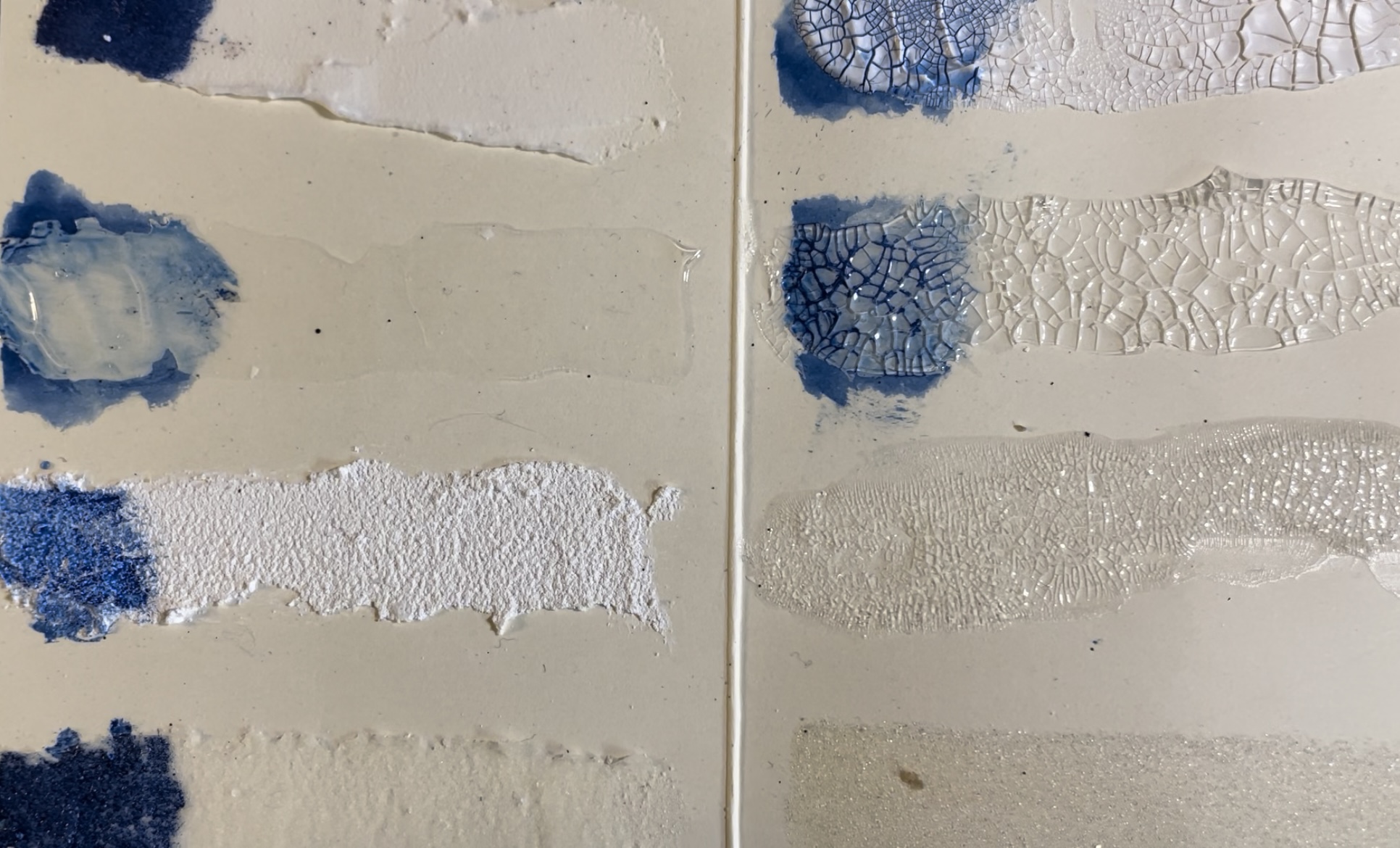
Next let’s swatch some Ranger Tim Holtz Mediums. Here I will be swatching: Opaque Distress Texture Paste, Translucent Distress Texture Paste, Opaque Distress Crackle Paste, Translucent Distress Crackle Paste, Opaque Distress Grit Paste, Translucent Distress Grit Paste, Distress Effects Rock Candy, and Frosted Crystal Distress Embossing Medium.


Here are the fully dried mediums. I added some Distress Ink on places to better show the wonderful crackle and textures of the mediums.


Now let’s try out some glaze techniques with some mediums. First I cut down some backgrounds to fit the index cards.


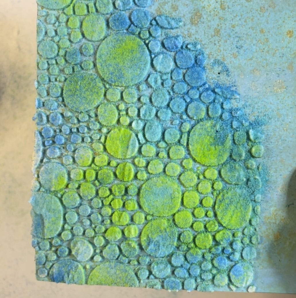
For the first card I used the Bubbles Layering Stencil and applied Opaque Distress Texture Paste through it. Then I sprinkled Distress Embossing Glazes Salty Ocean, Twisted Citron, and Salvaged Patina over the Texture Paste.


After letting the Texture Paste dry for about 30 minutes, I then used an embossing gun to melt the Glaze. Below are the finished results.


For the next card, I used the Scribbles Layering Stencil and spread Opaque Crackle Paste through it. For Distress Embossing Glazes, I added Candied Apple, Villainous Potion, and Picked Raspberry over the top.


After waiting 30 minutes, the Crackle Paste started cracking under the Distress Embossing Glaze. Then I heat embossed the glaze to get a finish like cracked ceramics.


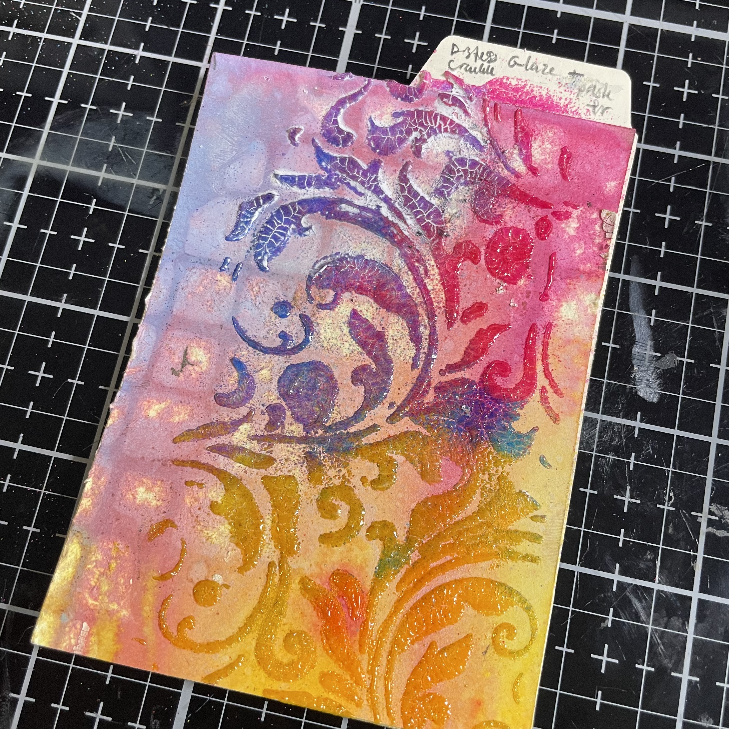
On the last card, I used the Flourish Layering Stencil and added Distress Embossing Glazes Wilted Violet, Picked Raspberry, Salty Ocean, Fossilized Amber, and Wild Honey.


For the last card with Translucent Crackle Paste the crackle was slightly cracked after 30 minutes. After heat embossing, the crackle was much more noticeable. The Translucent is generally more subtle than the Opaque Crackle. To get it to show up, I used some Picket Fence Distress Crayon to highlight the crackles.


Here are the three finished technique cards.


Products Used in Part 2:


Part 3: Making Technique cards using Distress Ink and Paper Dolls
(For video click here.)


For our first technique card we will be looking at a classic Tim Holtz Distress Ink technique: ink blending and water droplets. Here I will be using Picked Raspberry, Mustard seed, and Mermaid Lagoon Distress inks.


We simply make a blend of the three colors on the index card using some dome foam applicators. The card is being held in place by the new Tim Holtz Media Grip Mat.


Then slowly spritz a few water drops over the top. Once the water is on the card, absorb the droplets with a paper towel.


Next, using the same three colors, we will look at another classic technique: the smoosh, dip, and dry technique. I squished three inks on the kraft mat then spritzed with water. Then I smooshed the index card into the ink to get an impression. After I dripped water on the card to get the ink moving and then dried it with the Ranger heat tool.


Afterwards, I repeated the process to build up inky layers. For more in-depth check out the tutorial video.


Now we are going to create a Distress Oxide contrast over the top a base of Distress Ink and dip splatters. Follow the steps for the previous card and build up inky layers.


Next pick a contrasting color of Distress Oxide Ink. Here I chose Iced Spruce.


Smoosh the Distress Oxide Ink onto the craft mat and spritz with water. Then dip and dry until satisfied with color.


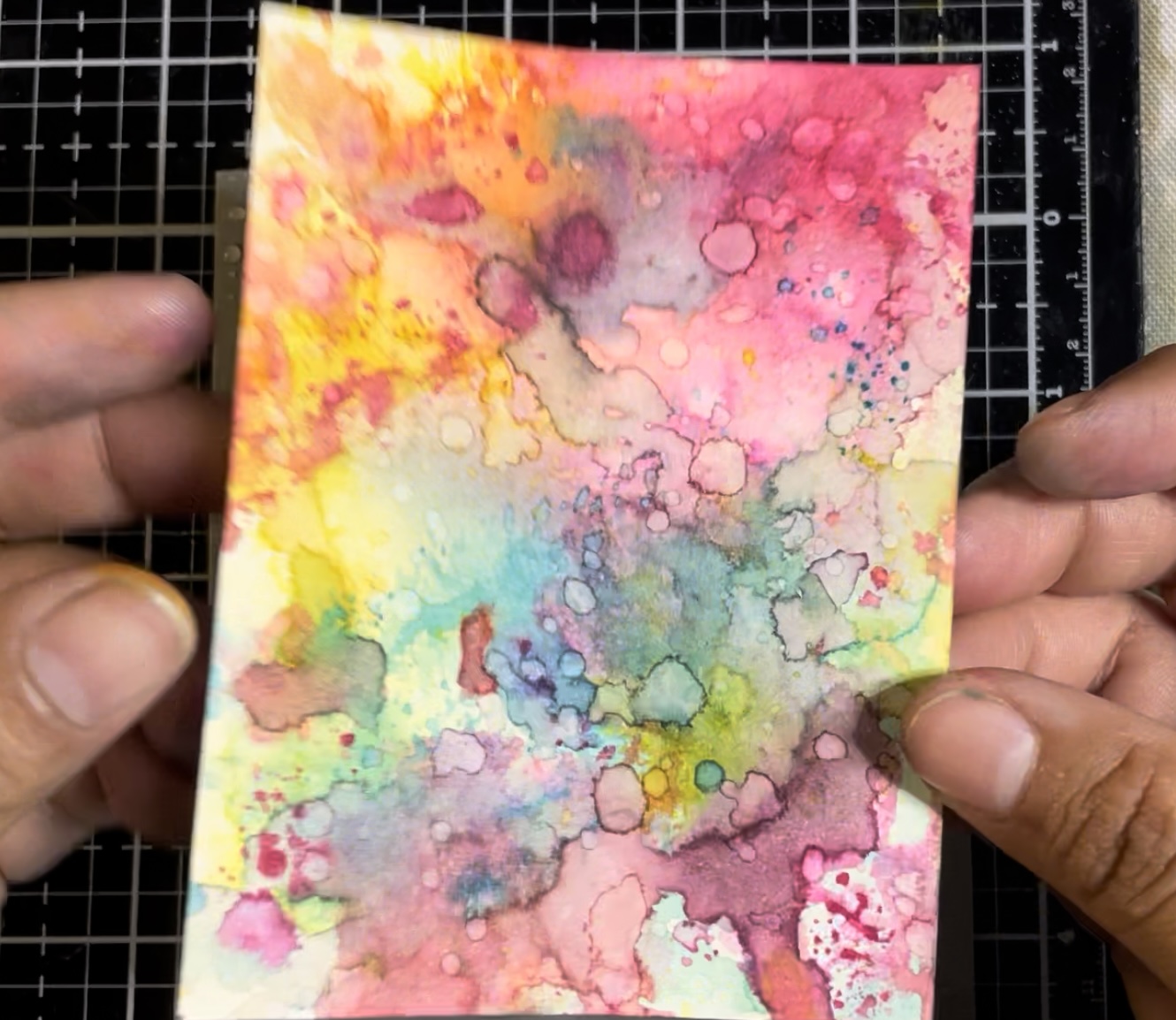
Here we are water coloring with Distress Reinkers. First, I stamped some floral outlines with Distress Ink on the index card. Then I heat embossed some Clear Ranger fine embossing powder to create a resist.


Here I took Reinkers and a Ranger Fine Tipped Water Brush add painted on the inside of the embossed stamped lines. For colors, I used Mowed Lawn and Twisted Citron on the leaves. For the flowers, I used Picked Raspberry, Mustard Seed, Crackling Campfire, and Carved Pumpkin.


Below are the finished results of the water coloring.


Next I made a quick techique card for lineless water color stamping. Pick a stamp and ink it up. Here I chose to ink with Mini Distress Inks; it would also work to color directly on the stamp with Distress Markers. Then I spritzed the stamp with water.


Here are the finished results of stamping the inked and spritzed stamp.


Now let us turn our attention to altering some Paper Dolls. For our first alteration, I used Distress Embossing Glaze in the color of Salty Ocean. First I added some Embossing Ink to the paper doll using the Distress Embossing Pen before adding the glaze. Last I heated the glaze powder with an embossing gun.


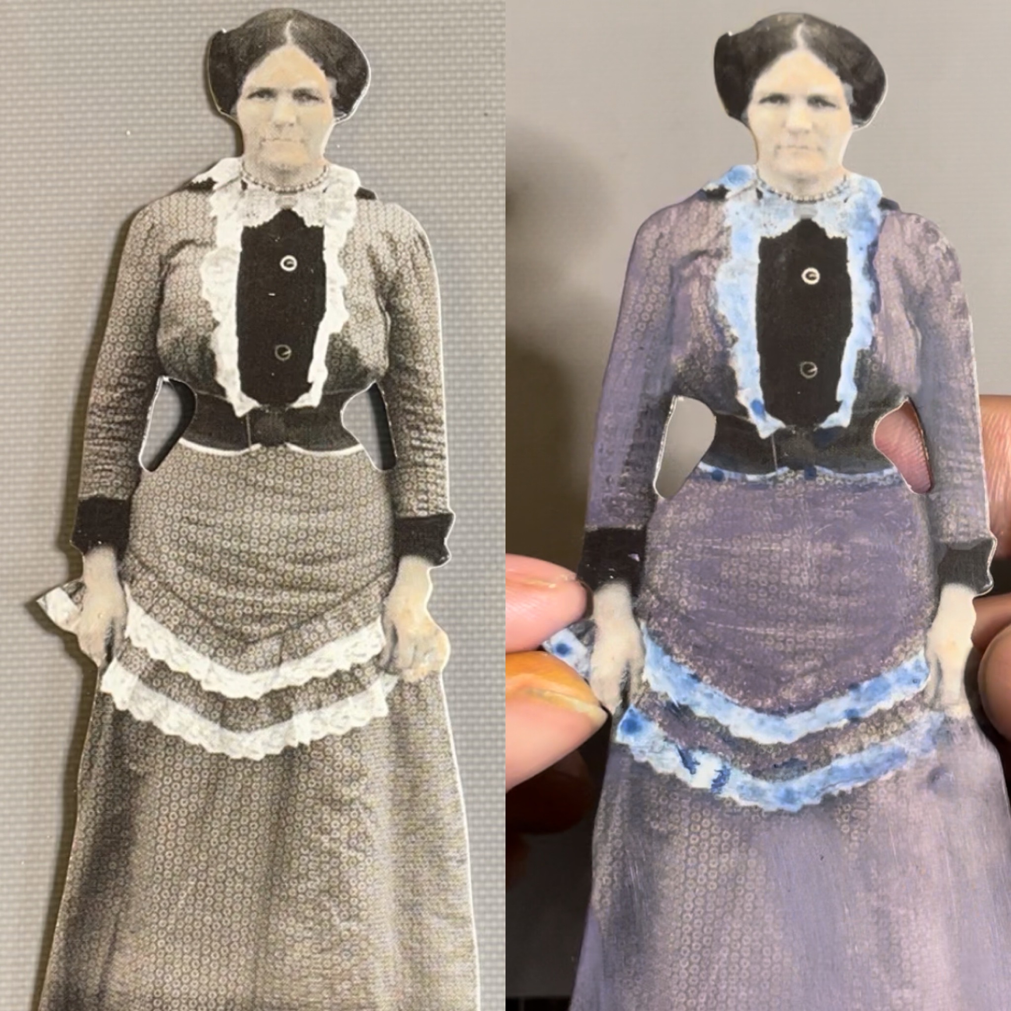
For this paper doll I used Distress Crayons to add some color. I used the colors Dusty Concord, Prize Ribbon, and Tattered Rose. To add the color I scribbled some Distress Crayon onto the Media Mat and then used a water brush to pick up the color and gently apply it to the paper doll.


For our next to last alteration, I decided to use a material that has been in my stash for a while: Distress Markers. Here I colored this paper doll using Distress Markers: Stormy Skies, Faded Jeans, Tattered Rose, Frayed Burlap, and Gathered Twigs.


Here on the last alteration I used Frosted Crystal Embossing Powder. First I used the Embossing Pen to add ink and then sprinkled on Frosted Crystal Embossing Powder before heating with an embossing gun. Then I used Distress Reinkers to color the paper doll using a water brush. For colors I used Rustic Wilderness, Tattered Rose, and Fossilized Amber.


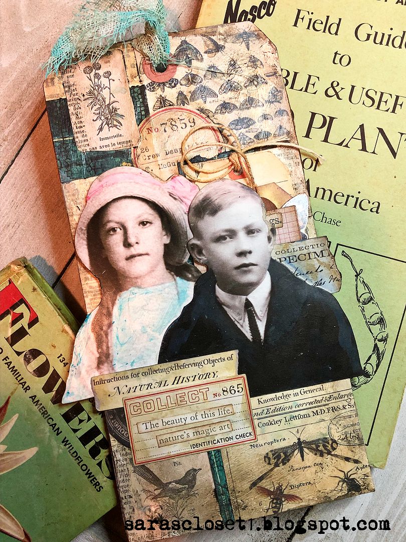
Below are all four altered paper dolls set on collaged tags.


For Index box tour click hereand go to time stamp 0:47:34 .


Products Used in Part 3:


Thank you so much for joining me here today at the Funkie Junkie Boutique Challenge Blog. Until next time, happy crafting!
Janna~ 💕🎨💕

I can also be found on:
Instagram: @treasuresofthesea_jannak