Wednesday, March 30, 2022

Guest Designer - Katy Drogos

The Funkie Junkie Boutique is delighted to have Katy Drogos (I Like to Cut and Paste) return as our Guest Designer this week as the winner of the For the Love of Mixed Media challenge. We know you're going to be as impressed as we are with her inspiration piece for the current Industrial Grunge challenge.


Hi! I'm Katy. I love all the stuff - cardmaking, mixed media, and everything in between. I started off making scrapbook pages. Then I learned about the world of Distress from Tim Holtz. Forever my world was changed! My blog is I Like to Cut and Paste, and I am on Instagram and Facebook.

The story is this fella won first place at the World Fair for his futuristic invention. I am so honored to be the Guest Designer for this challenge: Industrial Grunge. I used a Tim Holtz vignette box and mostly Tim's alcohol inks, foil cardstock, grit paste, paperdoll, sizzix die (gearhead) and 2 embossing folders (mini foundry and circuit), and baubles. I also used clay gears using Finnabair Moulds (mechanica, large gears) and gold paint.

Make sure you check out Katy's blog (I Like to Cut and Paste) to see more about how she created this wonderful mixed media piece. Don't forget to share your 'Industrial Grunge' project with us. The challenge can be found HERE and runs through 11:55 pm EST on Tuesday, April 5th.

Monday, March 28, 2022

Challenge Winners - Rather Blustery Day

Lots of our customers took on Suzz's challenge to use a product, color, or technique that challenges them to create entries for our "Rather Blustery Day" challenge. We thought their results were all wonderful, but the Design Team chose Krafty Jean's album using the Stamperia "Vagabond" papers as our overall winner. We can all agree that it can be more demanding to work in a larger format.


We hope to see Krafty Jean as a Guest Designer at a future date here on The Funkie Junkie Boutique Blog. You'll be contacted shortly with all of the details. And now our picks of three additional outstanding entries for the The Funkie Junkie Boutique Blog Top 3 Badges. In numerical order they are #4 Sarascloset, #6 Jo - Let's Art Journal, and #11 Vicki. You'll be contacted shortly with the Top 3 badges so that you can display them proudly on your blog.

And finally for the lucky randomly drawn winner for the $25 gift certificate to The Funkie Junkie Boutique; our congratulations go to #10 Bonnie in Kersey. Please email Linda at thefunkiejunkie@gmail.com for the gift certificate details.

Thank you again to everyone who took part in this challenge and congratulations to all our winners. The current challenge - 'Rather Blustery Day' - can be found HERE and runs through Tuesday, April 5th at 11:55 pm EST, so there's still plenty of time to link your projects. Please be sure to read the rules carefully before you submit your entry.

Saturday, March 26, 2022

Saturday Showcase - Peach Tea and Saltwater Taffy

Happy Spring to everyone! I'm the newest on the Design Team, but many of you know me as just Lyla from A Chief's Wife's Heart's A' Fire blog. I'm excited to bring today's Saturday Showcase to you; the first of this kind of thing for me, ever! I've had my eye on the Prima Marketing papers for some time now, and while I am a total Tim Holtz buff, I'm in love with the colors of their "Peach Tea" collection. Wouldn't you know it; Tim debuts his newest Distress color, Saltwater Taffy, and it matches the Peach Tea Papers, Flowers, and SIIC (Say It In Crystals)! So I decided to combine all four and mix it all up with one of Tim's newer Thinlits from the Sizzix Chapter 1 release. Read on and find out what I did with these...


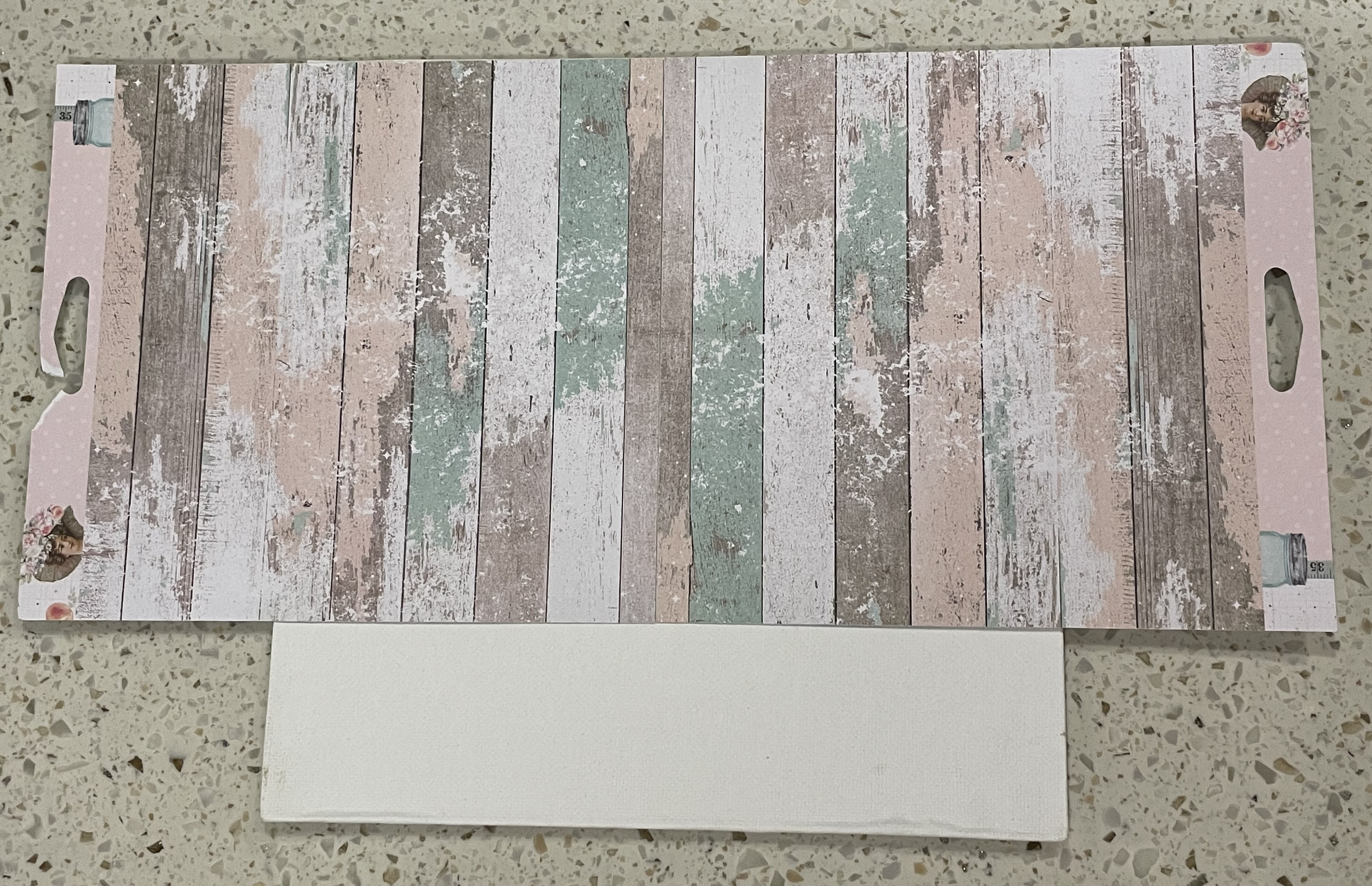
This is what I began with. I'd ordered the three Prima Marketing Peach Tea items, along with Tim Holtz's Bunny Games Die Set and that YUMMY Saltwater Taffy, knowing it was going to go on this simple canvas board (you can get them at Dollar Tree). I picked up that baggie of trimmings from our recent building, and when I saw Tim's 3-D Textured Impressions Folder peeking at me from my Craft bag... I hit on exactly what I wanted to do!


Don't let the lighting fool ya: these Peach Tea Papers from Prima Marketing are soooooo delish looking: rich, yet pastels. I was pleasantly surprised to find that many of my Distress Inks/Oxides matched perfectly! There is a spot-on match with Distress Oxides: the brand new Saltwater Taffy, Salvaged Patina, Kitcsh Flamingo, Antique Linen, and Vintage Photo. I thought regular Salty Ocean looked good for some blue pop, but ended up changing it out for the more pastel Speckled Egg Distress Oxide. I also thought Squeezed Lemonade looked good on this paper pad, as well. I ended up using only 3 out of all of these.


Prima Marketing's double-sided designer paper pads are very sturdy paper! That's what really pleased me the most, it's the value as well as the color and usability. Here, you can see the canvas panel being covered with my FAVE sheet choice of the pad. This worn look is going to be a spectacular backdrop for those little bunnies!


Here, you can see I decided to take the boards of the paper in another direction at the bottom. Go ahead - pinch the photo and see how those upper 2 sheets matched up spot on! THAT's paper I can deal with! I used only 2 of the 6x6 sheets to cover this 8x8 panel with enough scraps (a couple shown above) leftover to use at the end. So Prima matches up their ends here and that is more value for me. A little line of not matching was ME. I started to freehand cut and changed to the knife. Don't worry - it won't be seen anyway. I did edge the bottom two with Antique Linen Distress Oxide.


Grab some stash cardstock (I keep a ton of black, browns, and whites to use in between layers or for stiffening help, etc) in brownish-tanish... can I make a basket freehand cutting? Let's see...


This is where Tim's "Intertwine" 3-D Embossing Folder came in... I DRY embossed it. I was looking for it to be like a RATTY type of basket. I wanted the texture, and I wasn't going to get ratty if I spritzed water. Another thing I didn't want; no coloring. Just this plain color and sanding was planned.


Again, don't worry about the line. I'll have filling for this basket a 'plenty!


I ended up needing a backside for this. The dry embossing went great and I had little holes in there (you can see up on the basket middle), but to keep glue from coming through, I was going to need to tape this all up and use my Glossy Accents at the end.


If I'm going to make a basket...it's going to LOOK like a real basket. So here's some top edging. Just roll that piece and then roll it again, with tape to hold it.


Here's the backside - it's all holding together and ready for the panel.


I made a larger pattern first (right side) and then cut it more exactly from another sheet of the stash. Embossing needed it to be in 2 pieces to get it through my Big Shot, so I have a space. ;)


Here's that plastic "wood" shaving. It was soooo soft and stayed together. I was grabbing it off the ground before the guys could ruin it by cutting more junk into it!


And now...heeeeeeere's the HARES! The Peach Tea papers and the Saltwater Taffy are just SOOO PERFECT TOGETHER, but add the Tim Holtz Bunny Games....I'm talking CUTE, here!


These bunnies are TINY, but that's exactly what makes them so stinkin' CUTE! And - biggest surprise for this Crafter (as some of you know, I've had severe RA for half my life) - was to find this set to be not so many pieces! The set itself is sorted together so that you don't even need the instructions to get the colors right. I did look for a video but didn't find one, so I simply cut all the bunny parts all on one sheet. I noticed right away that there were fewer pieces than in most of the Colorized sets, and the eggs in the set were SUPER SIMPLE! Just 2 dies each for a large egg and a small egg.


The only thing I can say that this Tim Holtz Bunny Games Die Set won't do well when reversed. I know some of the Colorize sets can be reversed, but when I tried to do so with this... You can see above here - the bunny just 'lost' his... roundness/puffiness. NOT cute. Yet, my plan was still going to work just fine.


Cracking eggs was never EASIER! Simply make the egg with the 2 cuts (glue together), and make another full cut, but don't glue it. Hold the 2 pieces together as you cut zig-zagged all the way through. Put the unglued (inside will be white, so the extra cut is white) zigszagged pieces slightly jutted out of the glued set zigszagged pieces. You now have an open egg. You can even just glue all around the outer edges, so you make a pocket in each half. (I have an idea going for using that.)


Now - those Prima Marketing Peach Tea SIIC (Say It In Crystals). This is my first time using these, and I am LOVING how ROUNDED they are! Fully rounded out but look faceted and sweetly matching all the same colors as the papers!


I even did a pink/blue/pink/blue painstakingly perfectionist I am. LOL


The color is closer here - a bit washed out to me. But for thinking "Spring"... I couldn't have chosen a better color scheme for this project! (THANK YOU, LINDA!!)


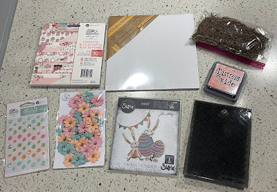
Here's everything I used - some of my stuff is VERY old now. I've linked the important stuff at the bottom. PLEASE CHECK OUT THIS PAPER THEME!! The Distress Inks I've used will show you the colors much better than I can on a blogpost.

ARE YOU READY?
Here's the resulting project:


Be Curious! I certainly am: our fourth Grandchild is due August 27th and I am so excited! Boy, or Girl won't matter to this Memaw...just a healthy HAPPY Baby is all I ask.


Tim's Bunnies have black for eyes and 1 eye is a tiny bit smaller than the other (on both bunnies). But not this Memaw's Grandbabies - so far, all 3 have huge BlueBlue eyes. Princess (the only girl so far) has purple flecks in hers. So these bunnies got 2 larger dotted eyes in blue (from stash trash).


That leftover paper became another "board" that got some Tim Holtz Idea-ology Mini Fasteners and a Quote Chip Theories (edged with Distress Crayon Picket Fence). See the baby bunny - no particular color on this one... just plain Peach Tea paper with shadowing in Tim Holtz Distress Oxide Antique Linen for a bit of depth. Bunny paws are trying to break the shell, but the ears are already popping out!


There couldn't have been a better (in all ways a paper can be better!) paper collection to use for this particular project. And the Spring feeling it gives makes me think of all the baby blue/pink that will be distracting me all through the summer. I don't think they want to know what it will be, but no matter: this Memaw LOVES her new Wittle GrandBunny!

I had fun doing this project, and it helped that all of it seemed to just match itself! I hope you'll be inspired to try a few of the Prima Marketing Papers - especially the Peach Tea collection! Have a super Saturday!

Supplies used:

Wednesday, March 23, 2022

Industrial Grunge

Teri asks us to get those gears and other metal pieces out to create a project with an industrial feel to it for our new challenge. It's a great opportunity to create a guy card or project. Here's some inspiration from our Design Team to get you "in gear" for some grungy goodness.

Teri Wilson - TerisMailbox

Janna Ketchum - treasuresofthesea_jannak

Laura Gilhuly - AngelScraps

Suzanne Czosek - Suzz Stamping Spot

Lisa Hoel - Creative Juice


The overall winner will be offered the chance to be a Guest Designer at a future date here at The Funkie Junkie Boutique Blog, and everyone who enters and follows the rules will go into the drawing for the chance to win a $25.00 spending spree at The Funkie Junkie Boutique. There are also Top 3 Badges for three additional outstanding entries, chosen by the Design Team.

The guidelines for entering are simple: create a new vintage or shabby chic project following the challenge theme, link it to your post (not just your blog) and also include a link to this challenge in your post. You can combine our challenge with up to 10 challenges (including this one) to be in with a chance for winning. If you are entering through a public forum (such as Instagram) you'll need to include the words 'Funkie Junkie Boutique Challenge'. Also, please turn off your Word Verification so our Design Team can leave comments on your blogs. Make sure you follow these rules as unfortunately, we have had to eliminate entrants from the prize drawing in the past.

Whatever you create, enjoy the making! We look forward to seeing your projects! This challenge is open through 11:55pm Eastern Time on Tuesday, April 5th, 2022.

Wednesday, March 16, 2022

Guest Designer - Katy Drogos

The Funkie Junkie Boutique is delighted to have Katy Drogos (I Like to Cut and Paste) as our Guest Designer this week. Katy impressed the Design Team with her beautiful heart door hanging for the Funky Frilly Valentines challenge last month.


Hi! I'm Katy. I love all the stuff - cardmaking, mixed media, and everything in between. I started off making scrapbook pages. Then I learned about the world of Distress from Tim Holtz. Forever my world was changed! My blog is I Like to Cut and Paste, and I am on Instagram and Facebook.

For this challenge of using products that I struggle with, I chose the Tim Holtz Village Collection. I had made a couple of houses but I didn't like how they turned out. The windows weren't right or the roof-so I put it away and haven't tried since. I thought this is the perfect time to get this set out. I made a church using the village collection, the small cobblestone and wood grain embossing folders, tiny lights, alcohol inks and distress inks. The difference this time is I took my time and I watched the videos and carefully put things together. Thank you TFJB for letting me be a guest designer today! :).

Make sure you check out Katy's blog (I Like to Cut and Paste) to see more about how she created this wonderful mixed media piece. Don't forget to share your 'Rather Blustery Day' project with us. The challenge can be found HERE and runs through 11:55 pm EST on Tuesday, March 22nd.

Monday, March 14, 2022

Challenge Winners - For the Love of Mixed Media

The "For the Love of Mixed Media" challenge resulted in an amazing variety of projects, and our Design Team looked carefully at each entry before coming to a decision. In the final tally, the overall winner is Katy Drogos. Her love of mixed media was beautifully expressed in her grungy canvas magnet. You'll want to follow the link to her blog to get closeups of the amazing details.


Congratulations to Katy for once again winning an opportunity to be a Guest Designer at a future date here on The Funkie Junkie Boutique Blog. You'll be contacted shortly with all of the details. And now our picks of three additional outstanding entries for the The Funkie Junkie Boutique Blog Top 3 Badges. In numerical order they are #3 Senna, #17 Judy McKay, and #18 sarascloset. You'll be contacted shortly with the Top 3 badges so that you can display them proudly on your blog.

And finally for the lucky randomly drawn winner for the $25 gift certificate to The Funkie Junkie Boutique; our congratulations go to #4 Jo - Let's Art Journal. Please email Linda at thefunkiejunkie@gmail.com for the gift certificate details.

Thank you again to everyone who took part in this challenge and congratulations to all our winners. The current challenge - 'Rather Blustery Day' - can be found HERE and runs through Tuesday, March 22nd at 11:55 pm EST, so there's still plenty of time to link your projects. Please be sure to read the rules carefully before you submit your entry.

Saturday, March 12, 2022

Saturday Showcase: Alcohol Ink Play

Hello, Lisa Hoel here with a new Saturday Showcase for you. For our current challenge, "Rather Blustery Day", you are supposed to focus on a technique, supplies, etc. that you find challenging. I chose to focus on Alcohol Inks for my challenge and I'm continuing that theme here today! I used the alcohol ink backgrounds I created to decorate two phone stands made with Eileen Hull's new Phone Stand Die.

Lisa Hoel for The Funkie Junkie Blog challenge – alcohol ink Phone Stands made using Eileen Hull's Phone Stand Die #creativejuicefreshsqueezed #tim_holtz #sizzix #mymakingstory #thefunkiejunkie #thefunkiejunkieboutique #frillyandfunkie
These stands are so quick to make and are great for gifts!

Lisa Hoel for The Funkie Junkie Blog challenge – alcohol ink Phone Stands made using Eileen Hull's Phone Stand Die #creativejuicefreshsqueezed #tim_holtz #sizzix #mymakingstory #thefunkiejunkie #thefunkiejunkieboutique #frillyandfunkie

Lisa Hoel for The Funkie Junkie Blog challenge – alcohol ink Phone Stands made using Eileen Hull's Phone Stand Die #creativejuicefreshsqueezed #tim_holtz #sizzix #mymakingstory #thefunkiejunkie #thefunkiejunkieboutique #frillyandfunkie

I'm really glad I dove in and just played around with the alcohol inks. I started off by watching again some of Tim Holtz's educational videos (soooo informative!). You can find two here and here. I used Yupo cardstock for my substrate. Yupo is a non-porous synthetic paper that is perfect for alcohol ink. I have a list of other supplies used at the bottom of this post but you can browse products here in the Funkie Junkie Boutique.

Here are some photos of the results of my background experiments:


Here's one technique that Tim shared that I really liked. He showed us how to make prints with stencils.


Mist a stencil with isopropyl alcohol and "stick" it down onto the Yupo. Drip various colors of ink onto the stencil/paper. It will wick under the stencil but that is what you want it to do. Let it sit there until all the ink dries underneath the stencil.

Peel off the stencil and you get your first generation print!


You can create several successive prints with the ink left on the front of the stencil. Mist it with more isopropyl alcohol and lay it on a new sheet of Yupo. Let it dry and peel it off. Repeat.


Another fun product to use is Alcohol Lift-Ink.


I cut a piece of one of my backgrounds very slightly larger than the face of the phone stand. Also a smaller piece to cover the front of ledge on the bottom.

A stamping platform is very helpful for this technique because it often needs several applications of Lift-Ink to remove enough alcohol ink. Start with a CLEAN stamp! Residual ink on your stamp will stain your ink pad.

Amount of ink removed after one stamping.

Position and ink your stamp, then stamp it onto your background. The lift-ink reacts with the alcohol ink. Dab (don't wipe, smear warning) the stamped areas with a clean paper towel. When most of the inks have been picked up by the towel, you can buff the rest off.

Results after repeating process 3x.

If you want a stronger contrast repeat the above steps to keep removing alcohol ink. Don't forget to clean your stamp each time.

You can also stamp over alcohol ink using Archival Ink. Be careful stamping on the Yupo because it is slick and can easily smudge as you apply pressure.


Next I cut out the "HELLO THERE" words out of the background using the Bold Text #1 Die Set . Thinlits dies cut through Yupo just fine. I glued it to the stand and trimmed off any overhanging paper.


Phone Stand assembly time!
It only takes one pass through your die cutting machine to cut all the pieces you will need. Cut it out of mat board or heavier chipboard so it will be sturdy.


Fold all the parts at their score lines. I find it easier to insert the tabs of the ledge piece through the slots before I glue the back brace into place.


Put some dabs of glue under the tabs.


Glue back brace in place.


You can change the pitch of your stand depending on where you adhere the brace.


Glue the front piece of the ledge in place.

Details about the second phone stand:
I used Eileen Hull's new Snail Mail Die Set to cut "stamps" to make the collage on the front. First I picked out complementary alcohol ink backgrounds from my pile and cut them up into sheets with the Snail Mail Die. With regular paper you can tear them apart like stamps but since the substrate was Yupo I cut them with scissors.


I mixed and matched my stamps into a collage covering the front of the phone stand. I also put some extra stamping on the back because, why not? ;-)


Lastly, I stamped with various of colors of Archival Ink over the whole collage. I assembled the stand as shown above.

Whew, that was a lot! I hope you are inspired to go play and try some new techniques. Supplies are listed below. Have a great weekend!


Supplies used:

Tim Holtz Die Set - Bold Text #1
Eileen Hull Scoreboards Die - Phone Stand
Eileen Hull Thinlits Die Set - Snail Mail
Tim Holtz layering stencils - Patchwork Hex, Dotted Line, Circuit
Tim Holtz stamp sets - Halftone & Rings, Glitch 1, Glitch 2, Mini Glitch, Inquisitive, Evolution, Field Notes, Specimen, Spring Sprung
Ranger Archival Ink -  Black Soot, Vintage Photo
Alcohol Ink Blower tool
Stamping Platform
91% Isopropyl rubbing alcohol (from drug store/grocery store)
Sizzix Making Essential - Mat Board