
It's time for another new theme for the next 2 weeks; "Distressed About Paints"! Lyla leading off here once again, and if you'll remember: July is my favorite month and that usually shows up in all my creative makes during this time of year. When Linda, owner of The Funkie Junkie Boutique put out a challenge to the Design Team for using Distress Paints, I was disappointed at first because painting is not one of my best forms of art and the thought crossed my mind that this was going to be a total flop from me. But as I went through my drawer of Tim Holtz items, I realized that I use Distress Paints quite a lot more than I thought. I took that revelation further with the idea that this project didn't need to be solely Distress Paints, but the use of any DP mixed in with any type of paste medium, certainly brings any plain product up to a new level. Let's roll on and see where this project ended up!


We'll start with that helpful list of links so you can create your own make:


First up: using my TH Media Trimmer to cut some matboard into a Tag-shape. I cut 2 of these; once for a front and one for a back, as is my usual.

Since I wanted to use 2 pieces from the TH Facades, I took the larger piece for measuring the size of tag I wanted. The Facade pieces would both stand out- giving me 3 'levels'.

I was super lucky to find some very old TH Adheasive Deco Sheets deep in my stash, when I was cleaning out my plastic drawers a few weeks ago! I set them aside just for this project because the adhesive-backed cloth reminded me of tough canvas I use to hold my beach stuff. I used some small-diameter rope and scrap TH Kraftstock paperie- sanded- for some added charm. This would be the FRONT side of my tag.

Oh my! The TH Backdrops Vol.4 paperie is going fast from my stash: I LOVE it so much! It created some wording for the BACK of the Tag without adding more to the 'levels' I already had planned. This was perfected with some Oxide Inking and water spray play- till I was happy.

Then I went to work on the main upper decks, so to speak. I used some TH Ranger Opaque Grit Paste for the 'sand' and some TH Opaque Texture Paste for the middle water and some 'clouds' up above those. You'll notice I put both TH Facade pieces situated together and being textured together. They will not be on the same level when I put the Tag altogether. (In the materials pics way up above, I show Seasonal Crypt and Grave grit pastes. I ended up not using those simply because the Emerald Coast sand is not that dark. "my" beaches are literally the whitest sand you will see in the entire USA!)

Here comes the main theme: DISTRESS PAINTS! While I am definitely not a painter... by far, folks.... I did remember some of Bob Ross's strokes from his show and got waaay outta my box with this! I brushed a coat of DP Salty Ocean all over the "ocean" and "sky" areas, giving some swoosh marks onto the ocean and some straight line streaks in the sky. Simple enough. Then after heat drying that, I took my craft toothbrush and lightly brush stroked back and forth over the water, but heavier all over the sky. Then used the same toothbursh to 'dot paint' all over the sand. The Opaque Texture Paste is not the same white shade as the Picket Fence Distress Paint, so it gave it a speckle appearance.

After rinsing out the toothbrush, I used it to make swooshes and streaks in the ocean with some Prize Ribbon Distress Paint and added darker aspects to the ocean, heat dried, then topped some 'white caps' on the swooshes for some bubbles on the wave tops. I hope you'll be able to see it !

Ah, but I needed some more depth to the sand and shiney to the water: TH Lost Shadow Distress Oxide all around the bottom edge of the sand, and Glossy Accents all over on top of the water filled those needs nicely.

Cutting out some layers for the palm tree:
4 layers of Neutral Kraftstock brown for the trunk and one brown branch,
2 layers each of Cool Kraftstock's greens for the palm toppers.
I did front and back of these so the middle stock color meets; edging all the layers with Forest Moss Distress Ink and Distress Oxides in Ground Espresso and Vintage Photo. Layered with the trunk in the very middle and then the dull green on both sides (sandwiching the trunk) and then topping both outer layers with the last brighter green gives a realistic look to a palm tree.

Time to put all the Facade pieces together to the Tag base. Tim, you really shouldda come out with extra pieces a loooong time ago! Folks, the time has come and they're available at The Funkie Junkie Boutique!!!

The last part was cutting out lettering for the title to My Happy Place, and we're done!
Please allow me to introduce you to "My Happy Place"!

FRONT

Look at the layers you can do with Facades!


A couple of star fish (happy ones like the ChiefHubby and I) from stash sitting in the sand.

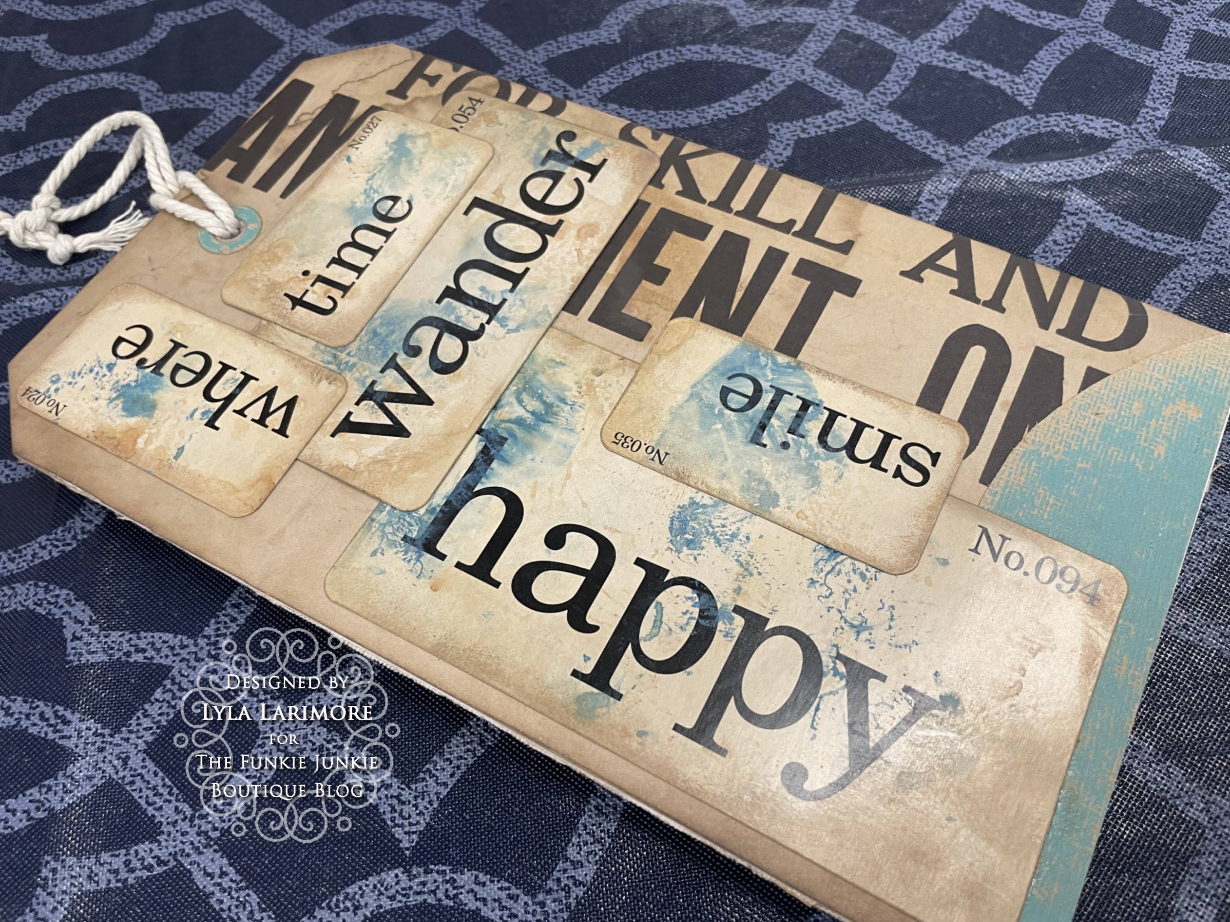
BACK
This was the perfect space for some scrap TH Kraftstock paperie and TH Flashcards!
That brings us once again to another end to this first posting of our newest theme, "Distressed About Paints" and you'll need to pop back in to Inspiration Ave for more great makes on this theme from my fellow Design Teammates!
And speaking of "new"... if you haven't clicked on those helpful product links yet, you'll want to pop in ASAP to The Funkie Junkie Boutique to check out all the brand new TIM HOLTZ HALLOWEEN PRODUCTS! EEK; they're positively delightfully frightful!! Grab 'em while you can! These are the best prices you'll find!
Until next time...
Stay Safe &
HAPPY BLOGGING!!
No comments:
Post a Comment