I created a very tiny accordion book and used both products on each page but first I will show you a couple of panels I made when I was playing.
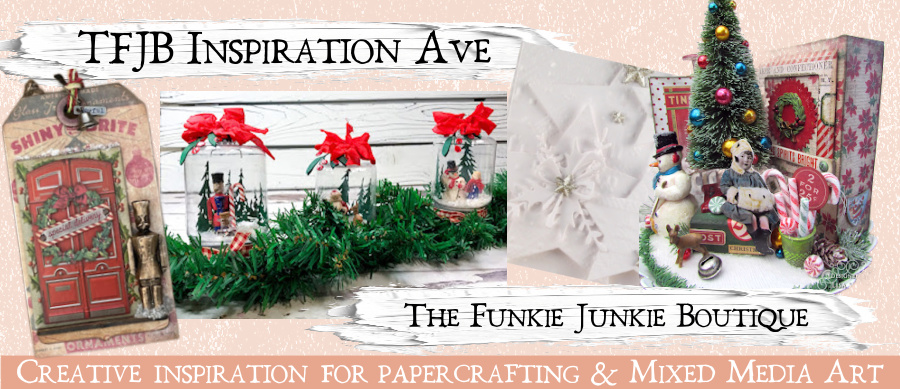
Using Jet Black Archival Ink (Ranger), I stamped the big flower from the Funky Floral Art set (Wendy Vecchi) onto a piece of water colour card stock. Then I painted the flower with three shades of the Izink Pigment - Olive Drab, Roast Chestnut and Burnt Orange. To paint, I dabbed the little brush that comes in each bottle onto my kraft sheet and then dipped a paint brush in a bit of water, tapped some of the water off so the brush was not soaked and then the pigment before I started to paint. It behaves very much like water colours.

For the second panel, I randomly dry brushed some Heather and then Magenta Acrylic Paint (Dina Wakley) on a piece of watercolour card stock and then sponged on some Elephant Acrylic Paint (Dina Wakley). Next I added some stamping with Watering Can Archival Ink (Wendy Vecchi) and some stamps from an old Tim Holtz set #THMM101.

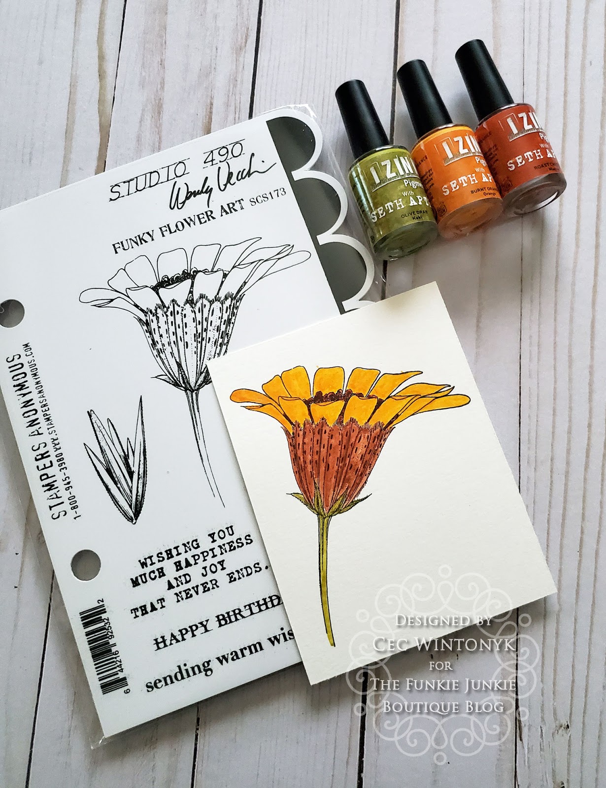
Using a palette knife I scraped some Freezia and Arctic Grape Izink Ice randomly over the panel. When that was dry I used the palette knife with the Arctic Grape Ice through a Bubble stencil (Tim Holtz) to get some bright markings. This will make a great background for some mixed media project in the future.

And now the little book. I started by cutting one piece of water colour card stock 3 1/2" x 10 1/2" and a second piece 3 1/2" x 10". Both pieces were scored every 2 1/2" on the long side and folded accordion style. The leftover 1/2" strip on the longer piece was clipped to angle the ends and then adhered to one side of the shorter piece to make a continual accordion.
Fourteen pages were cut from water colour card stock. Originally I was going to adhere them to a mat before I added them to the page so I cut them 2 1/4" x 3 1/4" but then I changed my mind about the mat so without a mat, I wish I had cut them 2 3/8" x 3 3/8".
I also cut two pieces for the covers that measured 2 5/8" x 3 5/8".

The next step was to dry brush Lemon, Tangerine and Sedona Acrylic Paint (Dina Wakley) on one side of each page and cover. I use the cheap, almost ratty paintbrushes that Seth likes to use (you know the kind that have a wooden handle, bristles that tend to shed and you can buy in a dollar store) because you get rough coverage, which is a look I love.

Once the paint was dry I splattered Olive Drab, Burnt Orange and Roast Chestnut Izink Pigment one at a time on each page, let it sit for a few seconds, spritzed it with water and then moved the pages around to let it run. I dried the pages between each colour. I also found that the longer I let it sit, the more it absorbed into the card stock and left darker spots of colour. The water makes it quite translucent.


The next step was to do a lot of stamping with Jet Black Archival Ink using stamps from Ultimate Grunge, Leaf Prints, Nature's Wonder and the old set marked #THMM101 (Tim Holtz). I found the stamping too harsh so I sponged over it very lightly with a mixture of White Gesso and Squeezed Orange Acrylic Paint (Dylusions).
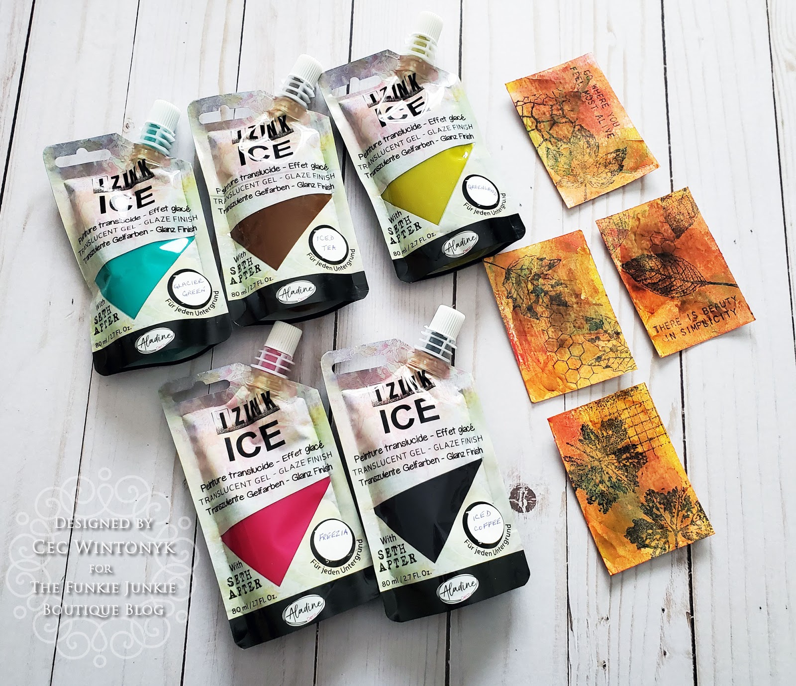
The last step in decorating the pages was to scrape Izink Ice over each page and cover using a variety of colours (Freezia, Glacier Green, Greenland, Iced Tea and Iced Coffee) drying between each colour. It is really difficult to see in the photos but the Ice gives a lovely sheen to the pages and because it is so translucent you can see what is beneath it.

If you add it to an unpainted surface, the colours pop and you can see where I overlapped the colours, you get interesting looks. If you look closely at the piece on the right, the Iced Tea looks brown and even orange where it overlaps the Glacier Green but it looks mostly orange on the edges. Even over all the paint and pigment on the books pages that I laid down first, the addition of the ICE provides some really interesting colour variety.
While I didn't do this you can use tools to make marks in the ICE while it is still wet to provide more texture to your project.


Now that everything was decorated and dry, it was time to make the book. First I inked the edges of the long accordion strip with Vintage Photo Distress Ink (Tim Holtz) as well as the edges of each individual folded section on both sides. I dyed a piece of seam binding with some Rusty Hinge Distress Ink (Tim Holtz) and glued it to the back of one cover. The edges of the covers and pages were inked with Vintage Photo DI. Both covers were added to the end sections of the long strip and then the individual pages were mounted on the remaining sections.

A bronze leaf charm was tied to the end of one of the ties and then the ties were wound around the book and tied to create a closure for the book.
I hope you enjoyed this look at these two wonderful new products and will take a stab at trying them out. By the way, if you are wondering why I chose this colour palette and the leaf stamps, it is because I am not enjoying 2020 and thought I would go back to the fall and maybe it would kick off a different outcome. I know it is wishful thinking but I had to try 😂.
Supplies list with links to The Funkie Junkie Boutique:
Seth Apter Izink Pigments
Seth Apter Izink ICE
Dina Wakley Acrylic Paint
DYLUSIONS PAINTS, SQUEEZED ORANGE DYP46035
Ranger Archival Ink Pad - Jet Black AIP31468
Ranger Tim Holtz Distress Ink Pad - Vintage Photo TIM19527
Ranger Tim Holtz Distress Ink Pad - Rusty Hinge TIM27157
Ryon Seam Binding
Stampers Anonymous Tim Holtz Rubber Stamps - Nature's Wonder
Stampers Anonymous Studio 490 Wendy Vecchi Stamp Set - Funky Flower Art SCS173
Tim Holtz Leaf Prints Stamp Set
Tim Holtz Ultimate Grunge Stamp Set
Tim Holtz Clear Stamp Set #THMM101
Stampers Anonymous Tim Holtz Layering Stencils - Bubble THS002
Scor Tape
Leaf Charms
Bronze Jump Ring Set
Gorgeous creations. Beautiful colors.
ReplyDeleteOooh Cec you've whetted my appetite for having a play with these! xx
ReplyDeleteLove this!! I might need these!
ReplyDeleteGreat post with lots of possibilities for the ICE and pigment Izink products, Cec! I love your fall booklet with each panel, and I'm with you on let's just get on with fall, already.
ReplyDelete