Happy Saturday! Suzz here to share a Saturday Showcase featuring the lovely Sizzix Texture Fades Embossing Folders designed by Tim Holtz.

I started by pulling out all my Texture Fade Embossing Folders to play with.

I then pulled out many different leftover scraps of inky backgrounds, white cardstock, and patterned papers and started embossing!

The Texture Fade Embossing Folders take a patterned paper and add a whole new level of visual and physical texture.

This Idea-ology Backdrop looked like leather and the embossing folder added the quilting and hint of texture with some ink sponged over the texture after the paper was embossed.

I used the soft yellow Backdrop paper with the Typewriter embossing folder in the card above. I took the Distress Ink pad and dragged it lightly over the embossing to create a contrast.
Then I started playing with the embossing on white cardstock to create a different effect.

I sponged this background with Versamark Embossing Ink by dragging the ink pad face down over the raised texture. I sprinkled it with a gold embossing powder, shook off all the excess, and heated it with the heat gun.

Next I sponged with Antique Linen Distress Ink to age it. A little sprinkling of water and brown Distress Spray added a little bit more aging. The finished product became the background to my first card.
I loved how that turned out, and decided to play with some Mini 3D Texture Fades.
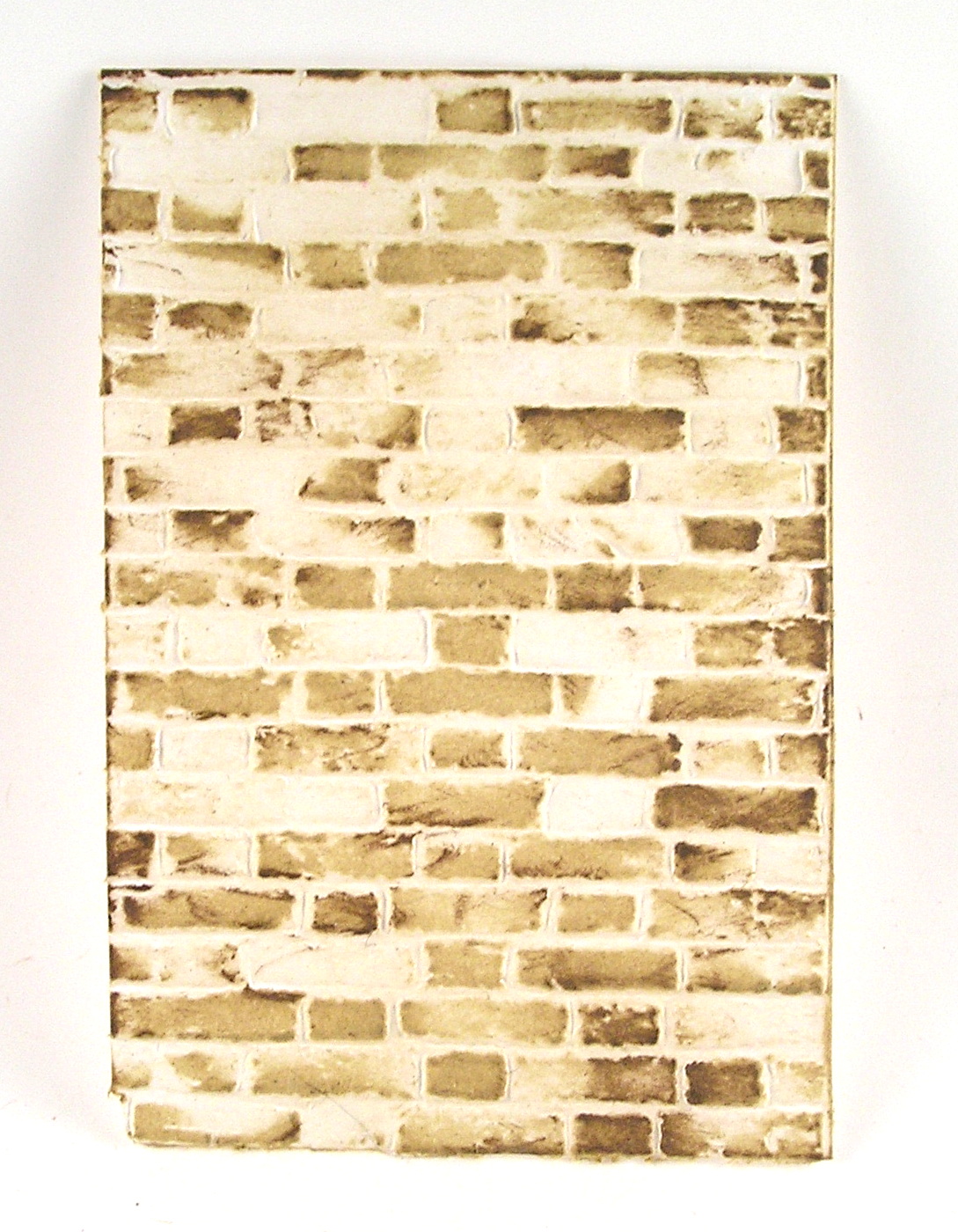
On the background embossed with Mini Brickwork, I dragged the Antique Linen pad across the surface multiple times. I then used a brown Distress Ink to add a hint of shading. I dragged the brown ink partially across the surface to only pick up some of the edges. I loved the effect, and repeated it with the Mini Cobblestone Embossing Folder.

For the cobblestone, I started with the Antique Linen Distress Ink, dragging it across the embossed paper. I then came back with the Hickory Smoke Distress Ink and added another layer of ink by dragging it across the embossed surface. It is quite addicting!
Then I decided to try spraying on the Doily Embossing Folder with Distress Ink Sprays, and then embossing white cardstock.

I thought that was too much ink, so I decided to ink up the embossing folder. I wiped it down from the previous experiment, and after it dried I took the ink pad and dragged the ink directly across the raised portion of the embossing folder.

I also spritzed the inked up embossing folder with water to loosen up the ink and give a stronger impression on the paper. I took the inked up embossing folder and opened it up completely on my craft mat. I laid the paper onto the open folder. I used a brayer to roll over the surface and pick up the ink. For my next example, I used blue dye ink.

This print was created using the same process, but with more water spritzed. The more water, the softer the effect. After all the spritzing, I wondered how it would look without adding any water and only dragging the ink across the surface.

I used a brown ink and you can see because the ink beads up on the plastic surface you get a stipple effect
For the last one, I spritzed the paper as well as the folder.

I decided to pull out some other inky backgrounds previously made as well as using spray to add color to white cardstock. I started with white cardstock and embossed it using the Damask Texture Fade.

After the embossing was complete, I pulled out a beautiful silvery Distress Stain Spray and spritzed the surface, allowing pooling of the ink and then heat setting the ink.
I found this gorgeous painted gold background in my leftover pile and embossed it using the Typewriter folder.

After I pulled it out of the embossing folder, I decided to splatter it with some white paint and hit it with some shimmery inky spray.
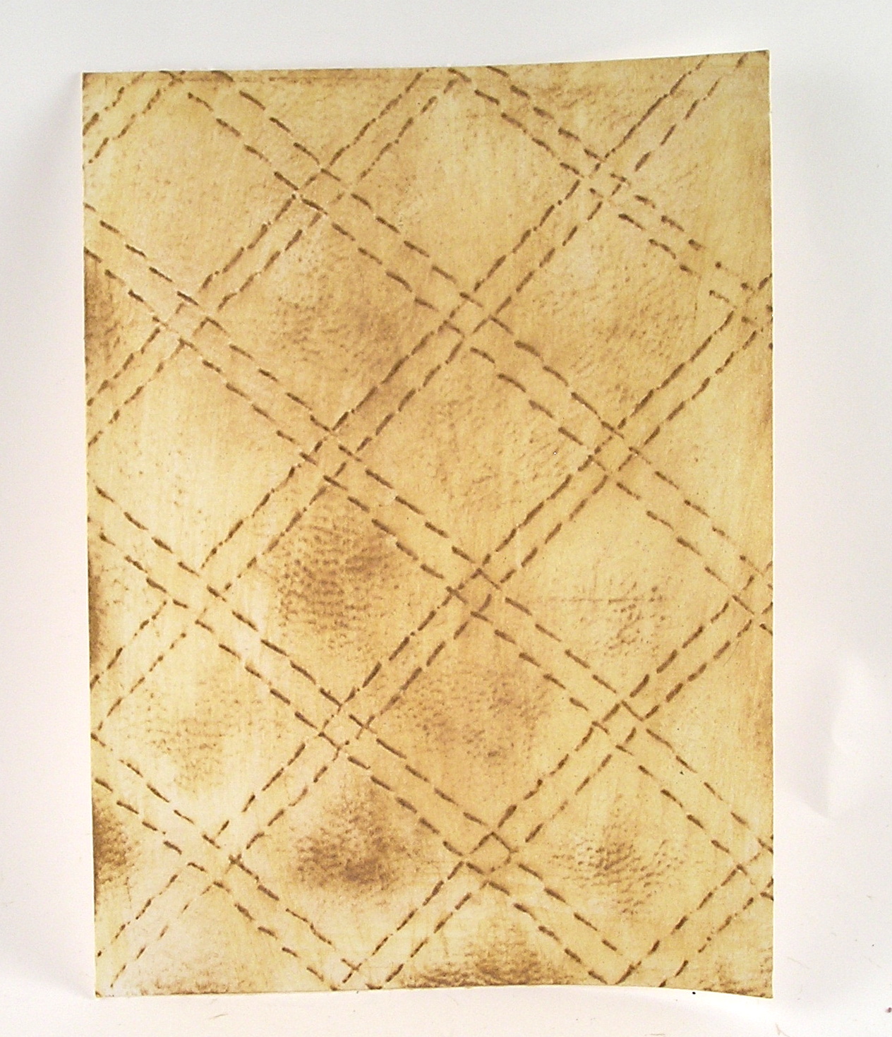
Next up, I tried to create a leather-inspired piece with the Quilted folder. I embossed the quilting on white cardstock. After I embossed the paper, I used an ivory dye ink and a brown dye ink to create this soft effect.
Finally, I decided to try cutting some die cut flowers from embossed backgrounds.
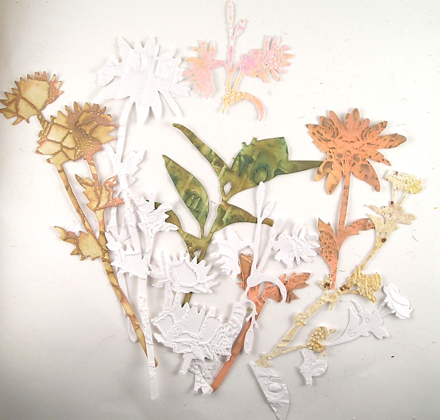
After I die cut them, I sponged a few of the different flowers. Hint: The 3D Embossing Folders will impress deeply, and you can see that some of my flower stems broke off. (Easily fixed as you can put them on the card back together.)
A few more pictures on how effective the embossed background shows up on different art.

In this clean and simple card, the Doily embossing folder speaks volumes with no color, just its beautiful texture.
In these pages from a mini book I created, I pulled pieces embossed with the Damask folder as a layer of texture and interest.

I love the Damask, as it is elegant and can look well in a rustic project.

I hope this Saturday Showcase has inspired you to check out the Texture Fades Embossing Folders.
Suzz
Suzz
Products Used
Ranger Distress Oxide Inks - Vintage Photo, Hickory Smoke, Saltwater Taffy
Ranger Distress Ink - Antique Linen, Ground Espresso, Hickory Smoke
Tim Holtz Idea-ology - Transparent Wings TH93785
Ranger Distress Sprays - Saltwater Taffy, Silver, Gold
These are FABULOUSLY AWESOME!!
ReplyDeleteMy fave is the very top, but I love the affects you got with each one- and mixing them together actually matches spot on… who knew!!
Fantastic creations! Love seeing all the possibilities when playing with embossing folders.
ReplyDeleteGreat post. Love all the ideas!
ReplyDelete