It's another Saturday Showcase! Lyla here, taking you into another cool project with a very cool product: Underwater Love, a Ciao Bella Paper with a sweet summery theme! Like many others, I pass over paper after simply glancing at the photos since I know what usually will work as far as color shades with a planned project. But even as I passed over this particular paper, something kept drawing me back to it; there was just something about that particular shade of blue... aside from the 'flowery' images that I usually don't care much for. Wow, wow, WOW; was I set up to be surprised! No sooner had Tim Holtz come out with the newest shade of Distress Ink, Unchartered Mariner, than it began to click together; that beautiful shade of blue was the same in Underwater Love! And more surprise was in store for me once I got the latest 'happy mail' from The Funkie Junkie Boutique. This paper is not only beautiful, double-sided, and very sturdy (I'm even going to go as far to say it's as sturdy as Tim Holtz's newer Kraft Stock), it's a pleasing perfect match for the Unchartered Marine Distress Oxide! Follow along with me and see if you agree!
This project is using the Eileen Hull Folio Journal Die and Eileen Hull compatible thin die sets as shown in photos below. The 'star' of this Showcase is the Ciao Bella Underwater Love 12x12 Paper.
The camera simply does not do the colors in the photos enough justice. We're talking a beautiful shade of blue, and I've put my Unchartered Mariner Oxide Ink into the middle of the double-sided papers so you can compare with your own. I fell in love with the 'wood' as well as the 'map' papers and there are 2 of each! The other side of the stack is just as pleasing, but to get better views than this, you really need to see it HERE (BONUS: It's on SALE for $10.00 !!)
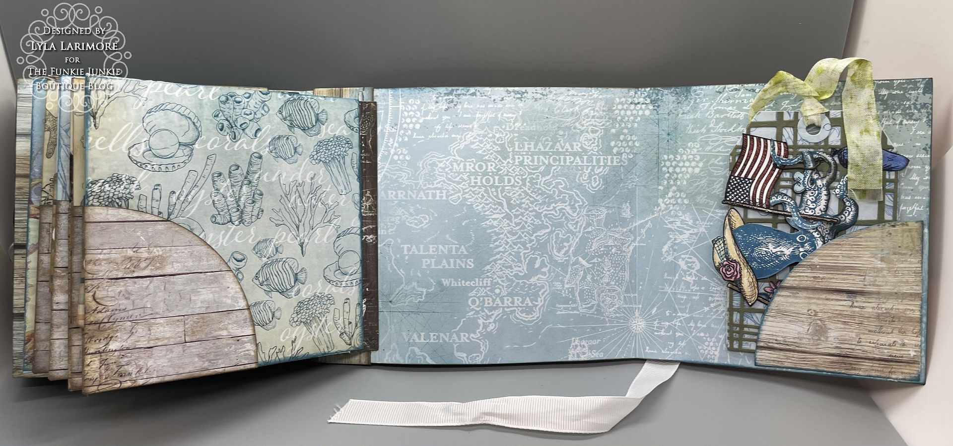
I chose one of the 'wood' sheets for my outside with one of the 'map' sheets for the inside. Normally, I am one of those who insists on putting another cardstock in between these layers, just for stability. Not this time; this Underwater Love stock is all that's needed!
I did my normal opposite layering (left blue to right blue then left wood to right wood) since it always gives a good spine. I did use my usual Glossy Accents for adhering. I also had a plan for the leftover strip up there at the top of this photo...you'll see.
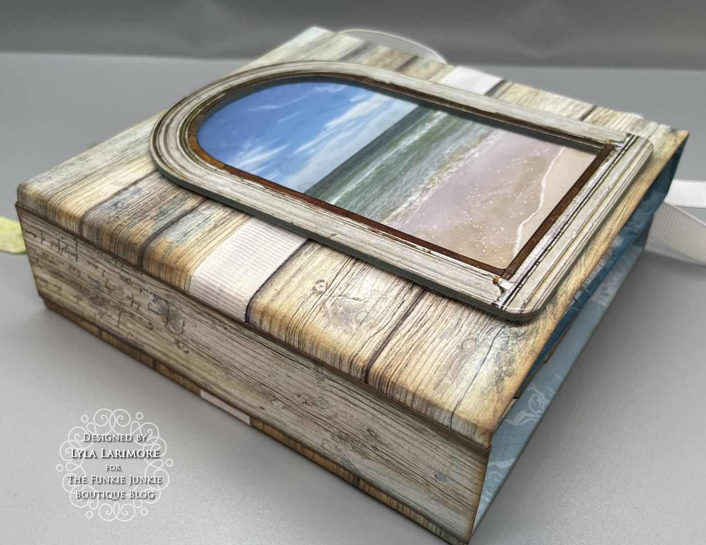
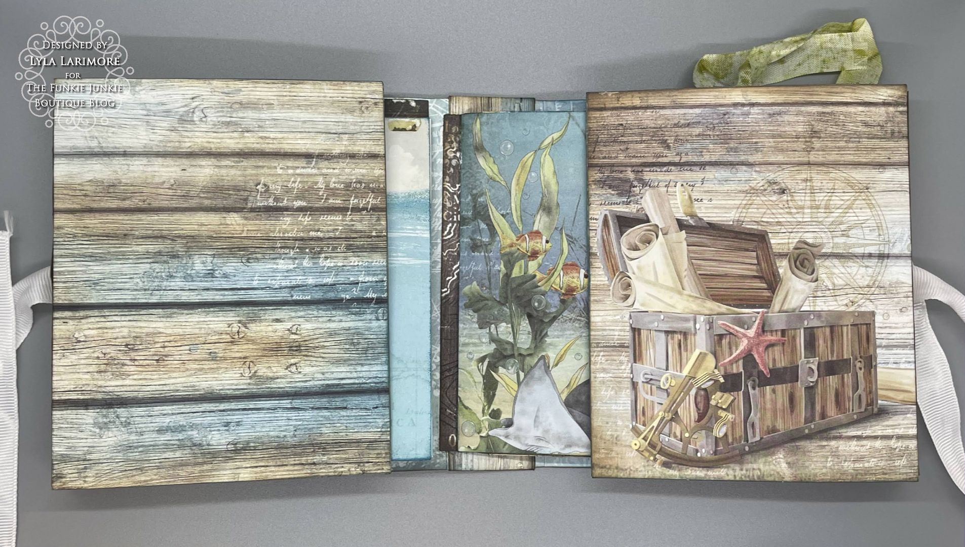
After getting the outside and inside covers together, I chose a plain ribbed white ribbon for closure. A 'slice' of that wood leftover became a sweet board to overlay onto the spine- inside and out. It hid the holes as well as secured the closing ribbon.
I got out the compatible Eileen Hull Thin Die Set Page Pocket and Flowers to cut pages and corner pockets. The leftover pieces of stock were cut into one-inch strips - just short of the length for the pages - for use in making the pages into tuck pockets themselves.
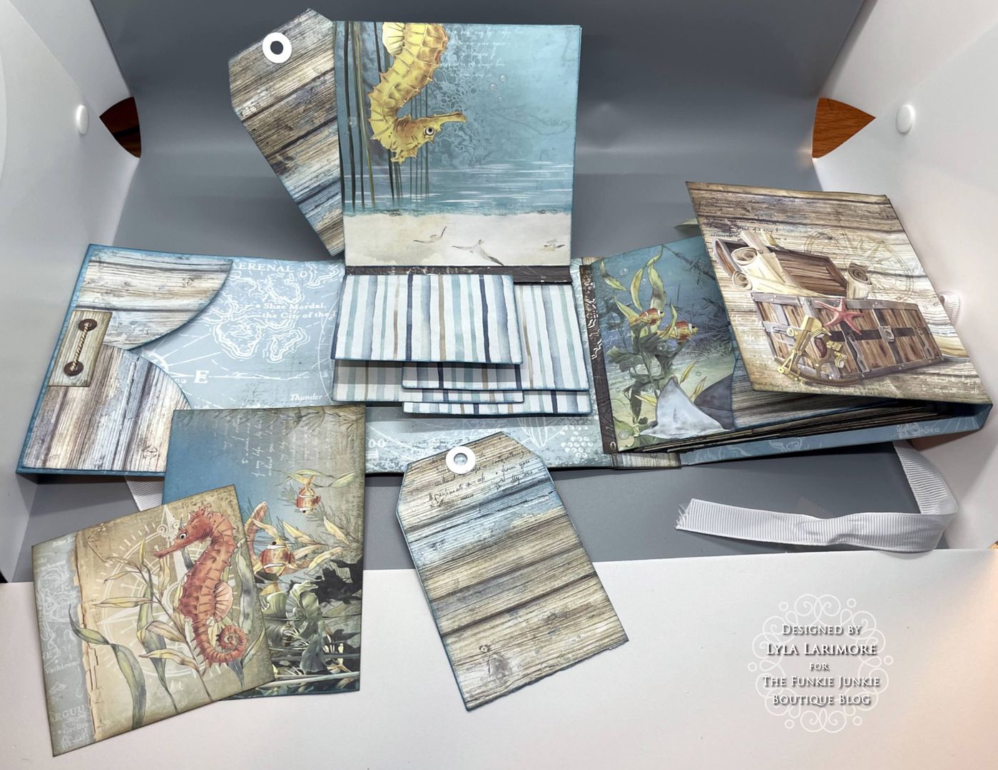
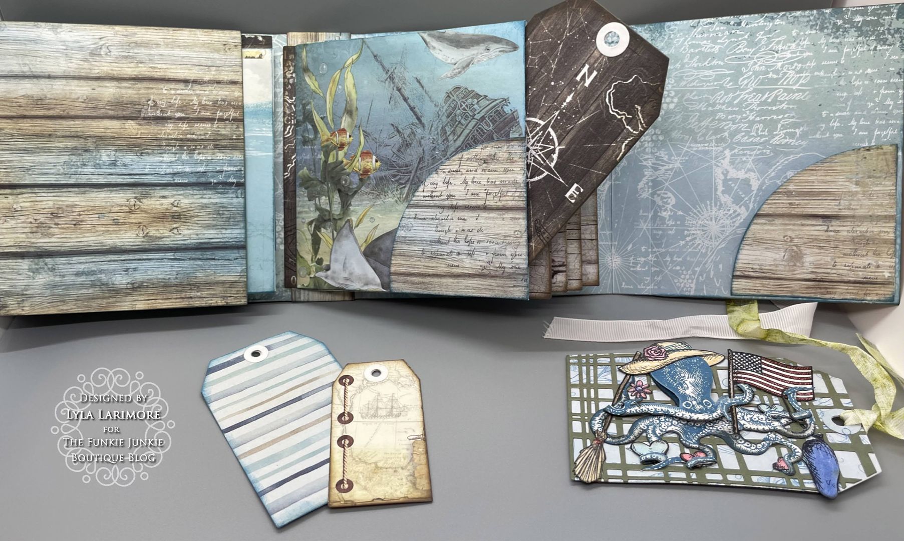
Next, I used the other two compatible Eileen Hull Thin Die Sets (Card Waterfall/Tags and Bookbinding/Label) for waterfall pages, the tags I planned to fill several pockets with, and the binding for the pages to layer onto.
Then it was time for the assembly of all the inside. I gave all the edges and corners (including the cover) a bit of the Tim Holtz Unchartered Mariner Oxide Ink, and heat dried everything.
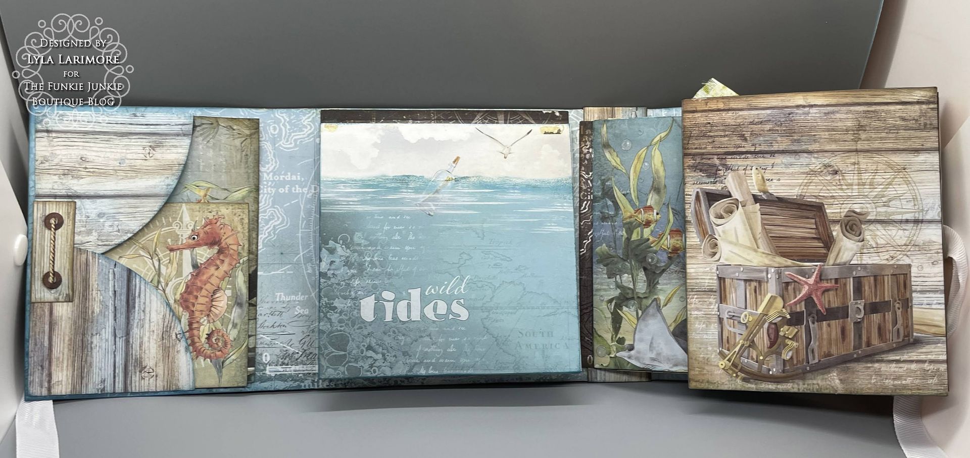
I'm showing how I put together my pages to form a pocket in the middle of them. This page above, was to have nothing else on the outside. Others will have tuck pockets on the outside lower corners. You can see in the next pic, how I added the corner tuck spots before putting the pages together.
Making the top-to-bottom waterfall pages was easy. I inked them up all around the edges and that Unchartered Mariner just PERFECTLY matched!
I used ALL the pages except for one: the mermaid/secrets page. I did have plenty of leftovers even after cutting more tags than I initially had. That 12x12 stack went pretty far! Now, my only problem was to figure out what I wanted on the front of the entire book. Flowers? Nah. Tim's Paper Dolls? Much as I love them...nah. More wood cuts stacked up? Nah. Everything I suggested got flat-out rejected by my ArtMuse. A memory came out of nowhere, along with a voice in my head saying, "Less is more. Less is more!" The memory is so peaceful: my favorite Happy Place...
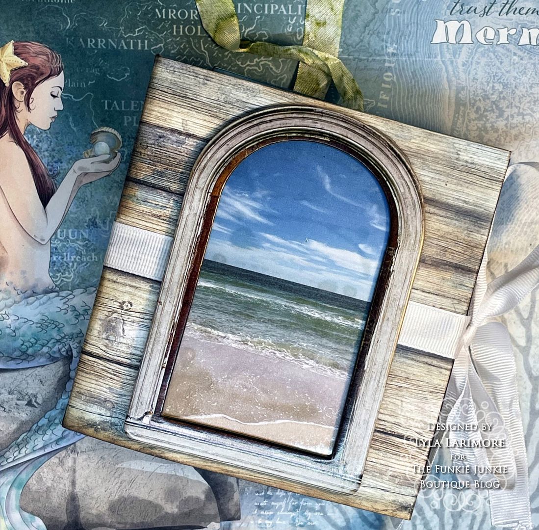
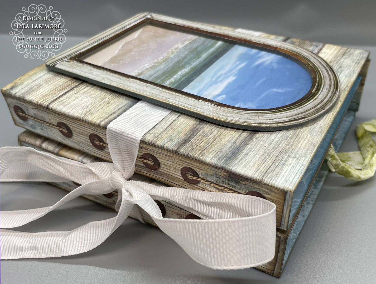
I spied the bag of Tim Holtz goodies I have for a future project on my desk. The package of Idea-ology Window Frames caught my eye. Why not? So I went to my computer, looked up the date to find that set of photos, and found IT - the perfect shot.
After printing it out on regular white cardstock, I laminated it with clear shelf paper. I used only one thing on the Window Frame: Distress Crayon in Speckled Egg all around the edges.
And it looked simple and simply amazing to me!
This is where that one strip of wood went to... cute, eh?
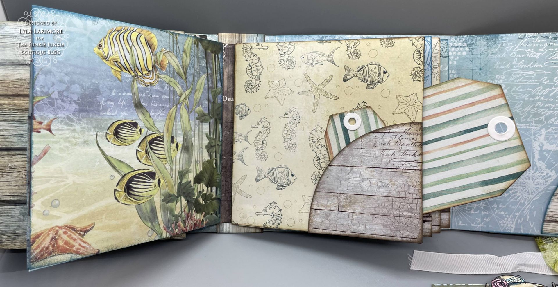
Some of the other 'wood' and fish paper...

... and more of the other side of these papers.
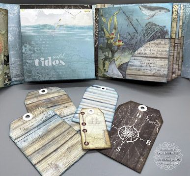
These are probably my favorite designs of the Underwater Love 12x12 Ciao Bella Paper. I hope you enjoyed this Saturday Showcase as much as I enjoyed making this folio!
Products Used:
Eileen Hull Page Pockets & Flowers Die 664883
Eileen Hull Bookbinding & Label Die 665153
Eileen Hull Waterfall Pages & Tags Die 665154



This is incredible!!!! I love how you made the window scene!
ReplyDeleteWow!! This is so awesome!! I love that die set that you used-so helpful in making this beautiful book! And the window--that is seriously awesome! Thank you for sharing! :)
ReplyDeleteThis is absolutely fantastic, Lyla! What a great album. I love that Stamperia paper and what you have done with it. I'm a seaside girl myself and it really calls to me. Very nicely done step out!
ReplyDeleteAn absolute joy to behold Lyla! Your view of the sea is absolutely perfect for leading you inside and putting you in a restful space as you take in the beauty of each page x
ReplyDeleteThank you so much, everyone!! 👍😎❤️
ReplyDeleteLove this...so detailed and beautiful!
ReplyDeleteGreat minds think alike Lyla! This is gorgeous and I love that paper collection so much.
ReplyDelete