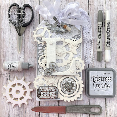
The theme chosen for this next two weeks here at TFJB Inspiration Ave is "Let's Be Neutral!" and while it's a very good play on words that we could all adopt for a bit of peace for everyone, but the real idea is all about the latest Tim Holtz Distress color: Lost Shadow! Tim promised awhile back that the last 2 Distress colors he released would all be neutrals. I'm all in since my usual fave way to do colors is going with neutrals! Lost Shadow does not fail in any way to awe me with its subtle shading and I am sure this is one Distress Ink that I'm going to get a lot of use from. Be sure to check out the links of products near the middle of this post, so you can get this latest Distress Oxide from The Funkie Junkie Boutique! Scroll along with me and I'll show you what I did with this beautiful greyish shade!
Wednesday, March 22, 2023
Neutral is Nice!
I set out some materials and tools I knew I wanted to use. For this project, I'm using a couple of not-so-old Tim Holtz Dies; Gearhead Thinlits Set and Mechanical Bigz XL.
I decided to use up some leftover stash cardstock of 2 shades of grey that closely matched the new Lost Shadow.
This new neutral shade was just the right subtle pop these edges needed!
For those who may be newer to TFJB Inspiration Ave blog, I do like to make out a plan by placing my items together and taking a photo. If I get stumped on how I wanted it, I just refer to my pics.
I had some extra room on the backside, so I dug out my
TH Voltage Bigz Die to add another element there.
From the older TH Mechanical Bigz Die; putting together the smaller "bolt head" pieces.
And giving everything a couple coats of TH Distress Picket Fence Paint. Although the matboard I used had a white inside and backing, giving both sides those 2 coats not only sealed up the matboard, but also allowed me to have both sides of my Tag used.
This chipboard L has been in my stash for.... years and years! I picked it up to use it for some project back when and just never did. It's been on my mind to use it and it fit this project perfectly for me: L for Larimore!
I coated all the Idea-ology items and let them sit to dry fully...
...so I could scrape and scratch at them like the paint was actually peeling from use.
These papers are from Tim Holtz Backdrops Volume 1.
I used Glossy Accents to adhere the papers (one to each side) and after fully drying, sanded all the edges down. I also sanded more randomly around.
I layered the Gearhead die cuts with the lighter shade under the darker-so the later top layers of white would pop from the darker underneath. I randomly tore the lighter around the edges of each piece, and then tore the top darker piece just slightly smaller. This makes it look like it's "shadowed". ;) Then I did the same onto the backside of the Tag as well.
More IdeaOlogy: got out those TH Dials to add into my Voltage die cut faux gauge, and added some Hardware Heads to the Factory Tags piece.
I used an older TH Baseboard Lace Frame and edged it with Hickory Smoke Distress Crayon- a nice complementing shade to the Lost Shadow. Using some of the leftover Backdrops sheet, I made a photo holder slot on the back.
I couldn't resist a pic of how it looked without the L on top- I just LOVE Tim Holtz gears!!
Here's a helpful list of links for products I used:
Let's see the results of both sides!
Now, the BACK and a couple more closeup photos...
Thanks so much for joining me for this project tutorial! Be sure to pop into the Inspiration Ave blog, to see all the great things coming up from The Funkie Junkie Boutique and TFJB Design Team: new projects as well as new products!
Until next time...
Stay Safe &
HAPPY BLOGGING!!
Lyla
Subscribe to:
Post Comments (Atom)


No comments:
Post a Comment