
This week at the TFJ inspiration ave blog we are creating to the theme of “ let’s be neutral”. Neutral colours can help create contrast when used in a background or used as a primary focal point. Today I am going to try both neutral colors in the background and neutrals as a main focal point when talking about neutrals, I am also going to be including metallics in that category as well.
For my project, I am making a set of two cards with neutral colours as a background and as a focal point. For instructional video click here.

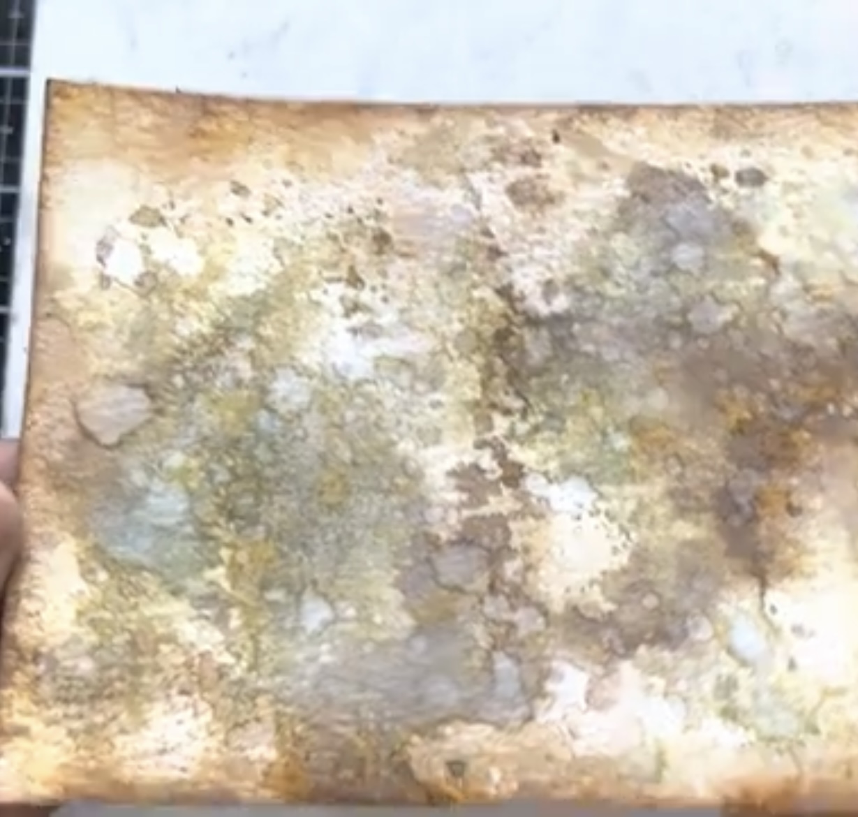
Tonight we were playing with neutral colors, so let’s take a quick stop and just admire the view of distress colours on the wall.

From my distress ink collection I have pulled Old Paper, Antique Linen, Tea Die, Vintage Photo, and Ground Espresso. From the oxide side, I also pulled out Ground Espresso and Walnut Stain.

Below are the other supplies that I used for making these two cards.

To start the card base on I decided to use a classic technique of ink pad, squishing and layering. First, I added a few colours to the craft mat and then spits water over the top. Here are used a combination of distress and oxide inks:Tea Die, Vintage Photo, Old Paper, Antique Linen, Walnut Stain, and Ground Espresso oxide.

I have built up layers of ink on a piece of distress, watercolor, and cardstock by dipping and drying into the inky puddles on the craft mat.

Below are the inky layers for the neutral background.
For our bright and colourful background of Mermaid Lagoon, Picked Raspberry and Squeezed Lemonade distress spray stains.

Again, I used a piece of Distress Watercolour Cardstock for the foundation. Then ice burst some water over the top of the watercoloured cardstock before adding spritzes of color.

Once dried with the Ranger heat tool, I added a few droplets of water to get a distressed look.

Next I ran both backgrounds through the Sizzix layered embossing folder.


On the colourful background I used a brayer to spread a thin layer of Distress Paint Tarnished Brass over the top of the raised dots.

For our neutral focal point, I built up a layer of three die cut shapes. On the base later I have an oval circle cut from one of the Tim Holtz Idea-ology backgrounds than oval cut out, and segment from flower fields. These are glued together to make the main focal point. The flower fields was cut out of a piece of the Christmas two-tone woodgrain cardstock.

For finishing touches, I added a piece of velvet trim, and label sticker.

For the second card, I created my focal point using an Idea-ology stitched frame paired with a chunk of collage strip.

I is elements onto the card, then added botanical layers and a die cut bird from feathered friends. In each of the corners I placed a flat back droplet, and for the sentiment I used a metallic word sticker.

Below are the two completed cards for this week’s theme Let’s Be Neutral. Here we have one card with a neutral coloured background and on the second card we have a neutral coloured focal point.
Thank you so much for joining me here today for TFJB Inspiration Ave. Until next time, happy crafting!
Janna~ 💕🎨💕
I can also be found on :
Instagram: dunhamtreasuresofthesea_jannak
YouTube: The Crafty Corner with Janna
Distress Oxide Ground Espresso
Distress Spray Stain Mermaid Lagoon
Distress Spray Stain Squeezed Lemonade
Distress Spray Stain Picked Raspberry
No comments:
Post a Comment