Saturday, January 19, 2019

Saturday Showcase - Making Backgrounds with 3D Texture Fades

Happy Saturday, here we are in 2019!  I am thrilled once again to be part of the Frilly and Funkie DT and to have the chance to share my favorite products from The Funkie Junkie Boutique.

You all inspire me with your stamping, inking and card making techniques.  I'm more of a paper artist, just give me some glue, scissors and paper and I can snip up a great project in no time.  But give me ink, stamps and paint, well that sends me to the corner to scratch my brow and wonder what to do with it all!  We all have our comfort zones, don't we?

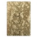
Well for me, it's all about stepping out and doing something different, so today I want to share with you my little journey with Tim Holtz's 3-D Texture Fades Embossing Folders.  I love the deep impressions you get with these folders.

Something Frilly!
So let's start with a frilly card where I used the Kaleidoscope 3-D folder.  I used Core'dinations cardstock and cut a piece to fit the folder. I lightly misted the card stock on both sides so that the impressions would really pop.  Then I ran it through my Vagabond 3 times; that ensures maximum embossed dimension. (Caution:  the sandwich for these embossing folders is different than the "normal" embossing folders so do be careful!  With the Vagabond you use ONLY one cutting pad.)

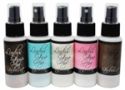
After running through my Vagabond, I simply applied some white paint to my brayer and brayered lightly over the surface of the paper.  I love how the white paint really highlights the raised impression.  Finally I gave the paper a light spritz with Lindy's Creme Brulee Cream Mist.  Unfortunately, you can't really see the effect of the misty sparkle, but trust me, it looks great, give it a try!


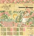
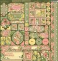
From there it was easy to cut the embossed paper to size and use as a background on this pretty card I made with Graphic 45's Garden Goddess.  It's simply layered with design paper and a scalloped border sticker, topped with flowers and a butterfly.  Now the card is truely worthy of a garden goddess with that fabulous embossed design!


Now Let's Get Funky!
I used the Mechanics 3-D Texture Fades embossing folder to create this next background.  Here's where I crawled out of my comfort zone!

First I embossed my card stock.  I used tan card stock and misted on both sides before embossing and ran it throug my Vagabond, 3 times, remember that.


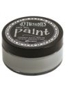
Time to create some interest on that background. So, I grabbed a fan brush and Dylusions paint in Slate Grey, Vanilla Custard and Ground Coffee.  


 I used a fan brush because the bristles will clump together like you see in this photo and when you run the brush over the paper you'll get streaks rather than solid color. I took care not to put too much paint on my brush so that I'd get streaks.  But then I spritzed the paint to spread it out a bit, makigng the custard color more of a background than a streak.


After applying the custard color, I followed with slate grey and then ground coffee.

I also discovered that you will get a different effect if you have to smoother surface of the paper face up than the textured side up.  The one on the left is the smoother side.  When the textured side is up, the paint highlights the paper texture as well as the embossed textures.


Now it's a masculine card!
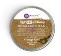
It was really easy to turn this into a masculine card.   I think I'll give it to my husband for Valentines, he'll like this a lot better than a hearts and roses card! I cut a card base from Tim Holtz's Memoranda pad and added my embossed panel.  For embellishments I "dirtied" up a piece of measuring tape, added some gears and a word band.  And of course, I rubbed on just a wee bit of vintage gold Prima wax just because I wanted to give the card a few highlights!

 Prima rust paste system is 3 different colors of paste that when used together will give a really rusty corroded look. I start by painting on the brown rust and then I add some gold rust.  Next I dab on some red rust.  You want to blend the colors a bit so that it looks like rust.  There's really no wrong way to do it.


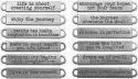
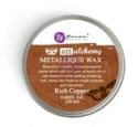
A strategically placed word band finishes off my card nicely.  I used copper Prima Metallic Wax to highlight the words.


And finally, something in between:

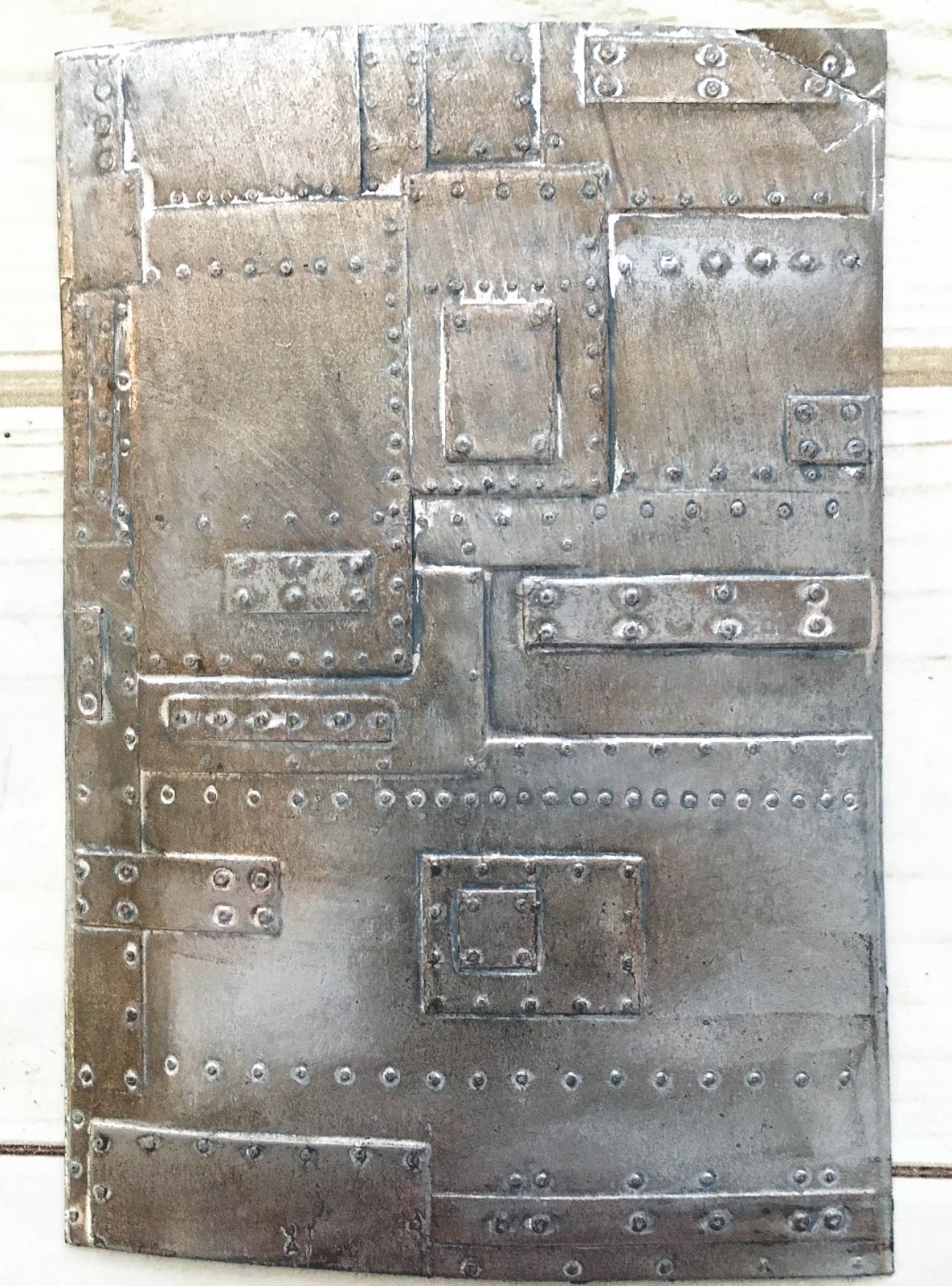
This time I embossed with a piece of silver metallic using the Foundry 3-D Embossing Folder.


After embossing, I painted it over with Dylusions Slate Grey and then quickly rubbed most of the paint off.  This served to dull the bright shine of the metallic paper.


Then I misted with black mist letting the mist pool around the raised areas.  Before the mist dries, use a paper towl to dab off much of the mist, being sure to leave mist in the crevices and around the "plates and rivets."  Let the mist dry throughly before procedding to the next step.


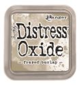
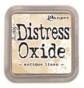
Lastly, I lightly rubbed areas with Prima's Rich Copper Metallic Wax and Distress Oxide Frayed Burlap to give a weathered worn loo.

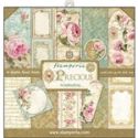
Now you're all set to add this panel to a card and look what a vintage looking card it makes when paired with Stamperia's Precious collection.  I cut a 6" card base and fitted the panel to the left side.


 At the upper right, I added a fussy cut image from the Precious collection and topped that with some pretty blooms.


I added a bride and groom to turn this into a wedding card and a love word token at the bottom to set the mood.


I hope you've enjoyed my journey with the 3-D embossing folders.  I think you'll find lots of ways to use them as they are quite versatile.  Stop by The Funkie Junkie Boutique where you can find the products I've used.

Thursday, January 17, 2019

Guest Designer - Beverly Jordan

Please say hello and give a warm welcome to our Guest Designer for the Vintage Valentine challenge.  Beverly Jordan was the Top Pick from the 'Tis the Season for Gift Giving challenge and can be found on her blog, Beverly Jordan.


Hello everyone, I am Beverly, from Orlando, Florida, and am so honored to be a Guest Designer for this brand new challenge at Frilly and Funkie Challenge Blog...A big 'thank you' to the Design Team for this chance!

I have been crafting since I was a child, and am an avid scrapbooker, card maker, and love to make mini albums for gifts. I love scoping out antique markets, creating 100+ Christmas cards 10 months ahead of time and baking delicious original desserts for my family while practicing as a Dental Hygienist these past many years.


I created a Valentine Mini Album using a 3D Die by Spellbinders. The die was designed for a 3D card but thought it would be perfect to use for this project which I made a Valentines Mini Album. By using the die cut frame and only attaching it to the spine, I was able to make a vintage, shabby chic, album. Am planning on adding photos of my hubby and I, for his Valentine! Being a ribbon addict doesn't help, but it was fun adding several different ones of different textures and colors.

* * *
To see all the details of Beverly's mini album, click here and you will be taken to her blog. Once you have checked her creation out, come on back and share your Vintage Valentines with us. The Vintage Valentines challenge can be found HERE and runs until 11:55 pm EST, January 29, 2019.

Check back with us on Saturday when one of our designers will have a new Saturday Showcase for you and if you need more Valentine inspirations, the gals on the funkie side of the team will be here to show you their projects next Wednesday.

Monday, January 14, 2019

Monday ShowCase - Ranger Adirondack Alcohol Inks & Tim Holtz Yupo Paper

Happy Monday to you all! The Saturday Showcase slipped to Monday and I am happy to share with you some inspiration using the Ranger Adirondack Alcohol Inks using the Tim Holtz Yupo Paper.

Ranger Adirondack Alcohol Inks Tim Holtz Yupo Paper Sizzix Butterflies for the Funkie Junkie Boutique

I spent quite a few hours playing with the alcohol inks and then cutting some of the backgrounds out to use on a few projects.

I started with the Translucent Yupo Paper and the reds, greens, yellows and blending solution.

Ranger Adirondack Alcohol Inks Tim Holtz Yupo Paperfor the Funkie Junkie Boutique

For any of my backgrounds I like to first layer on a light alcohol ink. To do this I put three drops of the color first on the felt and then add a few drops of alcohol blending solution. I smear this up and drown across the entire surface. After I cover the surface, if I want to remove the streaks I just dab across the surface to let the blending solution bubble up the color.

Ranger Adirondack Alcohol Inks Tim Holtz Yupo Paper  for the Funkie Junkie Boutique

Once that is done, I let the surface dry. Next for the background I was trying to create with the drops and circles I start by dripping directly from the bottles onto the background. I drip as single color in multiple places across the surface. While it is wet I will drip blending solution over the circles I have created. I then like to let them dry before I add the next set of circles. I add them by dripping more circles and more blending solution.

If I don't like where the colors are blending I will bring in large amounts of the blending solution and let it spread to lighten up the background. You can see I did that on this background after I added the green as it was getting muddy.

I let the green dry and came back with yellow dots. The more blending solution on the background that is not dry will help expand the circles. After it dried I added the red dots back into the surface.

My next attempt was still on the translucent background with greens, blues and yellows.

Ranger Adirondack Alcohol Inks Tim Holtz Yupo Paper  for the Funkie Junkie Boutique

On this one I added much more blending solution and didn't let the colors dry in between adding more colors. I also used the heat gun to push the colors around the background.

Ranger Adirondack Alcohol Inks Tim Holtz Yupo Paper  for the Funkie Junkie Boutique

You lose the hard edges and it becomes much more free form without the circles of color. After it dried I came back and added some more circles by dripping the colors directly onto the dry background.

Ranger Adirondack Alcohol Inks Tim Holtz Yupo Paper  for the Funkie Junkie Boutique

I then pulled out the white Yupo cardstock and created a much softer and blurrier background by adding many drips of blending solution and using the heat gun to push the colors around.

You can see the blending solution and inks pooling off the edge of the paper.

Ranger Adirondack Alcohol Inks Tim Holtz Yupo Paper  for the Funkie Junkie Boutique

When it dried you can see how it pooled colors around the edges and how the white cardstock helps keep a much richer color.

Ranger Adirondack Alcohol Inks Tim Holtz Yupo Paper  for the Funkie Junkie Boutique

I then added some drips of blending solution.

Ranger Adirondack Alcohol Inks Tim Holtz Yupo Paper  for the Funkie Junkie Boutique

I finished it with adding a few drops of blending solution to a clean felt pad and dabbing across the surface to get tiny bubbles across the surface.

Ranger Adirondack Alcohol Inks Tim Holtz Yupo Paper  for the Funkie Junkie Boutique

For my last sheet I used White Yupo Cardstock and decided to use the felt applicator for all my colors.

Ranger Adirondack Alcohol Inks Tim Holtz Yupo Paper  for the Funkie Junkie Boutique

I covered the background with the yellow alcohol ink first by adding a few drops of yellow ink mixed with a few drops of the blending solution.

I then started adding a hint of brown ink with a few drops of blending solution and dabbed it on the right side of the paper.

I repeated with a fresh piece of felt with a blue alcohol ink mixed with the blending solution. I didn't re-apply and ink and kept dabbing all the way over to the left.

I then added a bit more brown. I left drying time between each color and replaced my felt each time I put a new coat of color.

I also at the end just used a clean applicator with just blending solution. Most of all the important thing with the alcohol inks is to just try out new ideas. The medium is fun and forgiving!

Ranger Adirondack Alcohol Inks Tim Holtz Yupo Paper  for the Funkie Junkie Boutique

I didn't finish off this piece, I just put it on a card front to finish later.

I did die cut a bunch of butterflies and leaves from the other backgrounds:

Ranger Adirondack Alcohol Inks Tim Holtz Yupo Paper Sizzix Butterflies for the Funkie Junkie Boutique

I quickly put together a tag and a card using the butterflies:

Ranger Adirondack Alcohol Inks Tim Holtz Yupo Paper Sizzix Butterflies Stampers Anonymous Entomology for the Funkie Junkie Boutique

I purposely left the background of the cards white and simple to highlight the beauty of the alcohol inks.

Ranger Adirondack Alcohol Inks Tim Holtz Yupo Paper Sizzix Leaves Stampers Anonymous Entomology for the Funkie Junkie Boutique

 I also cut out a dragonfly from the leftover backgrounds.

Ranger Adirondack Alcohol Inks Tim Holtz Yupo Paper Sizzix Tattered Dragonfly for the Funkie Junkie Boutique

The yupo paper allows the alcohol inks to shine and the alcohol inks come in a variety of colors to allow you to pick your color combinations. The Funkie Junkie Boutique has the papers and inks available to purchase. There is still time to play in the Inspired By Challenge!

Suzz