Saturday, August 12, 2017

Saturday Step x Step - Mini Book

Hi there! Suzz here to share a mini book created using old dictionary pages.


I was thrilled when Sara Emily challenged us with books. I love reading and love up-cycling damaged old books into a new piece of art to enjoy again.  

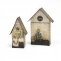
I decided to create a mini journal with lots of stamping. I started with the idea of a house that opens up to show you inside. I decided to use Tim Holtz's tiny houses die and trim off the edges.

Here are my original pages die cut: 


I cut down a the crease where you would normally fold the die to form the houses. I did this with multiple pages from the dictionary and from two pieces of chipboard.


After I trimmed off the excess sides from the die cut pattern I then punched four holes on the main house that was to be the back of my book. I then used that as my pattern to draw where the circles should be on my other pieces.


I covered my chipboard with pages from the dictionary. I kept two of the houses from the dictionary pages in the full house shape to attach to the front and back of my book. I cut all the other pieces in half along with one of my chipboard pieces for my cover of the book.


I used glue to attach my paper to the chipboard. I also cut cardstock houses for all my pages as I wanted the pages to be sturdier than just the dictionary pages. I attached them all with glue as I have found that using tape tends to show through in the stripes of tape behind the text paper. Glue can also do this if you don't give an even coat. I painted a light coat of white acrylic paint across all my pages to mute the text and allow me to stamp over the texty background. Let this dry before continuing on to the next step.


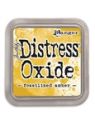
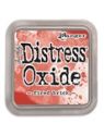
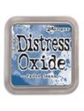
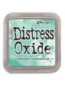
For each of my pages I used a different distress ink on the page. I first dragged the ink pad over the surface.

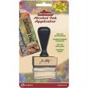
I then smeared it first with my finger to soften the ink over the entire surface. I then put brown dye ink onto my craft mat and  used a sponge applicator to sponge the entire surface with brown dye ink.  I then gave them all a lovely sprinkling of water and heat set the ink and water spots.

Then the fun began with stamping and layering images over the surface of the various pages.


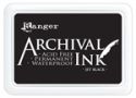
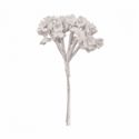
For my cover I decided to die cut a heart image and follow the same process of covering it with the text background and the inky process. I stamped the word love across the surface with black archival ink and hand drew hears and outlined with a black watercolor pencil. I made a tiny bouquet which was attached on the right side but overlaps the middle. This allows the page to still open but looks like it is attached in the middle.

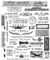
I stamped the text along the top and bottom of the house. I pop dotted the hear so it could overlap my holes on the top but allow the book to be linked with jump rings.


As I continued to sponge the pages you can see I picked up some of the previous colors used in the other pages because my sponge picked up the distress oxide. I liked the blended colors and didn't mind the effect. Heat set the archival ink as it tends to stay wet on the painted.


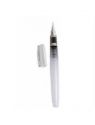
I used white highlighter to help lighten up where the inky pages got darker and waterbrush to help blend my watercolor lines.


I also sponged archival ink over the stencils and cleaned off my stencils with the ink cleaner. I added a touch of watercolor pencil on top of the inky background. I also took the silver glittery design tape and dragged the black archival over the surface to give me a black shimmery stripe along the top.


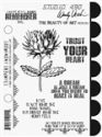
For my final page I just used the Wendy Vecchi stamp as my focal point. I framed the sentiment with a house and heart using black and pink watercolor pencils and a waterbrush. I splattered white paint and decided to add a moon along the top.


Next up was just layering on my pages with a jump ring in each hole. Lay them in order to make sure your matching pieces line up. :)


The finished album and how it looks opened page by page:


I didn't do it but you could continue your stamping on the reverse side to finish out your images on the main pages as well as coordinating the backside colors to match the center.


And the finale:


I hope you have enjoyed the mini house journal book and you are inspired to play along with us in the Read and Good Books Lately Challenge!  You have until Tuesday August 15th to join in the fun!

Suzz


Friday, August 11, 2017

Friday Focus - Dina Wakley Media Heavy Body Paints (part two)

Hi everyone and welcome! It's Jenny here with the second part of the latest Friday Focus - this is where we take the opportunity to shine a spotlight on a particular product or range currently in stock at The Funkie Junkie Boutique. For the next week Dina Wakley Media Heavy Body Paints will have the special extra 15% discount applied so if you're already a fan or want to try them out now is the time to give it a go! There are smaller 1oz bottles as well as the larger 2oz tubes if you are just trying them out.

As a lover of all things painty I was excited to try these paints for the first time and find out what made them different from those I use regularly. And since there are lots of card-makers out there who may feel paints are just for canvases I decided to create two cards and experiment with a few techniques. Today I'll share the first second of those and show you how it came together - here's the first tutorial if you missed it last week.


The second card I created has more of a journal style feel to it, a bit more abstract and 'arty'. Here's how it came together (if you click on each photo you'll get a closer look at them).


I started by swiping an uneven layer of Vintage Distress Collage Medium over a piece of white card using a spatula.


Once dry I repeated the process with Blushing Heavy Body Paint.


To get more texture into the design I mixed Ruby Heavy Body Paint with some water and swiped it over the top with an old brush (to get the distinct bristle marks).


For a touch of drama I used the same Ruby paint, this time undiluted and in larger amounts, applying it with a smaller brush. The heavy body nature of this paint means it keeps it's dimension when dry.


I used the group of smaller blooms from the Abstract Blooms stamp set with the Evergreen Heavy Body Paint (picked up directly from my craft mat) and stamped them randomly over the background.


To brighten the design I repeated this process with the Lime Heavy Body Paint.


I added lines by dragging my spatula through Umber Heavy Body Paint and pressing it on to the card edge side down.


To finish the background I blended Old Paper Distress Ink over the card. The ink was resisted on the areas covered in paint and Collage Medium to give an uneven look. The card was then cut so that one part would fit a square card blank. The extra piece was added as one of the layers on my first card (from last week).


To finish I stamped one of the heads from the Homage To Frida stamp set on thin tissue with black archival ink and added it to the background with Matte Distress Collage Medium. Stitching around the edge with black cotton created an uneven border. Then adding a row of white lace flowers and the words bloom and grow (stamped onto white card) created the horizon line, balanced by adding white details to the head dress with a Dyan Reavley paint pen.

Here are a couple of close ups to show the details;


That's it for this week and the second part of the Friday Focus on Dina Wakley Media Heavy Body Paints. I hope you feel inspired to give them a go (if you haven't already) and remember, the extra 15% discount will be applied through August 17th.

Make sure you join us here at Frilly and Funkie for a new Saturday step by step. For now have a great creative weekend! Jenny xxx