
This is the card we are going to "deconstruct" today. I hear from so many people on my blog: "I just love Graphic 45 papers, but I'm intimidated when it comes to using them." I hope to allay those fears with this Saturday Step x Step and share some fun techniques along the way. Shall we begin?

(At the time I created this project, I had not received the refreshed version of this collection, so it's made with the original. Some images and patterns are slightly different, but the principles and steps are all the same. )
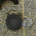
I began by selecting this cut apart page from the Communique paper pack, and matching it up with cardstock from my stash. I knew I wanted to use the large image of the typist, but I wanted to frame it in a fun way. After checking my die collection, I thought my Tim Holtz Pocket Watch Frame would be a great way to focus attention on this vintage image.

First I die cut two pocket watch frames from medium weight chipboard. I used one as my base, and evacuated the center of the second to be used as a frame. I placed the evacuated frame over my chosen image and traced around the outside edge of the frame, then cut out my typist image.

I wanted the typist's face to be as close to the center as possible. The nice thing about using the evacuated frame as a sort of template is that you can play around with placement before you cut.

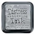
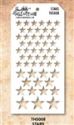
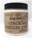
After inking the edges with Vintage Photo Distress Ink, I used Tim's Stars Layering Stencil and added some crackle texture paste to the surface of my image.

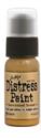
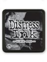
Once the paste was dry, I placed the stencil back in place and painted the stars with Tarnished Brass Distress Paint. When that was dry, I once again placed the stencil over the stars, only slightly to the left and sponged on some Black Soot Distress Ink to add a drop shadow to the stars. The stars on the right in this photo have been inked, the stars on the left have not. See the difference?

Next I wanted to age my image by adding a "cracked glass" effect. I tapped the entire image with embossing ink, then sprinkled it liberally with UTEE, tapped off the excess and heat embossed from BENEATH the image. Never ever heat UTEE from above, as the granules will fly everywhere and make a terrible mess! I find it helps to use tweezers to hold the image so you don't burn your fingers.
I let the UTEE cool for a minute or so, then tapped with embossing ink for a second time, and sprinkled in some mica flakes and repeated the heat embossing. I am an impatient crafter, so I stuck my image in the freezer for about 3 minutes to thoroughly chill the UTEE. Then I gently bent the image to crack the "glass". I sponged the entire surface with Black Soot Distress Ink and then wiped off with a damp paper towel. The ink goes into the cracks, highlighting them and giving the surface a great antique "glass" finish.
Now onto building the card. I cut a 12" x 12" sheet of black cardstock to measure 6" wide by 12" long. I scored it on the long side at 6" to create a 6" square top fold card. This is our card base.

Next, I cut a slightly smaller panel of patterned paper, inked the edges with Black Soot DI and stitched a border on the machine. I like to use bold patterns in the background to create depth and to serve as an anchor for the rest of the card. The larger and bolder the pattern, the lower it sits on the card.

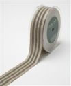
I added two strips of Scor-Tape to the center of my card. Since my ribbon was 1.25" Woven Black Stripe Ribbon, I placed the tape to "catch" both the top and bottom edges. I also left a little overhang on either side of the card.

Cut the ribbon slightly longer than the width of your paper, press onto the Scor-tape and wrap the edges behind the panel to create a neat edge.

Then just glue this layer onto the black card base.

Here is the next layer of this card. Notice how everything is matted on black cardstock. This helps to separate the layers and makes each element stand on its own. The patterns play happily together because I have mixed small, medium and large prints all in the same color family against a bold patterned background. The pen nibs measure about 2" wide by 1 5/8" wide. The newsprint panel is 3" x 3" and the damask pattern is 4" x 2". The little filmstrip flags were cut from the paper collection, and one is glued on top, the other below.

Next, I added this little tag with foam tape. I ran red burlap string through the top and tied a bow...but later I changed my mind about the bow...as you will see.

I forgot to take photos of the next step, but it's pretty simple. I painted the edges of the pocket watch base with Black Soot Distress Paint. Then I ran the evacuated frame through my Big Shot using a texture fade. It really doesn't matter much which one you use...you just want to add some texture. I painted the frame with Black Soot Distress Paint. Once that had dried, I tapped on Tarnished Brass DP and sanded lightly after it had dried. Glue your prepared focal onto the pocket watch base using foam tape. Then line up the frame and glue in place.

Next, I dabbed on little bits of Barn Door DP. I tied the pocket watch stem with red burlap string and used foam tape to attach it to my card base. You can see here that I took the bow off the tag in the layer below.

I created a big, poufy bow with my ribbon and secured it to the card with my glue gun.

This was topped with a loopy red burlap string bow.

To create this custom embellishment, I used the antique bronze clock with cabochon. I simply punched out an image from the paper collection, glued it in place with Glossy Accents, and then glued the cabochon in place using Glossy Accents again. A few little taps of Barn Door DP added a little character. Et Voila! A custom embellishment that matches the card perfectly! The really fun part is that the clock is a brooch, and can be detached from the card and worn as jewelry.

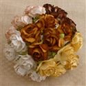
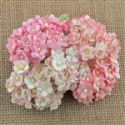
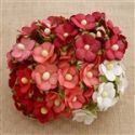
Now to add the flower cascade. I always glue down my largest flower first. In this case, it's the Wild Orchid Crafts Earthtone Wild Rose. I flanked it on either side with a red rose, cream cherry blossom and finally some red sweetheart blossoms. To create the burlap loop, just tie a loopy bow with a single strand of burlap string. Place hot glue up under the Wild rose and use the point of your scissors to push the knotted center into the hot glue. Hold in place for a few seconds and you're all set. Tap on a little Barn Door Distress Paint if you'd like.

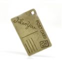
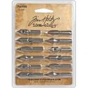
I fussy cut some pen nibs from the paper collection and added them to the focal image with foam tape. And finally, I added the little vintage postcard to the mix, and tucked a pen nib into the flower cluster. And now the cover of this card is finished!

The inside of the card is fully decorated. I left the top fairly simple with lots of room for a note.

One of the things I love about G45 papers is how fun they are to layer. Here, I've cut off some paper edges to create a border, then punched out a circle to add some pizzazz.

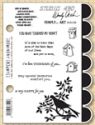
The bottom portion of the card has more layered elements, and a great sentiment stamp from Wendy Vecchi.
I hope I helped you overcome your fear of layering patterned papers and inspired you to play with all that gorgeous Graphic 45 you have sitting on a shelf. Thanks for stopping by!
Cheerio,
kathy
PRODUCT LINKS
 |  |  |  |  |
 |  |  |  |  |
 |  |  |  |  |
 |  |  |  |  |
 |  |  |  |  |
 |  |

Oh just brilliant Kathy! I'm loving seeing how these different layers come together right down to the amazing details inside - so much cleverness and so worth it! xx
ReplyDeleteHi Kathy a wonderful explanation of how to layer everything together. I love what you have donex
ReplyDeleteWhat a wonderful, thorough explanation! Could you please explain what you mean when you wrote, "The larger and bolder the pattern, the lower it sits on the card."
ReplyDeleteThank you so much! By saying "the lower it sits on the card" I am referring to the bottom layers, or the layers closest to the card base. Hope that makes sense!
DeleteWonderful tutorial Kathy! I love the little fishtail banners you added! Your layering is just fabulous! hugs :)
ReplyDeleteAwesome step by step! Love that vintage cracked glass and stenciling you created on the time piece! Fabulous!
ReplyDeleteI have also got this paperpad in my stack, but would never have this idea for a project. It's great!!
ReplyDeleteLia xx
Kathy, this is stunning!!! You work so well with bold colors of Graphics 45 collections! Love it!!!
ReplyDeleteHugs
Samra
Paper Talk with Samra
How did you know that Graphic 45 was intimidating? I stopped buying it, because I was afraid to use it!! I have several projects with all the parts for them, but I don't want to waste the paper.I have 2 boxes with tags to cover and put pictures of my great grandson and John's grandson. I just keep putting it off. Your cards are fantastic as usual. You must have your studio in some kind of working order.Hope the rest of the house is starting to come together. I hate unpacking as much as packing I think. I loved your cards. Take care. Lots of hugs.
ReplyDeleteI love what you created with the Graphic 45 paper. I love their papers, but as you mentioned, am always too timid to use it "properly". Thanks for your very informative instructions.
ReplyDeleteExcellent step-by-step tutorial! Love getting a glimpse into your thought process as you build and create these amazing projects! Graphic 45 needs you!! :0) Well done Kathy!!
ReplyDeleteNice step-by-step tutorial Kathy. Learned some new techniques and you have a beautiful card as well. Nancy Hill
ReplyDeletePlease...take your Graphic 45 papers out and USE them! They are so much fun to play with. You can use this card layout as a blueprint for almost anything in their line. Once you start, you'll get past the fear of "ruining" the paper. It's no good to you sitting on a shelf. Take it out and have a little playtime! Thanks for all these lovely comments! Hugs!!!
ReplyDelete