Tim Holtz 3D Embossing Botanical Sizzix Faux Plaster Tutorial
I began by cutting a piece of 8.5 x 11 Tim Holtz Mixed Media Heavystock into four quarters - the reason for using this Heavystock is that it has been designed to be very forgiving when you apply wet media and I find it doesn't warp the way some regular cardstock can.
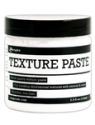
For my first experiment I spread an uneven layer of Ranger Opaque Texture Paste over the first quarter of Heavystock, allowing it to air dry (which doesn't take long, even here in the UK).

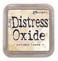
When dry I blended Antique Linen Distress Oxide Ink over the whole surface, spritzed with water, allowed it to dribble and run by moving the Heavystock around, then dried it with my heat tool. Do bear in mind you can stop at any stage of this process if you like the effects you've achieved!

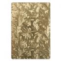
Now I ran the altered Heavystock through my Big Shot with the Botanical Texture Fades 3D Embossing Folder using my Multipurpose Platform and one of my Cutting Plates - the instructions for getting the correct 'sandwich' are included in the packaging and on Sizzix own website.

You'll notice I de-bossed my surface as I wanted to achieve a look of old decorative plaster. Again, you could leave it at this stage but I couldn't! choosing instead to brayer Picket Fence Distress Paint over the surface lightly.

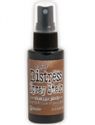
Finally I sprayed the whole piece with a little mist of water and used a paintbrush to dribble Vintage Photo Distress Spray Stain down into the de-bossed grooves. To encourage it to 'run' you can add more water until you get the effect you want. I allowed it to air dry again, though you could use a heat tool to speed up this part of the process. You'll notice as it dries it takes on more of a pale rose hue as the inks and water react with the Texture Paste.

So now my altered Heavystock was ready for use in a finished project. I tore it down the middle, effectively leaving me with two halves for two cards, though you could just use the whole piece as a stand alone background as it wouldn't need much in the way of embellishing.

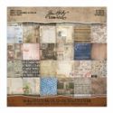
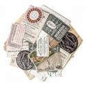
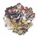
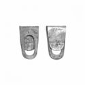
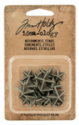
You can see I took some Tim Holtz Paper Stash to create a simple background, adding stitching and Design Tape with some torn Worn Wallpaper before layering on my embossed card. It then only took some ephemera (the Ideaology Layers collections, Collector and Botanical are a great source for these) a couple of metal Adornments and a sentiment from the Small Talk Occasions set to complete it. Here are some close ups so you can see how the embossed Heavystock adds so much detail to the finished card;


Tim Holtz 3D Embossing Botanical Sizzix Distress Oxide Paint Tutorial
Now here's a second a second, much shorter experiment which has equally wonderful results. Again I started with a quarter of the Mixed Media Heavystock. This time I dipped it repeatedly into a blend of Hickory Smoke Distress Oxide Ink and water to get that mottled effect we are all familiar with.

Having run it through my Big Shot with the Botanical Texture Fades 3D Embossing Folder (embossing rather than de-bossing this time) I used my brayer to apply a layer of Pumice Stone Distress Paint over the raised areas.

After the paint had dried I blended Walnut Stain Distress Ink into the Heavystock to add some 'age' and contrast to the embossed areas. And that was it, ready for use! I love the darker look to this one and decided to create a male themed card with it.

Now I must admit this card became a little more 'involved' than the last, though to keep it simple you could equally just use Tim Holtz Paper Stash and various Layers as before.

I did use Paper Stash for the background as before but this time used my brayer to add light layers of Distress Paint over before applying an uneven layer of Texture Paste through a Layering Stencil. As it had a look of verdigris I did add one more layer of media to my torn piece of altered Heavystock (I can't ever leave well enough alone!) brayering the smallest amount of Tumbled Glass Distress Paint over the raised areas.


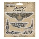
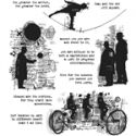
The central panel looks complicated but was achieved easily by stamping one of the images from the Tim Holtz 'Theories' stamp set onto card dipped in Antique Linen Distress Oxide Ink and water. I stamped the image for a second time onto spare card, cut around the man and balloon, and dipped them in the leftover paints from the background to get the verdigris look again (use shades of brown and grey and end with light dabs of the Tumbled Glass). The altered metal Adornments and a sentiment from the Small Talk Snarky set completed the card. Here are the final close ups so you can see more of that embossed Heavystock;


That's it for today's Saturday Showcase tutorials using Tim Holtz Botanical 3D Texture Fades Embossing Folder! I hope you've enjoyed seeing just a couple of the possibilities for using it - there are plenty more as you play with different colours, inks and paints, and of course two more designs too! And now that The Funkie Junkie Boutique has the new Tim Holtz 3D Impresslits in stock there are even more 3D shapes to alter.
Have fun and get creative!
Jenny xxx
 |  |  |  |  |
 |  |  |  |  |
 |  |  |  |  |
 |  |  |  |  |

Wow! Such a beautiful aged finish and wonderful layering! And!
ReplyDelete, I think I could even do this, thanks to your wonderful tutorials. You are really achieving some splendid effects with these brayering techniques. You make me want to get inky! Thanks, Jenny!
I love what you did for both cards and am amazed at how different the embossed & de-bossed are. Great tutorial, Jenny :)
ReplyDeleteThank you for posting this. Great directions. I love the embossing folder.
ReplyDeleteFabulous cards and lots to learn about the process. Loving how you go a little further when most of us would stop because your end result is always spectacular.
ReplyDeleteBoth cards are awesome. Love the processes you used on them. Thanks for sharing.
ReplyDeleteThanks so much for sharing your techniques, these are very inspiring.
ReplyDeleteExcellent tutorial! Since I'm a "vintage gal" I LOVE these!! Will be experimenting soon! THANK YOU!!
ReplyDeleteYour cards are both fantastic and it was good to see how you created them! x
ReplyDeleteTwo amazing cards, Jenny! I love that you tempted us with a masculine as well as a feminine finished card!Great results with your layers of oxides and paints on these wonderful surfaces! Thank you for your inspiration through this wonderful tutorial! Hugs!
ReplyDeleteFabulous! Will save these instructions.
ReplyDeleteOh my gosh Jennie! That plaster effect is outrageous! I so love it! And both cards turned out beautifully. You've inspired me to play with this folder a bit more. My first two attempts were lacking... TFS and hugs, Autumn
ReplyDeleteGorgeous Jennie! Inspirational Tutorial and beautiful card! Love it!
ReplyDelete